Become a MacRumors Supporter for $50/year with no ads, ability to filter front page stories, and private forums.

Reality4711

macrumors 6502a
Original poster
Aug 8, 2009
738
558
scotland
Is there a 'Numbers Guru' out there to take me through a basic first time set up.

All I want to do is
1/a small spread sheet. with twelve rows (months) and weight in pounds in second column.

2/ a graph (or American Chart) with 'x' for weight between 150lb & 220lb against 'y' twelve (months)

So that when I enter the weight each month it is shown on the graph automatically.

I can do this on a piece of paper in about 5 minutes.

Would love to be able to do the same in Numbers - just cos. I can.
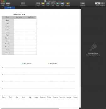
 

udontno

macrumors 6502
Jul 19, 2011
321
122
VA, USA
Does this link help you?

I am not a numbers expert, but I was able to set up a simple bar graph template for student eye color, Airdrop it to a class of first graders, and they were able to modify the chart for their class results. It's not too terrible once you know how to do it.
 

Dave Braine

macrumors 68040
Mar 19, 2008
3,994
357
Warrington, UK
Enter your data: ie, Month and weight, in the two columns. Click in the top lefthand cell(January??). You will see a small dot in the bottom right hand corner of that cell. Click and drag that dot down and across to the bottom right hand corner of the second column, basically selecting all your data cells.

Go into the Insert menu, down to Chart then left and choose the type of graph that you want. I don't know what an "American Graph" is, but have a look at a 2d Line Graph. The chosen graph will appear and will change as you change the weight entries.
 

Reality4711

macrumors 6502a
Original poster
Aug 8, 2009
738
558
scotland
Does this link help you?

I am not a numbers expert, but I was able to set up a simple bar graph template for student eye color, Airdrop it to a class of first graders, and they were able to modify the chart for their class results. It's not too terrible once you know how to do it.

Saved and will work on it later today.

Thank You.
[doublepost=1551095385][/doublepost]
Enter your data: ie, Month and weight, in the two columns. Click in the top lefthand cell(January??). You will see a small dot in the bottom right hand corner of that cell. Click and drag that dot down and across to the bottom right hand corner of the second column, basically selecting all your data cells.

Go into the Insert menu, down to Chart then left and choose the type of graph that you want. I don't know what an "American Graph" is, but have a look at a 2d Line Graph. The chosen graph will appear and will change as you change the weight entries.

Hello,

The American for graph, it seems, is Chart. Just me being picky:oops:;)

I've copied your help post and will work with it later today.

Thank You
 

Reality4711

macrumors 6502a
Original poster
Aug 8, 2009
738
558
scotland
Hello both.

This is as far as I have gotten.

I want to have scales at each end of the graph with column titles (as per the templates).
I did this from scratch because each time I tried to follow your(instructions) I was unable to edit what I was seeing.
Told you I was a numpty!

I'll have another go later.


Dave; yours is the method I followed closest (I find the Apple one confusing).

Regards
 

Attachments

  • Screenshot 2019-02-25 at 15.01.13.jpg
    Screenshot 2019-02-25 at 15.01.13.jpg
    95.5 KB · Views: 285
Register on MacRumors! This sidebar will go away, and you'll see fewer ads.