Become a MacRumors Supporter for $50/year with no ads, ability to filter front page stories, and private forums.

RealMonster

macrumors regular
Original poster
Oct 28, 2007
196
152
So the advantage of selecting an entire column when creating a graph in Numbers is that when you add more rows, the data is updated automatically. I have a new column that has no data until a couple weeks ago, and I want it to just update without leaving a tonne of empty space at the left side of the graph, but I also don't want to have to update the chart data every single time I add a new entry—which is every day.

Numbers seems particularly weak in the area of graphing, but maybe I'm just missing something?
If I understand what your goal is, after selecting the entire column for the graph, I think it might work to filter the column based on cell is not blank. You can turn it off temporarily to add new data, and then flip it back on.

1610478816737.jpeg
 
If I understand what your goal is, after selecting the entire column for the graph, I think it might work to filter the column based on cell is not blank. You can turn it off temporarily to add new data, and then flip it back on.

View attachment 1711547
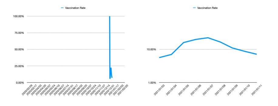
Actually, the problem is more this:
Screen Shot 2021-01-12 at 2.19.53 PM.png

These graphs are the same data, the difference is that the one on the left is me selecting the whole column, and the right is me selecting the specific cells that are relevant.

When I add data to the column "Vaccination Rate", the graph on the right will update automatically, because it's a graph of the whole column. The graph on the right will have to be manually updated to extend the range of valid data.

Basically, I want the graphing system to let me say, "look, ignore everything in this column before this time, but keep track of everything new."

(That filter thing unfortunately compresses the whole chart. It works, but it eliminates rows for the whole chart, not just in the columns I'm interested in.)
 
Actually, the problem is more this:
View attachment 1711556

These graphs are the same data, the difference is that the one on the left is me selecting the whole column, and the right is me selecting the specific cells that are relevant.

When I add data to the column "Vaccination Rate", the graph on the right will update automatically, because it's a graph of the whole column. The graph on the right will have to be manually updated to extend the range of valid data.

Basically, I want the graphing system to let me say, "look, ignore everything in this column before this time, but keep track of everything new."

(That filter thing unfortunately compresses the whole chart. It works, but it eliminates rows for the whole chart, not just in the columns I'm interested in.)
I would think then one of the date-based filters would work well. There's lots of options there.
 
I would think then one of the date-based filters would work well. There's lots of options there.
The problem with the filters is that it hides all the data, not just from the column that I want; all the columns are affected by it. That means columns with plenty of valid data aren't shown, and all graphs are correspondingly updated, meaning several of them have data left out. The issue is because I have multiple columns and they're not uniform in their starting time; if they were, none of this would be a problem in the first place. Unless I'm misunderstanding something about how the filters work—which is possible—no way that I've been able to figure out how to use them preserves data from multiple columns and only ignores data from one.

Perhaps the only way to do this is to have multiple charts rather than multiple columns in one chart, unfortunately. It's a slightly more annoying data arrangement, but it may work better for my purposes.
 
Register on MacRumors! This sidebar will go away, and you'll see fewer ads.