Become a MacRumors Supporter for $50/year with no ads, ability to filter front page stories, and private forums.

illegallydead

macrumors 6502a
Oct 22, 2007
714
0
Colorado!!!
First off, that is Office 2010 for PC (obviously). If 2008 vs. 2007 is any indication, the products will look and behave completely differently. The Mac version will in all likelihood try to be more "mac-ish", but will ultimately fall far short and will hopefully suck a little less than 2008. I am keeping my fingers crossed, though! Please, please, surprise me!
 

r.j.s

Moderator emeritus
Mar 7, 2007
15,026
52
Texas
Personally, I hope the MacBU brings the ribbon to the Mac version. Using 2007 at work, and 2008 at home is horrible with the UI differences. They should be similar, although, not that hideous. 2007's UI isn't all that bad.
 

The Flashing Fi

macrumors 6502a
Sep 23, 2007
763
0
Remember, it's not done. MS made a lot of changes to the UI of Office 2007 before release. It had a slate theme IIRC. I wouldn't pass judgement until it's actually done.
 

illegallydead

macrumors 6502a
Oct 22, 2007
714
0
Colorado!!!
Personally, I hope the MacBU brings the ribbon to the Mac version. Using 2007 at work, and 2008 at home is horrible with the UI differences. They should be similar, although, not that hideous. 2007's UI isn't all that bad.

Agreed. Personally I think the ribbon is kind of nice. Oh, and they should really try to attempt to include all the features of the PC version. I am sick of having Excel not able to do half of the stuff the PC version can do!

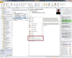
Oh, and to comment on the screenshot - why in the bloody hell is everything so bright? I hope this is the result of some sort of theme going on that makes everything whiter. Personally I like my windows (in Windows) dark. And so does Microsoft. Just look at the icons in the taskbar in Win7 (they are all white on black). I am thinking everything being this white would be too weird for me...
 

11800506

macrumors 65816
Oct 31, 2007
1,060
1
Washington D.C. Area
Personally, I hope the MacBU brings the ribbon to the Mac version. Using 2007 at work, and 2008 at home is horrible with the UI differences. They should be similar, although, not that hideous. 2007's UI isn't all that bad.

I would agree. After using Office 07 for an extended period of time you really get used to the ribbon. I wish they could bring it to the Mac version, although obviously it should be usable first.

The 2010 UI sounds like a bit of a mess but maybe with some more polish it could look better.
 

r.j.s

Moderator emeritus
Mar 7, 2007
15,026
52
Texas
Oh, and to comment on the screenshot - why in the bloody hell is everything so bright? I hope this is the result of some sort of theme going on that makes everything whiter. Personally I like my windows (in Windows) dark. And so does Microsoft. Just look at the icons in the taskbar in Win7 (they are all white on black). I am thinking everything being this white would be too weird for me...

Noticed that too. It's probably the user's settings.
 

str1f3

macrumors 68000
Original poster
Aug 24, 2008
1,859
0
Personally, I hope the MacBU brings the ribbon to the Mac version. Using 2007 at work, and 2008 at home is horrible with the UI differences. They should be similar, although, not that hideous. 2007's UI isn't all that bad.

MacBU has said that they won't import the ribbon interface into mac office and I think it's a good idea. The ribbon interface sticks out like a sore thumb from the rest of OSX. It wouldn't be as serious a flaw as what Office 2010 currently looks like but it wouldn't fit in. Personally I prefer the mac version visually even though I use 2007.

I used Office through boot camp but my time may be coming to an end. Office for Windows seems to be getting updates just for the sake of charging customers a recurring price and all the while it gets ever more bloated with useless features. Office seems to have peaked at 2003/2004. Hopefully MacBU will put out a better product.
 

jaw04005

macrumors 601
Aug 19, 2003
4,571
562
AR
Oh, and to comment on the screenshot - why in the bloody hell is everything so bright? I hope this is the result of some sort of theme going on that makes everything whiter. Personally I like my windows (in Windows) dark. And so does Microsoft. Just look at the icons in the taskbar in Win7 (they are all white on black). I am thinking everything being this white would be too weird for me...

It's completely a theme and their choice of background image. The other screen shots look just like Office 07.

What's the problem? We've known for two years that the "Ribbon UI" was coming to Outlook and Access.

And like the site says this is an alpha.

Paul Thurrott posted pictures of Office 2010 weeks ago. Here:
 

Attachments

  • office2010_outlook_preview.jpg
    office2010_outlook_preview.jpg
    129.7 KB · Views: 370

thomahawk

macrumors 6502a
Sep 3, 2008
663
0
Osaka, Japan
the menu UI looks nice

but the colors and graphical interface is UGLYYY!!!!!

im staying with 08 for now i guess.

i only wish that the mac MS office was more of a 2007 feeling, i dont like the current 2008. either that i'll go to iworks 2010 or whatever they do
 

illegallydead

macrumors 6502a
Oct 22, 2007
714
0
Colorado!!!
It's completely a theme and their choice of background image. The other screen shots look just like Office 07.

What's the problem? We've known for two years that the "Ribbon UI" was coming to Outlook and Access.

And like the site says this is an alpha.

Paul Thurrott posted pictures of Office 2010 weeks ago. Here:

I was making no comments one way or the other on the ribbon itself. Not going to say whether it should or should not be used. Just commenting that the visual design in the screenshot goes against everything that Windows 7 is trying to look like by default, but it seems evident that this is just a user customization, so no big deal!
 

opeter

macrumors 68030
Aug 5, 2007
2,709
1,619
Slovenia
Office 2010 will be the first version of MS Office, that will have a 64-bit version (finally).

Hope, that we slowly get the new applications written for 64-bit OS.
 

beg_ne

macrumors 6502
Jul 3, 2003
452
0
It's completely a theme and their choice of background image. The other screen shots look just like Office 07.

What's the problem? We've known for two years that the "Ribbon UI" was coming to Outlook and Access.

And like the site says this is an alpha.

Paul Thurrott posted pictures of Office 2010 weeks ago. Here:

Jeez, what a sad example that is. I could launch every app in my Dock, combine all the UI elements and still have something that has less clutter than THAT.

Seriously, all that garbage just to read email?
 

fishkorp

macrumors 68030
Apr 10, 2006
2,536
650
Ellicott City, MD
Remember, it's not done. MS made a lot of changes to the UI of Office 2007 before release. It had a slate theme IIRC. I wouldn't pass judgement until it's actually done.

Code freeze for Office was supposed to be late April. So unless the date got pushed back, it's done. However the post doesn't say how old or what build those screenshots are.
 
Register on MacRumors! This sidebar will go away, and you'll see fewer ads.