Become a MacRumors Supporter for $50/year with no ads, ability to filter front page stories, and private forums.

jihuiwen

macrumors newbie
Original poster
Jul 22, 2008
12
0
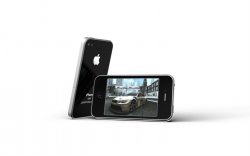
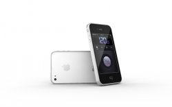
A couple of renderings of what I think the new iPhone should look like based on the current iPad design and the iPhone 4 prototype uncovered by Gizmodo.
Enjoy:D
Everything was done in Luxology Modo 401
 

Attachments

  • iPhone 4 2.JPG
    iPhone 4 2.JPG
    170 KB · Views: 2,261
  • iPhone 4 3.JPG
    iPhone 4 3.JPG
    178.5 KB · Views: 14,838
  • iPhone 4 1.JPG
    iPhone 4 1.JPG
    247.8 KB · Views: 729
  • iPhone 4 4.JPG
    iPhone 4 4.JPG
    136.1 KB · Views: 737

MICHAELSD

macrumors 603
Jul 13, 2008
5,484
3,494
NJ
I like the white back. I've chosen the black back on the previous two iPhones, but I'm not sure about this one.
 

SchneiderMan

macrumors G3
May 25, 2008
8,332
202
I agree it looks much better, and i think this is what Apple will change to, just like the iPads bezel.
 

nick1516

macrumors 6502a
Sep 21, 2008
564
0
Am I missing something, because all I see different is the volume rocker and rounded bezel, which I do think looks better though.
 

jihuiwen

macrumors newbie
Original poster
Jul 22, 2008
12
0
Am I missing something, because all I see different is the volume rocker and rounded bezel, which I do think looks better though.

You are missing the difference between a three layered sandwich design and an aluminum frame design with beveled edges that extends all the way to the edges of the front and back bezel. And also the difference between with or without black seams on the frame.:rolleyes:

One of the reasons I believe for the seams found on the prototype iPhone is that, if you pay attention to their positions and arrangements, they made it possible to take out the part of the frame that encloses the giant round volume buttons.(Maybe replace it with a pair of different buttons later on?)
 

jihuiwen

macrumors newbie
Original poster
Jul 22, 2008
12
0
I'm glad everyone seems to like it. In the meantime, I've uploaded a new image showing the bottom side with no screws.(the iPad doesn't have screws, and there are photos of another leaked prototype with no visible screws on the bottom as well)
Enjoy~:)
 

ethical

macrumors 68000
Dec 22, 2007
1,661
1
Wow really great job! Much prefer this look to the icecream sandwich of the prototype.
 

OrangeCuse44

macrumors 65832
Oct 25, 2006
1,504
2
That looks incredible. WAY better than the prototype. I'm crossing my fingers for this, great job.
 

elppa

macrumors 68040
Nov 26, 2003
3,233
151
That looks incredible. WAY better than the prototype. I'm crossing my fingers for this, great job.

In my eyes it is the prototype, just with a slightly different rocker switch and captured in the style of the shiny Apple PR shots we've come to expect.

Great job jihuiwen — must have taken some time!
 

0098386

Suspended
Jan 18, 2005
21,574
2,908
Very very purdy indeed. I also hope it ends up looking like that and I hope you get a job at Apple :D (or somewhere nicer if the horror stories of working for Apple are true).
 

jihuiwen

macrumors newbie
Original poster
Jul 22, 2008
12
0
This has been a fun modelling and rendering practice project for me. I too hope the next iPhone doesn't end up with that Microsoft iPad like sandwich design. Thank you everyone for all your support, I'm glad you liked this alternative design better. Thanks
 

Arran

macrumors 601
Mar 7, 2008
4,928
3,935
Atlanta, USA
Now that's more like it! Much better looking.

Maybe the leaked prototypes had their cut-down 'skeleton' frame so they'd fit inside the 3G camouflage case?
 

Shotglass

macrumors 65816
Feb 4, 2006
1,175
0
The volume buttons need to be separate. Mine got sticky and stopped working reliably, I've seen the same problem on 5+ iPhones so far, which is way too many.
 
Register on MacRumors! This sidebar will go away, and you'll see fewer ads.