Become a MacRumors Supporter for $50/year with no ads, ability to filter front page stories, and private forums.

Night Spring

macrumors P6
Original poster
Jul 17, 2008
15,249
8,463
These are Overnight Vitals complications for the X-Large watch face.

Does anyone know what these graphics mean? They are pretty, but I have no idea what they mean.

1737317788007.png
1737317835466.png
 
I imagine that's a circular representation of the usual vitals ranges. The small area in the left is probably "low", the right one "high", and the middle one "typical". The black markers would be the readouts.
 
I imagine that's a circular representation of the usual vitals ranges. The small area in the left is probably "low", the right one "high", and the middle one "typical". The black markers would be the readouts.
It's the black markers that have me really puzzled. There seems to be two types, a dot, and a line. I think I also sometimes get a colored segment without any marks.

I just wanted to know if anyone knew what they mean before going down the rabbit hole of collecting these screenshots everyday and comparing them to my vitals readings to see if I can decipher the code.
 
  • Like
Reactions: Parowdy
It's the black markers that have me really puzzled. There seems to be two types, a dot, and a line.
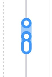
There's five readings (four if you don't have body temperature), and readings that are close together get combined into lines. It's similar to the weekly and monthly vitals readouts when you tap them in the phone:
 

Attachments

  • IMG_0849.jpeg
    IMG_0849.jpeg
    15.3 KB · Views: 47
  • Like
Reactions: Big_D
There's five readings (four if you don't have body temperature), and readings that are close together get combined into lines. It's similar to the weekly and monthly vitals readouts when you tap them in the phone:
Where did you get that graphic? I've never seen that before.
 
  • Like
Reactions: Parowdy
There's five readings (four if you don't have body temperature), and readings that are close together get combined into lines. It's similar to the weekly and monthly vitals readouts when you tap them in the phone:
that picture shows 1 vital over 7 days ...
the watch face complication, at least for me, is called "overnight vitals", so there should be 5 distinct data points ...
 
  • Like
Reactions: Parowdy
that picture shows 1 vital over 7 days ...
the watch face complication, at least for me, is called "overnight vitals", so there should be 5 distinct data points ...
Nope, tap the vertical bars in the view I mentioned and you see the individual readouts.
 
The style I showed a screenshot of is also used in the Weekly Vitals widget for the latest day.
 
Nope, tap the vertical bars in the view I mentioned and you see the individual readouts.
I get that, but look at the actual complication on the watch, that does not correlate (to me) in any way what I see in the Health app for the day/night nor to the weekly view ...
 
That is the question, LOL!

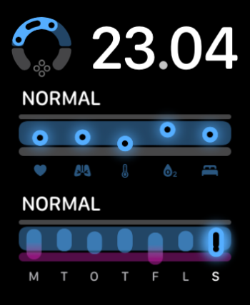
I got all five vital readings today, so the second graphics, the one that says 14:39, should represent all 5 readings. But it looks more like 4 segments than 5.
and furthermore, why the 2 great "bars" at the bottom? show in both yours and mine ...
 
Health app on the iPhone, Vitals / Vitals, select "W" at the top, tap any of the vertical bars.
Got it. And it does seem similar to the Watch complication, but not quite. Below is the graph from the Health app from today, and it has 2 dots, a line, then another dot. The last dot is missing from the complication, unless it was combined with the line somehow.

1737320274901.png
 
and furthermore, why the 2 great "bars" at the bottom? show in both yours and mine ...
I know! In the sample picture of complications you get in the Watch app, one of those bars at the bottom is pink, apparently to indicate an outlier reading.

Hmmmm.

So I suppose if you had an outlier that was higher than normal, one end of the circle gets colored, and if you get an outlier that is lower than normal, then the other end gets colored?
found this and it seems updated and the Vitalks complication is not listed for my Wayfinder face, so wondering when this complication was introduced and if there are still bugs???

 
I know! In the sample picture of complications you get in the Watch app, one of those bars at the bottom is pink, apparently to indicate an outlier reading.

Hmmmm.

So I suppose if you had an outlier that was higher than normal, one end of the circle gets colored, and if you get an outlier that is lower than normal, then the other end gets colored?
Here’s what outliers look like
1737321196549.png
 
I know! In the sample picture of complications you get in the Watch app, one of those bars at the bottom is pink, apparently to indicate an outlier reading.

Hmmmm.

So I suppose if you had an outlier that was higher than normal, one end of the circle gets colored, and if you get an outlier that is lower than normal, then the other end gets colored?
yes, see above, and in the daily view it's a colored dot
 
and checking the other modular faces, they all seem to have both daily and weekly vitals complications and I assume it'll look like the above.
So it appears to me that these complications were designed for modular faces and were cramped into analog ones.

Personally, I don't like digital faces as I have to "read" them vs analog where I can "glance". But I look at my Health app every morning so don't really need this complication on my watch.
Good to see that Apple added those complications to existing faces though!
Good find @Night Spring!
 
  • Like
Reactions: Night Spring
But I look at my Health app every morning so don't really need this complication on my watch.
I don't need the complication on my watch either - like you, I look at the vitals data in the Health app.

It's just that the graphics is intriguing, especially when it's large like it is on the X-Large face. ;)
 
  • Like
Reactions: jz0309
IMG_4187.jpeg
incoming-7FF2B4A3-DDA6-4B77-AD7C-A04C7B631933.png
The "horseshoe" Vitals complication features three main segments, the muted blue part in the middle, representing the "Normal" range for your vitals, the (too)"Low" range in the bottom-left muted grey section, and the (too)"High" range in the bottom-right grey section.

It's worth noting that this complication (by itself) does not show you exactly which vitals lie in which range. The "horseshoe" Vitals complication only gives you a quick overview of the general range of your vitals. And, of course, will indicate if one or more vitals are too high or low.

If you want to know exactly which vital correlates to which dot or elongated dot then you have to check the Vitals app on Watch or Health on your iPhone.

With that out of the way:

The (perfectly) circular black dots represent one out of the five vitals.

Look at the "23:04" example: The leftmost dot represents my wrist temperature.The measurement is (comparatively) much lower than my other vitals so it gets a circular dot. The measurement is quite low, and the dot representing it on the horseshoe is therefore represented by the leftmost black dot.

The blood oxygen is (comparatively) a bit higher than the other vitals so it represents the rightmost dot on the horseshoe.

Because they are so close to one another, three remaining vitals (heart rate, respiratory rate, and sleep duration) are then combined to the elongated dot.

An elongated, rectangular black dot represents at least two or more vitals that are deemed too close to each other to each get a (perfectly) circular dot.

Look at the "10:09" example: Four out of the five vitals are all within the "Normal" range, and, more specifically, almost dead center within the "Normal" range, and very close to each other. This means they get combined into one, elongated dot.

The blue or blue+pink outline-"blob" represents the total combined range of all the vitals combined.

A pink dot and (partly) pink "horseshoe" outline-blob indicates that one or more of your five vitals was in the (too)"High" or (too)"Low" range.

A pink circle will also appear in the middle of the "horseshoe", with a number indicating how many of your vitals were outside of your "Normal" range.

The four grey dots at the bottom of the Vitals complication is just the Vitals app logo and doesn't change or show any data.
 
Last edited:
Register on MacRumors! This sidebar will go away, and you'll see fewer ads.