Become a MacRumors Supporter for $50/year with no ads, ability to filter front page stories, and private forums.
Photography assigment critique
- Thread starter Rothman
- Start date
- Sort by reaction score
You are using an out of date browser. It may not display this or other websites correctly.
You should upgrade or use an alternative browser.
You should upgrade or use an alternative browser.
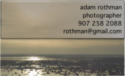
#2 is better, but I don't love either one f them. Use a different font, perhaps. Also, maybe right justify it. And you might try capitalizing your name, but it might look ok un capitalized. If you could, I'd suggestputting an email or a url to your work on the card too, so people could look before they call. Lastly, rotate your photo so the horizon isn't crooked.
I have added 5 more versions of the second picture with different fonts and the horizon line fixed. What kind of shot have/would you use for your business card?
First of all thank you for your comments. But I was left with a couple of questions and I would really appreciate if you could clarify?
When you said that you don't love them do you mean the photo or the card on the whole? Is there anything in particular that you don't like about the pictures or anything that you would suggest to make it better?
Thanks again for your suggestions.
#2 is better, but I don't love either one f them. Use a different font, perhaps. Also, maybe right justify it. And you might try capitalizing your name, but it might look ok un capitalized. If you could, I'd suggest putting an email or a url to your work on the card too, so people could look before they call. Lastly, rotate your photo so the horizon isn't crooked.
First of all thank you for your comments. But I was left with a couple of questions and I would really appreciate if you could clarify?
When you said that you don't love them do you mean the photo or the card on the whole? Is there anything in particular that you don't like about the pictures or anything that you would suggest to make it better?
Thanks again for your suggestions.
I think the wrting should be black with a white outline or something to make it stand out more, as it's kinda hard to read.
I think the wrting should be black with a white outline or something to make it stand out more, as it's kinda hard to read.
Thanks I really like that idea, I added two images white text with black outline and the opposite to the flickr page.
well the white with black outline is much easier to read, but it still seems like a pretty lackluster design, IMO.
is the assignment to just use one photo as a background and then your information on top, like you have it? or was it "create a business card" ?
I feel like it would be much more professional if you ghosted the photograph and then laid out your information properly on top, rather than handing in a 100% photo with your information scrunched in the corner like an afterthought...
A business card is meant to be handy for your contact information. It seems to me that right now your main focus is that picture, which it shouldn't be. Yes, you are a photographer and that is what your business card says, but if they want to see sample work, then they should head over to a website or portfolio.. this business card shouldn't serve that purpose.
They're all hard for me to read. I'm not sure why but nothing really stands out in them for me. It could be the huge hot spot, it could be the lack-luster font, it could be the fact that I simply thing the photo is boring-even for a business card.
If you're dead set on using that card try to add an interesting element to it, use another font or use that font more creatively. I guess business cards are tough, they're tough for me and I went through many before I found one that I loved. If you have to use a photo due to the assignment try to think of ways to make it interesting without it being distracting and attractive without it being goofy.
If you're dead set on using that card try to add an interesting element to it, use another font or use that font more creatively. I guess business cards are tough, they're tough for me and I went through many before I found one that I loved. If you have to use a photo due to the assignment try to think of ways to make it interesting without it being distracting and attractive without it being goofy.
well the white with black outline is much easier to read, but it still seems like a pretty lackluster design, IMO.
*...*
Yes, you are a photographer and that is what your business card says, but if they want to see sample work, then they should head over to a website or portfolio.. this business card shouldn't serve that purpose.
I like what you said about making sure the text and contact info is at the forefront. That really makes sense for a business card. I added some photos to the flickr where I reduced the opacity of the background. I also thought about flipping the image and putting the text on the left. I think that this might help to bring the focus to the text by having it be on the left. Do you think this would help? Is reducing the opacity what you meant by ghosting the photo?
They're all hard for me to read. I'm not sure why but nothing really stands out in them for me. It could be the huge hot spot, it could be the lack-luster font, it could be the fact that I simply thing the photo is boring-even for a business card.
If you're dead set on using that card try to add an interesting element to it, use another font or use that font more creatively. I guess business cards are tough, they're tough for me and I went through many before I found one that I loved. If you have to use a photo due to the assignment try to think of ways to make it interesting without it being distracting and attractive without it being goofy.
Thanks for the advice. I have been playing around with some other fonts but I am not finding anything particularly striking. Do you have any suggestions or ideas as to a good font for this situation? What do you like about your business card? Thanks!
Business cards have a front and a back. Maybe put your info on the back.
With some space to write names and numbers so you remember people.
As much as I like this idea our teacher stressed that he wanted it with the text and the photo on the same side.
I like the concept, I personally use picture business cards (wallets are cheap from Miller's...) but I use portrait pics that have the subject on one third or the other, then I put all of my info on the other side in the same font as my logo (even thought they might never see my logo, it makes me feel better as a design guy...haha). I also like to put the text over areas where the color is generally the same, the problem that you are going to run into with a sunset as your picture is the dynamic range of colors that you will have to cover with text, you could have from black to blown out very easily. However, if you have a picture of a couple smiling in front of a concrete wall, the wall is easily to put text over and the eye is drawn to the people, then your information. I don't though..just a thought...
The white font stands out the best, but the sun is so blown out it makes it hard to read, no matter what.
Maybe try black and white conversion and drop the highlights a bit?
Maybe try black and white conversion and drop the highlights a bit?
You might try this: 2/3 will be normal, full opacity photo. The last 1/3 on the left or the right....put a black line across it to cut off the photo (don't just crop it, crop it and put the line there) and put your info with a nice, plain white background, in black text. It might look decent. It might not. Supper's ready ") It's not a bad shot, I just don't like the idea of a full colour business card. The cards I keep and use have lots of white space, which is handy for writing notes, like "guy at wedding" so the client remembers who were you.
It's not a bad shot, I just don't like the idea of a full colour business card. The cards I keep and use have lots of white space, which is handy for writing notes, like "guy at wedding" so the client remembers who were you.
It's not a bad shot, I just don't like the idea of a full colour business card. The cards I keep and use have lots of white space, which is handy for writing notes, like "guy at wedding" so the client remembers who were you.None of them are all that good. I'm sorry if I sound rude, but I would rather give you an honest response. But for me a business card of any type should scream you! You need to catch the person's eye. Originality is key. If you want to keep it plain, and simple. Use some style.
Things I would do.
1. Change the picture. Maybe something with a solid background.
2a. I would make my name stand apart from everything. The card is representing you.
2b. Make a logo. If you want.
3. I would also add a website so clients can view my work.
I hope I don't come off of as a prick or anything, but I just like to be honest, and try to help out.
Register on MacRumors! This sidebar will go away, and you'll see fewer ads.