Got a tip for us?
Let us know
Become a MacRumors Supporter for $50/year with no ads, ability to filter front page stories, and private forums.
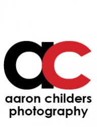
Photography Watermark/Logo. CC Please.
- Thread starter NiKeZz
- Start date
- Sort by reaction score
You are using an out of date browser. It may not display this or other websites correctly.
You should upgrade or use an alternative browser.
You should upgrade or use an alternative browser.

Well, I can give you a much better critique if you can be a bit more specific as to how you plan to use it. Is it a watermark for your photos? Website? Business card? Signage? Direct Mailers?
In general, why is everything lowercase except for the "P" in "Photography"? That's a little distracting.
I'm having trouble with the words inside of the oversized letters. They're different lengths, so you had to adjust the kerning. And now the spacing doesn't match. That really bothers me. I would suggest placing "aaron childers" below the "ac". Perhaps even some type treatment that fits the name between the two ascenders of the lowercase "h." Also consider mixing uppercase and lowercase. For example, try putting your name in all caps and photography lowercase.
Finally, the lowercase "ac" looks stretched to me, although I realize that may just be the font you used. That may not be a bad thing. You should at least try a version with perfect circles. And try differing weights. You might find that a bolder or thinner version has more impact.
Oh - one more nitpick - the kerning in the word "Photography" is a bit off - especially between the "r" and the "a."
I look forward to seeing some more iterations of this. I think with a few subtle adjustments, you'll have yourself a pretty strong mark.
Well, I can give you a much better critique if you can be a bit more specific as to how you plan to use it. Is it a watermark for your photos? Website? Business card? Signage? Direct Mailers?
In general, why is everything lowercase except for the "P" in "Photography"? That's a little distracting.
I'm having trouble with the words inside of the oversized letters. They're different lengths, so you had to adjust the kerning. And now the spacing doesn't match. That really bothers me. I would suggest placing "aaron childers" below the "ac". Perhaps even some type treatment that fits the name between the two ascenders of the lowercase "h." Also consider mixing uppercase and lowercase. For example, try putting your name in all caps and photography lowercase.
Finally, the lowercase "ac" looks stretched to me, although I realize that may just be the font you used. That may not be a bad thing. You should at least try a version with perfect circles. And try differing weights. You might find that a bolder or thinner version has more impact.
Oh - one more nitpick - the kerning in the word "Photography" is a bit off - especially between the "r" and the "a."
I look forward to seeing some more iterations of this. I think with a few subtle adjustments, you'll have yourself a pretty strong mark.
Well my first assignment from my professor for photography was to generate ideas for photography business logos and watermarks to use with our photos for the semester. The font I used I did a few adjustments to but the only spacing i messed with was to make Childers fit inside the C without making it look like the power button on the 360. I didn't mess with any kerning in the photography as its all the fonts natural face. I do understand what you mean about the P being upper case. Even i know better "Facepalm" Doh! lol Also food for thought although if i would use this for a website header or footer later on i would definitely fix the spacing of childers, but using it sized down do you think that you could notice the spacing issue?
I will try it out with a few different fonts, i already rasterized the font layers but it shouldn't be to hard to recreate them. Thanks for the help. I'll see what I can come up with today and I'll repost my final version.
I took your advice and tried to place aaron childers between the "h"'s in photography. With everything centered in grids it just doesn't look right to me. It throws everything completely off to me. But you have more knowledge of design than I do. Thoughts?

... but using it sized down do you think that you could notice the spacing issue?
Sure, if you make it smaller you won't notice some of that.
Also, my guess is that your name would not be very legible when the whole thing is shrunk down. The "ac" seems to overpower the wording quite a bit, in my opinion.
HTH,
~ Jeremy
Hi Aaron prefer your first effort there nice and clear and good colour combo ...
agree with Jeremy on your second attempt the initials over dominate
Sue
agree with Jeremy on your second attempt the initials over dominate
Sue
I couldn't get past the stretched a c.
There not stretched. Thats the original font. I edited a few things to make it unique ex. the A was pointed on the end strokes and i squared them off.
My opinion:
I'd lose the 'ac' the 'a' looks like a cropped 'd' for some reason,
I would go with something like this.

I like the way your name fits between the 'h's' but would move
it to the right just a bit. I'd use for bottom one for dark images
and top for light ones, if that makes sense.
R
I'd lose the 'ac' the 'a' looks like a cropped 'd' for some reason,
I would go with something like this.
I like the way your name fits between the 'h's' but would move
it to the right just a bit. I'd use for bottom one for dark images
and top for light ones, if that makes sense.
R
My opinion:
I'd lose the 'ac' the 'a' looks like a cropped 'd' for some reason,
I would go with something like this.
I like the way your name fits between the 'h's' but would move
it to the right just a bit. I'd use for bottom one for dark images
and top for light ones, if that makes sense.
R
I really like both of those. I just feel like there needs to be a smaller representation of the logo. Just how every business has a smaller logo of there bigger ones. Thank you for your effort and time though. Do you mind if i keep this for future reference?
Here's another option . . .
Really really like this one to. You guys are good guys for going and spending some time to help me out. I really do appreciate it.
Here's another option . . .
Immediately thought of this when I saw the AC overlapped. I'm sure you don't want to be associated with that show. haha.

Are you submitting your design to this thread for review after you turn it in or are you asking the folks in the forum to help you with your homework?
Did you do a bunch of pencil sketches to gather ideas or did you go right to the computer?
I ask the first question because I am a former teacher and like to see people put a maximum amount of personal effort into stuff.
I ask the second question because messing around on a sketch pad is one of the first steps toward a good design. You can take it with you and add ideas as they come. Then you can pick the most interesting three or five and work on them in greater detail.
Dale
Register on MacRumors! This sidebar will go away, and you'll see fewer ads.