Become a MacRumors Supporter for $50/year with no ads, ability to filter front page stories, and private forums.

Snuupy

macrumors newbie
Original poster
Jun 11, 2022
21
6
Hi Guys,

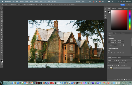
I recently installed Photoshop 2022 on my MacBook Pro M1. I cannot run it on full screen mode, there is always an open space on the top:
5F2C98B4-541E-497B-8C08-6D96EA7F78A7.jpeg


Also, when I am selecting photos, how can I enlarge the icons, because they're pretty small, and if I should merge a panorama, it's a nightmare:

6DFEA2D4-2AD8-42A6-9881-B86DEB7257DD.jpeg


For the first issue, I've tried to run the workspace in Photography mode, after that I've tried these options: https://community.adobe.com/t5/phot...l-screen-mode-f-photoshop-22-4-2/m-p/12170074 - still no result.

Could you please advise?

Thank you!

Sincerely,
Alex
 

Slartibart

macrumors 68040
Aug 19, 2020
3,140
2,815
did you try to auto hide the dock using command+option+D? Basically you need to hide it to bring up PS or Illustrator in full screen.
 
Last edited:
  • Like
Reactions: Snuupy

cupcakes2000

macrumors 601
Apr 13, 2010
4,035
5,425
Photoshop doesn’t have full screen macos style (ie, clicking the green button). You cycle full screen with the f key. You’ll see the kind of options you have there. I’m not sure what the gap in your screen shot but won’t the window just drag to fill it?

Second I normally have sorted and prepared the photos for import before hand. So the problem doesn’t exist. But if you put it in column view and resize you’ll get a bigger preview.
 
Last edited:
  • Like
Reactions: Snuupy

Snuupy

macrumors newbie
Original poster
Jun 11, 2022
21
6
Hey guys,

Thank you for the suggestions! :)

I've tried command+option+D and I've pressed the "F" button 3 times - no success. After that I realised that the gap between the photoshop and the web cam is for photoshop options, which is a drop down menu for some reason (on Windows it is a fixed menu).
F3E80D41-71C1-4825-9348-77D6CCDE69F2.jpeg


About the 2nd issue - it brought me back to Windows 7 haha.
 
Last edited:

Slartibart

macrumors 68040
Aug 19, 2020
3,140
2,815
Also, when I am selecting photos, how can I enlarge the icons, because they're pretty small, and if I should merge a panorama, it's a nightmare:

View attachment 2033854
as you are in icon view (by clicking the icon with the six little squares): from the menu bar at the top of the screen, choose View and then Show View Options. A rectangular window should appear over the opened Finder folder.

Use the Icon size slider to enlarge the icons/thumbnails to your desired size. You should see the size of the thumbnail images in the background increase/decrease as you move the slider:

macOS Finder
 

cupcakes2000

macrumors 601
Apr 13, 2010
4,035
5,425
Hey guys,

Thank you for the suggestions! :)

I've tried command+option+D and I've pressed the "F" button 3 times - no success. After that I realised that the gap between the photoshop and the web cam is for photoshop options, which is a drop down menu for some reason (on Windows it is a fixed menu). View attachment 2034265

About the 2nd issue - it brought me back to Windows 7 haha.
It’s drop down becuase that’s how you have set it in prefs. Go to mac system preferences and go to dock and menu bar, here you can choose to have it fixed or drop-down, across all normal desk tops or just full screen. Or both. Or neither.
 

cupcakes2000

macrumors 601
Apr 13, 2010
4,035
5,425
as you are in icon view (by clicking the icon with the six little squares): from the menu bar at the top of the screen, choose View and then Show View Options. A rectangular window should appear over the opened Finder folder.

Use the Icon size slider to enlarge the icons/thumbnails to your desired size. You should see the size of the thumbnail images in the background increase/decrease as you move the slider:

macOS Finder
Good point. There is also a slider at the bottom of the window isn’t there? Anyway, I had assumed he was talking from the perspective of the PS import screen, where no such options exist - hence the column view suggestion.
 
  • Like
Reactions: Snuupy

opeter

macrumors 68030
Aug 5, 2007
2,709
1,619
Slovenia

cupcakes2000

macrumors 601
Apr 13, 2010
4,035
5,425

wonderings

macrumors 6502a
Nov 19, 2021
954
947
My menus are there by default and do not drop down on my M1 Max. Latest version of Photoshop.
 

Attachments

  • Screen Shot 2022-07-25 at 7.19.48 AM.png
    Screen Shot 2022-07-25 at 7.19.48 AM.png
    2.4 MB · Views: 273

darngooddesign

macrumors P6
Jul 4, 2007
18,355
10,106
Atlanta, GA
Adobe is really inconsistent in how they have full-screen mode.

Photoshop doesn't hide the menubar.

XD hides the menu bar but doesn't use that space for the application window

Lightroom does it correctly.
 

cupcakes2000

macrumors 601
Apr 13, 2010
4,035
5,425
Try another product that is as good, if not better than the Adobe software: > https://affinity.serif.com/en-us/photo/ <
Are you just trolling any thread that mentions Adobe? It’s the third you’re in offering unsolicited ’advice’.
Adobe products are very good and some people like using them and don’t agree that AF is particularly close to desktop PS, so try and stay on topic instead.
 

TightLines

macrumors 6502
Jun 10, 2022
338
464
Are you just trolling any thread that mentions Adobe? It’s the third you’re in offering unsolicited ’advice’.
Adobe products are very good and some people like using them and don’t agree that AF is particularly close to desktop PS, so try and stay on topic instead.
Trolling? I am just offering the readers of this post and others that discuss Adobe products my opinion… why is sharing my opinion considered trolling by you, regardless of how many threads i may participate in? I don’t have a problem with you disagreeing; you or anyone else, but to label me as a troll is indicative of someone who get offended by people who just doesn’t agree with them… and therefore trys to find ways to shut them up; is that your motive and agenda with your comment?… People can form their own opinions if they have the info about something they can compare to… and me providing that information in a topic relevant thread shouldn’t be offensive to anyone; and your labeling me as a troll doesn’t and won‘t intimidate me into stopping the sharing of information…
 

TightLines

macrumors 6502
Jun 10, 2022
338
464
For all the faults Photoshop has, there is nothing close to it and this Affinity app is just cheap toy software that is barely compatible with the layered tiffs and psds that the industry uses. Stop comparing it to PS.

View attachment 2034472
Your opinion is just fine, and you are as entitled to it as i am mine, but it is incorrect to dispute my opinion by using a misrepresentation… Affinity Photo is very comparable to Adobe Photoshop and was created to compete directly against it… so much so that it can incorporate and is compatible with the same filters, plug-ins, etc… and even goes further and allows its users to save its files into a native Photoshop format. Something Adobe is seemingly incapable of reciprocating. So, no, I won’t stop as long as I think the info i share (just my opinion with a link to the product) for anyone who is interested in trying something comparable… like I mentioned in a previous post… my opinion should not offend anyone… you or anyone else.
 

cupcakes2000

macrumors 601
Apr 13, 2010
4,035
5,425
I’m pretty sure no one here is particularly ‘offended’ by what you’re saying, strange choice of words considering the subject matter.
 

ponzicoinbro

Suspended
Aug 5, 2021
1,081
2,085
Your opinion is just fine, and you are as entitled to it as i am mine,

It’s not an opinon. It’s the biggest expert opinion.

It’s not subjective. These are objective facts :

Affinity Photo is a budget app with many underperforming areas, unintuitive controls and bad file compatibility. It’s not a replacement for the most serious workflows and teams.

It is basically the new Paint Shop Pro, which was the budget app that tried to compete with Photoshop years ago.
 

Slartibart

macrumors 68040
Aug 19, 2020
3,140
2,815
It’s not an opinon. It’s the biggest expert opinion.

It’s not subjective. These are objective facts :

Affinity Photo is a budget app with many underperforming areas, unintuitive controls and bad file compatibility. It’s not a replacement for the most serious workflows and teams.

It is basically the new Paint Shop Pro, which was the budget app that tried to compete with Photoshop years ago.
Of course it is an opinion.

PS is undoubtly the industry standard, still there are things in Affinity Photo Adobe should take note of:
  • live gradients make Photoshops implementation look… well, »sad« I guess. 🤓
  • The brush system is as robust as the one of Photoshop, but what Affinity Photo additionally has are image brushes (full color)- oh, and you can can directly create brushes from a layer, no need to open a new canvas, create black&white images, et cetera et cetera…
  • And you can save your undo&processing/action history with a Affinity Photo document. Yep, @adobe - it can be done!
  • Can we agree that the filter preview in Photoshop is somewhat straight out of… I’ll be kind, say 2005?🥹 Affinity Photo does that live. Well, actually filters, layers, gradients,… all live in Affinity Photo.
Yes, Affinity Photos total action functionality is subpar to Photoshop any day of the week, but for certain applications it does indeed offer functional parity. And for a few others… it. is. better.😱😃
Many professionals seem to keep Affinity Photo for »fun« projects around - which on the other hand indicates that it can probably be a capable image processing program for many (others). Obviously YMMV.

postscriptum: dear OP @Snuupy, sorry for straying off the subject - this should be closed because the original problem was solved. And then this developing discussion about wether for a fantastic stew dish "real cooks use only Matfer Bourgeat¹ copper cookware” vs. “you can use a casserole from Le Creuset¹” should better move to a new/or different thread, shouldn’t it? 🙃

nota bene: ¹ cookware from other manufacturers IS available. 😁
 

Snuupy

macrumors newbie
Original poster
Jun 11, 2022
21
6
as you are in icon view (by clicking the icon with the six little squares): from the menu bar at the top of the screen, choose View and then Show View Options. A rectangular window should appear over the opened Finder folder.

Use the Icon size slider to enlarge the icons/thumbnails to your desired size. You should see the size of the thumbnail images in the background increase/decrease as you move the slider:

macOS Finder
I've done that a long time ago, but it is not linked to the bulk upload. Even that my thumbnail are bigger in the folders, when I am trying to upload a photo, I can see them small, hard to recognise on this 14" 4K screen. It is very annoying.

I didn't have the time to research in Google/YouTube, but tonight I will, and if I find something, I will let you guys know.

About the PS - I've used Lightroom for years, great program of course, but now I am using Luminar AI, and I am more than happy with this software, it is very easy to use, and for my purposes - editing NEFF photos - contrast/highlights/shadows/dehaze/sharpness, etc. It's much better, because it is saving me a lot of time editing photos. Of course, this is my personal opinion for my way of using it.
 
Register on MacRumors! This sidebar will go away, and you'll see fewer ads.