Note: Please read this post including my design intent and the voting rules before you vote.
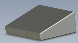
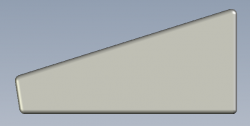
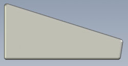
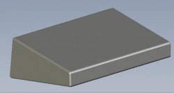
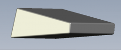
Here are some pictures of what I think the new iMac will look like (as far as its basic shape is concerned--more pictures are posted on my next post):
Isometric 1:

Right Side:

Left Side:

Front Side:

Back Side:

Voting guidelines for the following answers to the question "Do These Pictures (Posted in my First Two Posts of This Thread) Accurately Represent What You Think the New iMac Will Look Like?:
- Totally - This answer means that you think that the iMac will have the same basic shape that are represented in the models that I posted.
- Mostly - This answer means that you think that the iMac will look mostly like what the designs that I posted look like. (Possible reasons why you might choose this answer)
- Somewhat - This answer means that the iMac models that I posted barely look like what you had in mind.
- Not Really - This answer means that you had quite a different design in mind for what the new iMac will look like compared to the pictures that I posted.
- Not At All - The answer means that you think the iMac will look almost nothing like the model in my pictures that I posted.
Here is my design intent:
- I made a model of a touch screen iMac.
- I sloped the iMac at the angle of a common keyboard and left room for a keyboard to be placed in front of it. This angle makes it easier on the neck than looking at a piece of paper on a flat desk or table and also makes it easy for drawing with a stylus (and yes a stylus would be optional since Apple has perfected and patented fingered touch screen accuracy with their iPhone)--a lot of drawing boards are also angled up which makes the angled iMac a great all around design. The main reason for not having the screen vertical is because it would be hard on the arms and making it angled would be a lot easier for using it for many hours.
- I made the dimensions of the screen similar to (but not quite perfectly to scale) what a standard monitor's physical screen size would be.
- I filleted the edges so that they would be rounded for comfortable usage and so that the corners wouldn't be potential cutting hazards if they were to be accidentally cut into.
- (I may post another design model with the keyboard built-in to the front of the computer. That design might look better and function better anyway. The only reason that I left it off is because I thought the keyboard might get in the way but since I am now thinking about it again--the keyboard built-in will probably be better because the keyboard is needed so often and an on-screen keyboard would only get in the way (i.e. it would take up screen space) of other things that could be on the screen--and plus an onscreen keyboard is a lot harder to use. Apple has been gradually integrating an all-in-one iMac design and adding the keyboard to that all-in-one integration would be a good move for Apple. That design would make the computer all the more mobile. The only thing missing from the integration would be the mouse (and the power source ).)
).)
I made these models in the 3D rendering program named SolidWorks.
And of course feel free to post your own pictures and comments regarding what you think the new iMac will look like.
(This current thread is a continuation of this other thread.)
Here are some pictures of what I think the new iMac will look like (as far as its basic shape is concerned--more pictures are posted on my next post):
Isometric 1:
Right Side:
Left Side:
Front Side:
Back Side:
Voting guidelines for the following answers to the question "Do These Pictures (Posted in my First Two Posts of This Thread) Accurately Represent What You Think the New iMac Will Look Like?:
- Totally - This answer means that you think that the iMac will have the same basic shape that are represented in the models that I posted.
- Mostly - This answer means that you think that the iMac will look mostly like what the designs that I posted look like. (Possible reasons why you might choose this answer)
- Somewhat - This answer means that the iMac models that I posted barely look like what you had in mind.
- Not Really - This answer means that you had quite a different design in mind for what the new iMac will look like compared to the pictures that I posted.
- Not At All - The answer means that you think the iMac will look almost nothing like the model in my pictures that I posted.
Here is my design intent:
- I made a model of a touch screen iMac.
- I sloped the iMac at the angle of a common keyboard and left room for a keyboard to be placed in front of it. This angle makes it easier on the neck than looking at a piece of paper on a flat desk or table and also makes it easy for drawing with a stylus (and yes a stylus would be optional since Apple has perfected and patented fingered touch screen accuracy with their iPhone)--a lot of drawing boards are also angled up which makes the angled iMac a great all around design. The main reason for not having the screen vertical is because it would be hard on the arms and making it angled would be a lot easier for using it for many hours.
- I made the dimensions of the screen similar to (but not quite perfectly to scale) what a standard monitor's physical screen size would be.
- I filleted the edges so that they would be rounded for comfortable usage and so that the corners wouldn't be potential cutting hazards if they were to be accidentally cut into.
- (I may post another design model with the keyboard built-in to the front of the computer. That design might look better and function better anyway. The only reason that I left it off is because I thought the keyboard might get in the way but since I am now thinking about it again--the keyboard built-in will probably be better because the keyboard is needed so often and an on-screen keyboard would only get in the way (i.e. it would take up screen space) of other things that could be on the screen--and plus an onscreen keyboard is a lot harder to use. Apple has been gradually integrating an all-in-one iMac design and adding the keyboard to that all-in-one integration would be a good move for Apple. That design would make the computer all the more mobile. The only thing missing from the integration would be the mouse (and the power source
I made these models in the 3D rendering program named SolidWorks.
And of course feel free to post your own pictures and comments regarding what you think the new iMac will look like.
(This current thread is a continuation of this other thread.)


