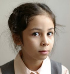
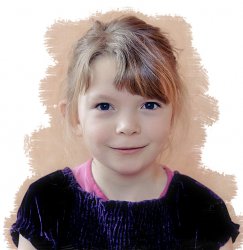
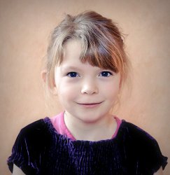
Here are four portraits I took of my husband's granddaughter. I'd love to have some input on how future portraits could be done better.
The lighting was natural daylight, on a cloudy day. One window let light in from the subject's right, another from in front (falling on her face). The background is just the wallpaper - slightly pink/peach and textured. I see already that I ought to have placed her where there was no seam.
The first, second and fourth have lowered saturation and increased sharpening. I've also increased highlights (her skin is so light and translucent, it was hard to get any definition). The third I've allowed to be a bit more vibrant; the color of her eyes and dress are not completely accurate here, but it made for a more intense result.
The two first have this info:
1/60 @ f/3.5, 46 mm, ISO 400. The second two have the same, except for 1/50. I used a Canon 350D with a Canon 28-80 L 2.8-4. I used this lens because it is my "best" lens, but was it the best lens for the job? I also have the Canon 50 mm 1/8 II, ought I to have used that?
She is a charmer, loves to be in front of the camera, and is a delight to photograph.")


The lighting was natural daylight, on a cloudy day. One window let light in from the subject's right, another from in front (falling on her face). The background is just the wallpaper - slightly pink/peach and textured. I see already that I ought to have placed her where there was no seam.
The first, second and fourth have lowered saturation and increased sharpening. I've also increased highlights (her skin is so light and translucent, it was hard to get any definition). The third I've allowed to be a bit more vibrant; the color of her eyes and dress are not completely accurate here, but it made for a more intense result.
The two first have this info:
1/60 @ f/3.5, 46 mm, ISO 400. The second two have the same, except for 1/50. I used a Canon 350D with a Canon 28-80 L 2.8-4. I used this lens because it is my "best" lens, but was it the best lens for the job? I also have the Canon 50 mm 1/8 II, ought I to have used that?
She is a charmer, loves to be in front of the camera, and is a delight to photograph.