Become a MacRumors Supporter for $50/year with no ads, ability to filter front page stories, and private forums.

craig1410

macrumors 65816
Original poster
Mar 22, 2007
1,130
911
Scotland
Hi,

I've just started my own IT Consultancy company called Agile Domain Limited and have been attempting to create a workable logo which will allow me to get some business cards printed as well as forming the header on my invoices and website and other things.

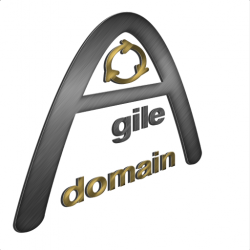
I'm by no stretch of the imagination a designer or artist so I need a reality check to see if what I have created is "good enough", "bad" or "really bad"... I have thick skin so please be honest even if it might sting a bit. Constructive criticism especially welcome if you have suggestions on how I can improve it. I use Pixelmator on the Mac but am really a beginner so this might be as good as I can manage. This is the 512x512 image but I actually created it at 1024x1024.

Note, Agile refers to IT specific methodologies but also general flexibility. Domain simply means "area of expertise" or "territory" according to the dictionary and also has IT connotations. It was the best I could manage at 2 days notice. I didn't want to dwell too much on a company name when I have a client keen to give me money...

Thanks in advance for your time,
Craig.
 

Attachments

  • AgileDomainLogo512x512.png
    AgileDomainLogo512x512.png
    121.7 KB · Views: 169
IMO ... you should add an A to gile so that it reads Agile inside of the Big A

Yes that's something I'm wrestling with a bit in my own mind. I originally had an A in there but my wife suggested removing it and I agreed at the time but I'm not sure... I tried moving the gile to the right to help to place it "after" the big "A" but it just leaves an ominous space to the left.

I suppose I could replace the little infinite loop with a capital D letter with arrows to show that it represents the idea of "iterating" which is important to Agile development. Then I would have a big letter "A" and a smaller letter "D" with agile domain in lowercase text below. If I keep the gold colour for the capital D and the word "domain" and similarly keep the brushed stainless colour for the big "A" and word "agile" it would be consistent.

I see someone else posted that they thought it was "gile domain" which is something that worries me.

Thanks guys, I think you are both right but I'll wait for other opinions before I act. It's after 1am here so I'll probably leave it until I've had some sleep and have a clearer mind too. ;)
 
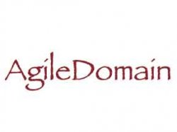
sometimes just a font can help you create a business identity
 

Attachments

  • Untitled-1.jpg
    Untitled-1.jpg
    3.7 KB · Views: 1,071
To be honest, it's pretty bad. I know that's not what you want to hear, but with some exposure to really great design, your own work will definitely start to improve. There's a website called Brand New (http://www.underconsideration.com/brandnew/) that has great commentary and analysis. They post just about every weekday, so there's always fresh stuff to learn. I hope this helps!

Edit: Also, it's worth mentioning that learning how to design well takes years. If you're really pressed for time, I would suggest looking for a professional graphic designer. Believe me, it will be a night and day difference.
 
Enough already.

Just bite the bullet and pay a professional, nothing will devalue your business more than an amateur looking logo and identity.
 
sometimes just a font can help you create a business identity
Although I am not sure Papyrus is the one to go for here. :p

To be honest, it's pretty bad. I know that's not what you want to hear, but with some exposure to really great design, your own work will definitely start to improve. There's a website called Brand New (http://www.underconsideration.com/brandnew/) that has great commentary and analysis. They post just about every weekday, so there's always fresh stuff to learn. I hope this helps!

Edit: Also, it's worth mentioning that learning how to design well takes years. If you're really pressed for time, I would suggest looking for a professional graphic designer. Believe me, it will be a night and day difference.
I'd second that.

Just bite the bullet and pay a professional, nothing will devalue your business more than an amateur looking logo and identity.
True.

I count myself as someone who is on reasonably good terms with good design and I might even churn out a decent "place holder" now and then.
But at the end of the day I go to the professionals.
You will be far better off getting a professional graphic designer to design you a logo.
Your business will thank you. :)
 
@Apple OC, I thought Comic Sans would have been a better choice :cool:

A professional business should look professional, the logo just doesn't say professional IMHO.

I'd have to say you've made the 8 common mistakes:
1) Wrong font choice
2) It's not a vector
3) Relies too much on effect
4) It's amateurish
5) Overly complex for readability
6) Relies too much on trends
7) No process in the design
8) Your logo is for your audience, it's not designed for yourself rather it's designed for the business.

I've designed many a brand strategy, the main thing is that you need to set a process, this will in effect give you the direction for the art. I can see you've just jumped into what most designer refer to as tooling, that is having the software and just designing without a strategy.

Research, reflected and refine, that would be the best advice I can give you as an art director of ten years experience. You need to work out what and how the category you're in trends art wise, reflect on why they have chosen the fonts/colours/styles and how they are implemented, then you can refine your design (pref. a sketch) then put it in your category to see if it blends or pops then start again.

Last corporate identity I was involved in developing took 4 weeks and tonnes of revisions, the end result was a simple timeless logo that looks great at any size. I have yet to see a brilliant logo knocked out in Photoshop in an afternoon.

I'd also suggest the best logo follow the following aspects:
1) Simple
2) Memorable
3) Timeless
4) Versatile
5) Appropriate

More info I'd strongly suggest checking Smashing if your keen to design it yourself.
 
Just bite the bullet and pay a professional, nothing will devalue your business more than an amateur looking logo and identity.

+1

There are a lot of things going on with this logo. As the above poster stated, the logo is not for you, it is for your business. Also, he is right about the effects heaviness. As you stated, you have no formal training in design so you wouldn't know where to start, nor what constitutes bad design.

If your set on creating your own logo then I would research what makes good design (or bad design and do the opposite :rolleyes:) and start in black and white. If it doesn't work in black and white, it doesn't work most of the time. Unfortunately the logo is an example of bad design and it does show that you have no training in this aspect.

If I were you I would hire a designer. You might even be able to trade services or barter since we are all in the electronics and technical fields.

Good luck none-the-less! :D

EDIT: BTW, what is the significance of the recycle looking symbol? It looks like you just tried to throw in a symbol to fill up space. Just wondering...
 
I'm by no stretch of the imagination a designer or artist so I need a reality check to see if what I have created is "good enough", "bad" or "really bad"... I have thick skin so please be honest even if it might sting a bit.


Sorry Craig... no offense, but I'm going with the "really bad" choice you offered.

It takes years to learn how to do great design. Your design proves it.

The best way to fix it, is to delete it off your hard drive and call a professional. That is, if you care about your business. If you can't afford a designer then just stick with a classic type face and call it a day. Once you start generating some cash flow, hire a designer or an agency to brand your business.
 
Hi guys,

Just a quick note to thank you all for your feedback. To be honest I'm not surprised at the general gist as I had some serious doubts myself. I just wanted to gauge reaction to see if my instincts were right.

I actually liked the simple font based logo which one of you put forward, it looked really nice but. Think i need a shape based logo too to cover off the possibility of requiring an icon in future for iOS or similar development.

Someone said my little circle with arrows looks like a recycling image. I never thought of that, it was supposed to represent "iteration" which is important in agile development.

One thing I do realise now is that logo and identity is a tough thing to nail down. There are so many variables such as font, colour, shape, texture and the actual content. Bringing that all together is not easy. It's easy to recognise a good design but really tough to create one.

Time to take a step back I think and maybe start with the message, identity and image and them start to translate that into design.

Thanks again to all, especially those who gave me the hard truth between the eyes. Just what I needed I think. ;)

Take care and have a good festive season all,
Craig.
 
One thing I do realise now is that logo and identity is a tough thing to nail down. There are so many variables such as font, colour, shape, texture and the actual content. Bringing that all together is not easy. It's easy to recognise a good design but really tough to create one..

I might print this out and hang it in my studio. Brings a tear to my eye.
 
Wow. A lot of unneccessary bashing for a simple request for constructive criticism.

Here's what I like:

I like the big sweepyness of the A, and I like that you have established it as an object in a 3D world by angling it away from the viewer. It is clean and refreshing in that regard. Keep that aspect. You might accent that by putting a line of text below and to the right that is oriented towards the viewer directly and normally. To really establish the logo as a 3D object place just the hint of a soft shadow under the logo as if it is hovering just off the ground (not a drop shadow, more like two subtle fuzzy light grey ovals, one under each "leg" of the A).

But otherwise I would go back to the beginning and rethink the name. New viewers will not understand the significance of "agile" or "domain" in the context you imagine them. It is confusing to them, and therefore intimidating. The reason "MacBook" works as a name is because it is simple and instantly intuitively understandable; seeing that name for the first time you know it will be an Apple laptop even before you ever see it, just from two simple sylables. That makes it inviting and adds a subtle undercurrent of subliminal anticipation and suspense, which makes it exciting. "Agile domain" does nothing like that; it's very blah and non-intuitive.

Think what the question "have you seen the new MacBook?" does to someone who has never heard the term "MacBook". They immediately think "what could that be?" as images of an Apple laptop appear in their mind. Now consider the question "Have you heard of Agile Domain?" The mental response to that will be "WTF is that and why should I even care?"

I agree, the recyle logo has to go; it is also confusing. Try a stylized "AD" if you must have something in that vein and get it outside of the A. Not having the A in "Agile" is also very confusing. You want it to hammer home the name immediately; you don't want folks to wonder about it or work too hard to understand it. The large first letter has a narrow place in publishing, but probably not in a logo.

I understand the attempt af freshness by not capitalizing "domain", but I think it needs to be.

You have mixed fonts; the A does not match the rest. This is important. It can be different, but it must not look "unrelated" to the other lettering.

Two glinty metals? One is probably better. Actually, none is probably even better; glinty metal went out about 1985. The glinty aspect is actually counter-productive to the readability of the words, and counter-productive is not the image you want to cultivate. I would try something that simulates red or blue lucite plastic; use a single hard line for a reflected horizon (inside the letters only) and then lower the contrast and raise the luminance level for the part above the horizon, to simulated reflected room light. Or, you could add point-source reflections in the edges of the letters to make the material seem to have smooth rounded edges (if placed properly).

If you must have glinty metal, try more subtlety; overdoing glinty reflections is a classic rookie mistake; you want it to look like glinty metal, not an attempt at glinty metal that does not reflect what that would actually look like in the real world.

And there is something off about the shading on the A. If done properly I would mostly like the gun-metal grey choice, but it is not consistent; if you look at the left "leg" it appears mostly flat (and looks pretty good), but the right "leg" appears much more tubular.

But you have imagination and appear motivated. Keep trying. Or pay a pro.
 
Last edited:
Hi guys,

I actually liked the simple font based logo which one of you put forward, it looked really nice but. Think i need a shape based logo too to cover off the possibility of requiring an icon in future for iOS or similar development.

Just a warning, but I think Apple OC was probably joking with that text-only version. Papyrus is one of those "no-no" fonts in design. It's for soccer moms who want to pretty-up a Christmas letter.
 
Hire a professional

As a professional photographer and graphic designer...
I'm sorry to say but that's really bad.
Actually, quite bad.

I would scrap the whole thing, but if not at least loose the angled effect and the faux finish. Next on the list would be to change the font used and the shape of the whole piece more or less. It has no overall "graphic feel" and is not refined/ simple enough. It doesn't have a solid shape. Think of the best brands and logos —  Apple - of course being one of the very best. The Nike wordmark, or more so, their swoosh. Logotype can work well, IBM, Coca-Cola, GAP, Facebook etc, but it has to be as simple as possible and distinct.

Take a look at some professional's sites or design blogs and I think you will realize why you should hire a professional or an agency.

for example:
http://www.graphic-exchange.com/home.html

And to whoever posted Papayas as a suggestion, you may as well have gone with Comic Sans, designers love to make fun of two fonts and that's sure one of them.

Short answer, hire a professional.
 
Last edited:
Wow. A lot of unneccessary bashing for a simple request for constructive criticism.

Here's what I like:

I like the big sweepyness of the A, and I like that you have established it as an object in a 3D world by angling it away from the viewer. It is clean and refreshing in that regard. Keep that aspect. You might accent that by putting a line of text below and to the right that is oriented towards the viewer directly and normally. To really establish the logo as a 3D object place just the hint of a soft shadow under the logo as if it is hovering just off the ground (not a drop shadow, more like two subtle fuzzy light grey ovals, one under each "leg" of the A).
Thanks! Appreciated.
But otherwise I would go back to the beginning and rethink the name. New viewers will not understand the significance of "agile" or "domain" in the context you imagine them. It is confusing to them, and therefore intimidating.
I've already chosen my company name and incorporated under that name and am 100% happy with it. In my field, this name will make sense and even outside my field, if you look both words up in the dictionary it still makes sense. I respect your opinion though but just don't agree. Sorry. :)
The reason "MacBook" works as a name is because it is simple and instantly intuitively understandable; seeing that name for the first time you know it will be an Apple laptop even before you ever see it, just from two simple sylables. That makes it inviting and adds a subtle undercurrent of subliminal anticipation and suspense, which makes it exciting. "Agile domain" does nothing like that; it's very blah and non-intuitive.

Think what the question "have you seen the new MacBook?" does to someone who has never heard the term "MacBook". They immediately think "what could that be?" as images of an Apple laptop appear in their mind. Now consider the question "Have you heard of Agile Domain?" The mental response to that will be "WTF is that and why should I even care?"
I'm not selling to Joe Bloggs - I'm selling to fellow IT professionals who will undoubtedly know what Agile is and why it is important. Domain simply means "area of expertise". In a similar vain, WTF does Apple actually mean? Not much.
I agree, the recyle logo has to go; it is also confusing. Try a stylized "AD" if you must have something in that vein and get it outside of the A. Not having the A in "Agile" is also very confusing. You want it to hammer home the name immediately; you don't want folks to wonder about it or work too hard to understand it. The large first letter has a narrow place in publishing, but probably not in a logo.
Agreed!
I understand the attempt af freshness by not capitalizing "domain", but I think it needs to be.
I prefer lower case as it reinforces the website address and as you say, looks more stylish. I'll think about this though.
You have mixed fonts; the A does not match the rest. This is important. It can be different, but it must not look "unrelated" to the other lettering.
The A was drawn freehand, it isn't a font per se. The rest is helvetica which I like a lot.
Two glinty metals? One is probably better. Actually, none is probably even better; glinty metal went out about 1985.
Ssh - don't tell Apple... A bit of an exaggeration I think but I agree it's perhaps past its best.
The glinty aspect is actually counter-productive to the readability of the words, and counter-productive is not the image you want to cultivate. I would try something that simulates red or blue lucite plastic; use a single hard line for a reflected horizon (inside the letters only) and then lower the contrast and raise the luminance level for the part above the horizon, to simulated reflected room light. Or, you could add point-source reflections in the edges of the letters to make the material seem to have smooth rounded edges (if placed properly).
Some good ideas there. I note that Apple have a single hard line across their banner to provide highlight. Looks good.
If you must have glinty metal, try more subtlety; overdoing glinty reflections is a classic rookie mistake; you want it to look like glinty metal, not an attempt at glinty metal that does not reflect what that would actually look like in the real world.
Not sure what you are referring to as "glinty". I'm just using brushed metal effect with some gradient to show some curvature. It's actually quite matt I'd say. It's not like it's chrome effect or anything like that.
And there is something off about the shading on the A. If done properly I would mostly like the gun-metal grey choice, but it is not consistent; if you look at the left "leg" it appears mostly flat (and looks pretty good), but the right "leg" appears much more tubular.
Agreed, I'm just not clever enough with Pixelmator yet to get that bit right. It seems to be caused by the perspective distortion I applied.
But you have imagination and appear motivated. Keep trying. Or pay a pro.

Paying a Pro isn't an option I'm afraid but it just so happens that I'm now sitting next to a guy at my new job who used to work for Bernie Ecclestone on the Formula 1 branding and is a dab hand with Photoshop, especially for logo design and other graphic effects. He's offered to help me out. Of course, if he does a good job then I'll be happy to pay some money once I've actually got some in the bank but for now I can't make any promises. To be honest I think paying a Pro is probably the easy way out but not necessarily the best. By going through this I believe I am developing a better appreciation of the creation process which will help me arrive at a better result once I can afford a Pro. I certainly wouldn't turn the creation of my business identity over to someone unless I was sure that they understood what message I was trying to convey. The more knowledge overlap the better.

Anyway, thanks to all who have provided advise, criticism and encouragement. It is all valued rest assured.
Craig.
 
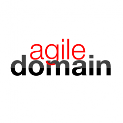
I like to start out by thinking at a very shallow level what I picture when I hear the name. Something light and smooth from the agile, yet maybe contained or complimented by something more heavy and concrete from the domain (I just imagine domain as a strong, solid word). If you don't want to hire a pro designer, maybe just a nice, clean sans-serif font like Helvetica Neue light/ultralight for "agile" next to the same font in regular or bold next to it for "domain."
 
I like to start out by thinking at a very shallow level what I picture when I hear the name. Something light and smooth from the agile, yet maybe contained or complimented by something more heavy and concrete from the domain (I just imagine domain as a strong, solid word). If you don't want to hire a pro designer, maybe just a nice, clean sans-serif font like Helvetica Neue light/ultralight for "agile" next to the same font in regular or bold next to it for "domain."

Okay, I think I understand. How about this?
Reminds me a bit of the Oracle branding.

I quite enjoy this by the way. A bit different to my usual work.
 

Attachments

  • SimpleLogo512.png
    SimpleLogo512.png
    21.3 KB · Views: 100
Register on MacRumors! This sidebar will go away, and you'll see fewer ads.