Become a MacRumors Supporter for $50/year with no ads, ability to filter front page stories, and private forums.

dornoforpyros

macrumors 68040
Original poster
Oct 19, 2004
3,070
4
Calgary, AB
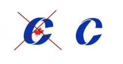
On thing that has always bugged me and gives me a headache every time I see it is the conservative party of Canada's logo, they've got this wierd twisted C thing going on that does not make sence. See the graphic below to see what I mean, pardon my shoddy 5 minute illustrator job.

Anyone else agree with me that their current C just hurts your head? The logo on the left is the current logo, the one on the right is how it "should" appear.
 

Attachments

  • conservative_logo.jpg
    conservative_logo.jpg
    6.6 KB · Views: 195
I like the left logo. It's sort of like a moebius strip therefore signifying continuity. The logo on the right looks too literal.
 
I see what you mean, after awhile the logo on the left begins to do my nut in. Wonder if it was intentional to have the C in that style?
 
Heb1228 said:
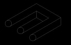
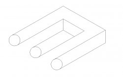
I love that drawing! I used to draw it all the time back in elementary school when I was bored. Yeah, I know I'm weird.
I know it from MAD Magazine, where they've always called it a poiuyt, which you get by typing letters from right-to-left across the keyboard.

My point in posting it is that I think the logo is purposely an optical illusion.
 
here you go . . .
 

Attachments

  • Drawing2.JPG
    Drawing2.JPG
    61.5 KB · Views: 203
  • Drawing3.JPG
    Drawing3.JPG
    61.4 KB · Views: 173
ha

or you could just picture the C as a ribbon that is flowing towards you instead of a loop

... wait I know how to fix it:
 

Attachments

  • liberal_logo.gif
    liberal_logo.gif
    3.1 KB · Views: 1,691
dornoforpyros said:
On thing that has always bugged me and gives me a headache every time I see it is the conservative party of Canada's logo, they've got this wierd twisted C thing going on that does not make sence. See the graphic below to see what I mean, pardon my shoddy 5 minute illustrator job.

Anyone else agree with me that their current C just hurts your head? The logo on the left is the current logo, the one on the right is how it "should" appear.

Don't touch my logo ...


peace | neut
 
I don't understand. It was obiously made that way for a reason. The one on the right is lame.
 
decksnap said:
I don't understand. It was obiously made that way for a reason. The one on the right is lame.

well I'm really not sure why this thread has been resurected after 3-4 months but my original post was because it was during the Canadian election and every time I looked at this twisted C it looked wrong. Yes now I can see it as a ribbon coming towards me and my brain no longer hurts looking at it.

Having said that there is still some wierd opitical illusion happening with it that doesn't register in most peoples brains the intended way.
 
Register on MacRumors! This sidebar will go away, and you'll see fewer ads.