Become a MacRumors Supporter for $50/year with no ads, ability to filter front page stories, and private forums.

DirtySocks85

macrumors 65816
Original poster
Mar 12, 2009
1,441
82
Wichita, KS
Ok fellow photographers, I've spent much of the evening working on my first serious attempt at a composite image of moving a subject to a different background. The biggest reason here is that I was trying to "save" a shot that I liked, but I overexposed to disastrous consequences. Even after fixing it in Aperture as much as possible, I was left with an ugly overexposed red car in the background that I couldn't do a thing about. So I decided to cut my model out from her background and plop her into another photo of mine that would be more fitting for her anyway.

So, here's the photo I wanted to "save":


And here's the background I found for her in my archive:


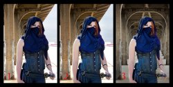
And here's the composite I came up with:


I don't think it's too bad for a first attempt, but I also know that I could probably improve it. Does anyone have any tips or advice on how I could improve on the image?
 
What software are you using? I've tried things like this with the OnOne Perfect Photo suit with mixed results. I think you have done a good job, but I think it is almost impossible to do something like this and for it to look completely natural. Especially to you as you are the one who knows it a cut and paste job. We are always our worst critique IMO.
Also it looks like the lighting is on her left, but in the scene on the right.

Aperture to edit each of the original images in RAW and then export those as jpgs that I imported into Photoshop CS5 (perk of a former job that I just happen to still have installed :)).

Yeah, I saw the lighting thing, I tried to add a lighting filter to the background layer to help even it out. I know that technically that might have been better if I hadn't flipped the background image, but the mirrored background made for a much more aesthetically pleasing layout. The other way around just felt unbalanced.
 
The number one thing you have to do is make sure the light comes from the same angle in both the foreground and background

Next make sure it is the same kind of light. You can't mix blue noon time foreground with a reddish sunset color background.

Finally DOn't export jpg files from Aperture to PS. Use TIFF. Better you can specify PS as the "default editor" in Aperures preference panel. Then the export to hidden, Aplerture launches PS and transfers the files as a TIFF image then it gets pulled back when you quit PS.

Over all it looks good and I agree the background did need to be flipped for composition. But it looks like she is standing in front of a one of those studio background sheets

Buy a big green screen canvas. Shoot the subject in controlled lighting. You have to pick the background FIRST and then copy it's light when you shoot
 
Buy a big green screen canvas. Shoot the subject in controlled lighting. You have to pick the background FIRST and then copy it's light when you shoot

Ideally I would have gotten it right in camera to start with. I wasn't really trying to get this composite image when I shot it, but this was at a Renaissance Festival, and this young lady was kind enough to pose for me, so.. it is what it is.


As far as the lighting/white balance goes, do you think that the girl needs to be warmed/the background cooled?

----------

Ok, so I went in and adjusted the white balance a little on the background layer. BIG DIFFERENCE making that a touch cooler. Which is odd, because I thought I shot both of these in similar lighting conditions.

Anyway, here's the first version again for ease of comparison:


And here's the "new" version where I cooled the background layer a bit:


EDIT: I just did one more version where I warmed her just a touch in addition to cooling the background as above. Really pulls it together quite a bit. Thoughts on the latest version?
 
Last edited:
I was going to give it a try but unfortunately your pics are private on flickr, and the resolution you've posted here is unlikely to yield the best results. Good luck though.
 
What software are you using? I've tried things like this with the OnOne Perfect Photo suit with mixed results. I think you have done a good job, but I think it is almost impossible to do something like this and for it to look completely natural. Especially to you as you are the one who knows it a cut and paste job. We are always our worst critique IMO.
Also it looks like the lighting is on her left, but in the scene on the right.

Do you find OnOne kinda clunky and slow?
 
I was going to give it a try but unfortunately your pics are private on flickr, and the resolution you've posted here is unlikely to yield the best results. Good luck though.

I appreciate it. I was however more looking for technical advice rather than to have someone else give it a shot for me. I mean, if you really want I can post the PSD file here, or the original RAW files for each image (but if I go that route you're going to have to do the painstaking process of cutting her out again). As was already pointed out to me, I made the mistake of exporting to jpg first, and to be honest I'm just not that into this photo right now to spend an hour with the magnetic lasso and quick mask tools to cut her out again in a TIFF.
 
The big issue is that the lighting angles don't match. The highlight is on our left on your model (especially the arm) and on our right when looking at the background. I can't get see past that mismatch. In daylight we assume that the light is consistent.

However, at nighttime we are used to lighting mismatches since we are 'know' that a scene is usually light by several sources. So... try making this a night time scene.

Make the background very dark, and blue it up... then it's moonlit. And because of the highlights coming from our right. Warm her up a bit and add a bit of warm light spilling onto the front of the post behind her. Then we will assume she is being lit by a street light to our left. Plus her outfit actually fits night time better than daylight in terms of mood, imo.

Luck
 
Have you tried flipping the model around horizontally like you did the background?

Also, add a little gaussian blur to the background and see how that works.
 
Have you tried flipping the model around horizontally like you did the background?

Also, add a little gaussian blur to the background and see how that works.

Wouldn't that just make the same exact composition as if I hadn't flipped the background in the first place?

And I hear what everyone is saying (maybe I need to find, or go shoot a different background image for this subject), but I just can't see the light direction being that pronounced in the background image. For me it looks pretty well diffused and omnipresent. I understand that light has to come from a direction, but in this case it doesn't even seem to be casting any shadows. Maybe if I darkened the right edge of the columns with a burn tool, would that change anything (for the better)?
 
You really need to add in some fake DoF by blurring the background.

I also like to Select all pixels on the girl layer, contract the selection by 1 to 3 pixels depending on the image size, invert the selection and then apply a small Gaussian blur. It just softens the edges and helps blend everything together.

Otherwise You just need to play with levels and curves to match up the lighting a little better.
 
Ok, great suggestions everyone. I've made a few adjustments based on your feedback.

snberk103/filmbufs: I did a horizontal flip (again) on the background to get the lighting to match. I thought that I "needed" her the other way from a compositional standpoint. I can see now that making the lighting believable is clearly more important to making this work. Thanks for helping me see that.

Kissaragi: Did a small Gaussian Blur on the background layer to add the impression of DOF. I also did a slight smooth/feather on her edges to help bring it all together a bit more.

Thoughts on the latest version?

 
The subject's white balance is on the cool side. You shot her in the shade, but it looks like your camera's WB was probably still on sunlight. Her skin looks a bit magenta as well. Adjust your white balance in the raw converter before exporting to photoshop - seeing as you're going to remove the background, ignore that & focus on the white balance of the subject.

On your first attempt, you warmed up the background but not your subject, which personally I don't think looked right. Your second attempt is MUCH better, however I still think the right hand side of the background is FAR too bright and the subject too dark.

The first thing the viewer sees is the subject's eyes, which is exactly what you want. But because her clothing is so dark, my eye then starts to wander off to the brightest part of the scene (the blown-out road next to her left elbow).

Instead, you need to keep the viewer's attention on the subject. To do this, lighten the blues so we can see all the detail in the mask covering her face and can see more contrast in her clothing. You can also use a vignette to draw attention towards the centre of the frame.

Personally I don't like the framing of the 3rd version. Because her eyes are looking back towards the left of the frame, I think it works better when you have her on the right hand side, looking into the image.

Overall, I'm not sure that this background is right for this composite. Think about where you would expect to see this character? Perhaps a dark corridor, or a shadowy backstreet at night.Try to find a background that really suits the foreground subject.

Personally, I'd also lighten the part of her face we can see. Humans are naturally drawn to eyes, but also to contrast - if you lighten that area it'll help really pull your viewer in. I'd also crank up the saturation on her shock of red hair - it adds beautiful contrast to the blue mask.

As others have said, the light is coming from the wrong place - the background you choose needs to be lit from the back top-left of the frame. This will explain the rim light around the back of her head & shoulder.

Really hope some of these pointers help. Keep up the good work!

Iain
 
Further to my last post, here's a quick example:

Image 1 is your original shot (the second edit).

In image 2 I've lightened the blues to show more detail in her clothing, brightened her red hair, and darkened the background to try & keep attention on the subject.

In image 3 I copied your empty background & flipped it to make a tunnel / corridor. I haven't changed the subject at all from image 2, but because the background is darker on all sides of her, it really helps keep the viewers attention on the subject.

Please bear in mind that I have dramatically over-cooked the edits in this shot to help highlight what I described. I really hope you don't mind me borrowing the image you posted here to provide some feedback.

Also, forgive the shoddy work on the cutout & background comp. It was just a quick job as an example.

Hope that helps.

Iain
 

Attachments

  • 3ninjas.jpg
    3ninjas.jpg
    672.5 KB · Views: 94
Further to my last post, here's a quick example:

Image 1 is your original shot (the second edit).

In image 2 I've lightened the blues to show more detail in her clothing, brightened her red hair, and darkened the background to try & keep attention on the subject.

In image 3 I copied your empty background & flipped it to make a tunnel / corridor. I haven't changed the subject at all from image 2, but because the background is darker on all sides of her, it really helps keep the viewers attention on the subject.

Please bear in mind that I have dramatically over-cooked the edits in this shot to help highlight what I described. I really hope you don't mind me borrowing the image you posted here to provide some feedback.

Also, forgive the shoddy work on the cutout & background comp. It was just a quick job as an example.

Hope that helps.

Iain


I never thought about doubling the arch! Brilliant!
 
Register on MacRumors! This sidebar will go away, and you'll see fewer ads.