Become a MacRumors Supporter for $50/year with no ads, ability to filter front page stories, and private forums.
S

-SOn-

Guest
Original poster
Hi guys, I recently used a new template for blogger. My blog add is http://sonying.blogspot.com

Everything looks good and all in 1024 x 768 with Internet Explorer, but when changed to a different resolution, the whole content goes to the left. I think it has something to do with fluid or fixed layout but I'm not sure.

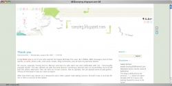
And also, my header is not properly fixed (you can view the image to get a better idea) so I edited it to properly fit the 1024 x 768 screen.

Please, please take a look at my CSS file (available using view source) and teach me how to fix it. Clear instructions would be very much appreciated. Thanks a lot in advance.

-SOn-
 
Tip: A good start is to make sure your page validates before applying styles.


1)

Change this

HTML:
<div id="logov">

<div id="logov">

<img src="http://img404.imageshack.us/img404/87/v4ban1blurio7.png" border="0"/>
</div>


to this:

HTML:
<div id="logov">
<img src="http://img404.imageshack.us/img404/87/v4ban1blurio7.png" border="0"/>
</div>

2)


3)

Change these styles

Code:
#wrapper {
	width: 870px;
	overflow: hidden;
	position: relative;
	margin: 0 auto;
}


#content {
	position: relative;
	width: 600px;
	text-align: left;
	float: left;
	background-color: transparent;
}


#logov { 
	height: 240px;
	width: 870px;
	padding-left: 20px;
	margin: 0 auto;
}


4) Add this Style

Code:
#logov img {
	margin-left: -57px;
}


5) This will clear up most of the problems in Safari and FF, can't test on IE as I don't have it, but it's a start.

Also, why is you min-nav in the <head>?

It should be in the body.
 
hi elppa, thx for ur reply.

I've changed no.1 as per your advice.

As to no. 3) , I'm really not sure as to how to change the styles to fix the problem. I'm not really good with these codes and how they function.

I've also added no.4) as per your advice.


And the reason I have the mini-nav in the <head> is because I want the three icons ( the three clickable ones stacked vertically on the upper right hand side of the page ) positioned at where they are. If I put them in the <body> I can't seem to place them up top.

Anyway, to make things clearer here is a screenshot after I've implemented your changes.

http://i56.photobucket.com/albums/g189/sonying77/ps1_1.jpg

As you can see, the header moves to the far left, and the whole page is also moved a little to the left.


Another point I note different about my page from other people's blogs is that the length of all my sentences are lined up in a straight line (they are of equal length regardless of how many words I use to complete a sentence).

I was thinking maybe changing this would fix the problem

Again, thanks for your reply.

Because you only implemented half of the changes of course it won't look right!

This is how it would look if you did change everything:

Edit: Having problems with attachments, will try back later.
 

Attachments

  • Picture 1.png
    Picture 1.png
    167.4 KB · Views: 83
hmm even after i implemented the changes it doesn't look like in your screenshot.. anyway thanks for helping elppa =)
 
hmm even after i implemented the changes it doesn't look like in your screenshot.. anyway thanks for helping elppa =)

Different rendering engines sometimes produce different results.

I don't have a copy of WIN/IE to test on.
 
Register on MacRumors! This sidebar will go away, and you'll see fewer ads.