Become a MacRumors Supporter for $50/year with no ads, ability to filter front page stories, and private forums.

appleguy123

macrumors 604
Original poster
Apr 1, 2009
6,870
2,573
15 minutes in the future
This poster's dimensions are 22"x28" and obviously my home printer cannot print it. Are there any stores (well known ones) that can do such a thing? And how much do you think it will cost?
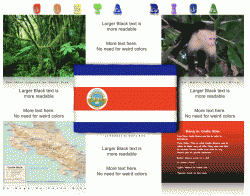
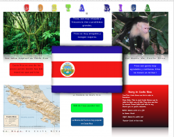
Also if this were your school poster what would you change? It is not a big grade, it is just that I really like having good work, but art is definitely not my forte. The words are in Spanish but they really don't matter. I am sorry but you have to view it here on iWork.com because it was too big to upload here.
Thanks in advance.
 
Hi,

I'm not a designer so I won't comment too much on that aspect, besides maybe telling you that I really dislike the font and color for the title :)

Anyways, you said the text doesn't mater much, but it is badly written, and some parts of it do not make sense. Are you positive they don't take this into account, or would you like some advice on properly written Spanish?

Funniest part is this sentence: "La música de Funk es muy Álamo en Costa Rica".

I suppose you meant to say that funk music is very popular in Costa Rica... but Álamo is actually a type of tree, specifically a poplar ;)
 
The iWork site doesn't work on Google Chrome. :mad:

There is a lot going on and by a lot I mean a lot of very archaic design elements that were once cool but were never cool all on one poster.

Your fonts are entirely too hard to read. The colors you have picked doesn't help. You're using reflections with drop shadows, and gradients. Overall there is no flow and I would think with an informative poster you'd want more flow.

I am not fluent in spanish but using babel fish to translate for you may not be the best idea. Sorry bud but I think it's back to the drawing board on this one.
 
Hi,

I'm not a designer so I won't comment too much on that aspect, besides maybe telling you that I really dislike the font and color for the title :)

Anyways, you said the text doesn't mater much, but it is badly written, and some parts of it do not make sense. Are you positive they don't take this into account, or would you like some advice on properly written Spanish?

Funniest part is this sentence: "La música de Funk es muy Álamo en Costa Rica".

I suppose you meant to say that funk music is very popular in Costa Rica... but Álamo is actually a type of tree, specifically a poplar ;)

Yeah if you know Spanish that would help. It's funny that the one word I had to look up was the one word wrong. I was just advising people that if they did not know Spanish it would not matter.


@Jessica This poster is going to be twice as big as what you see on the screen. Are the fonts still bad?
 
I would make some changes so it's more readable.
 

Attachments

  • Picture-31.gif
    Picture-31.gif
    179.8 KB · Views: 113
I'd say make the font more readable in the bottom right... Also one of the text boxes above is too close to the top...

A few other things, but, since it's a school thing it should be fine...

Also, I like what Consultant has, makes everything more readable.
 
I usually get things like this printed at Kinko's if the quantity is less than five. Most well-equipped copy-centers should have a large output printer.
 
I usually get things like this printed at Kinko's if the quantity is less than five. Most well-equipped copy-centers should have a large output printer.

I tried the online Kinkos and they only had 11x17 or special instructions. Will the "Special Instructions" work for this size? About what cost am I look to pay?
 
I am not going to judge your poster

If you like the layout and content, that's all that matters. This appears to be the case since you are already talking about printing. I sent you a pm.
 
It looks good, but to make it a bit more professional and more organised, here are a few tips about details:

Use only one kind of font, use less effects, don't use color gradients, they don't look professional. Use more consistent colors, don't go for random rainbows. In your text boxes, be careful to always leave the same amount of margin between the edge of the box and the text. If the text is too close to the top for example, but there is lots of free space at the bottom, it looks bad (for the top blue box and the green box especially). Maybe use rounded corners for every photo/graphic (the flag, the monkey, the map and all). Make the title stand out more by leaving some white space between it and the rest, I think it's too close to the content.
 
Okay I got it printed for tomorrow. I implemented most of your changes, most notably the removal of the gradients and changing the font to a universally more readable size and color. I have also moved the title down somewhat. Thanks for the help. And to people who later see this thread I printed it at officemax for $30.
And to the guy who helped me through private message, I'm sorry but my teacher bumped the deadline last second because she didn't think kids were working hard enough.
Thanks for all of the help.
 
Register on MacRumors! This sidebar will go away, and you'll see fewer ads.