Thank you for your prompt replies. I didn't expect to receive so instantly
")
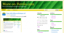
- I'd consider changing the light yellow / custard colored outer border. Perhaps even reverse the font color choice you have for that segment (more caramel) with the background color. The reason for this is that the lighter yellow makes the rough hewn edge of the white portion of the page hard to see -- it's done fairly nicely, and so keeping it visible would be nice. You might even play with aliasing and/or drop-shadowing that rough edge.
Any additional borders would add to more weight on theme, but I wanted to keep it as simple as possible, but thank you for your suggestion.
- The yellow web 2.0 plastic doesn't really fit the overall theme. I'd think about another way to do that. On the one hand, the navigation bar stands out too much stylistically to me from the parts around it, but on the other hand, the download button example, where you've used the rough edges on the plastic look, also doesn't work for me. Other icons like the calendar date icon I like.
Yes, I would agree that stylistically plastic menu do not fit well with the whole theme and another solution might have been used, stylistically "right" main navigation might not stand out well.
Regarding "download" button it was designed as a last minute "change", I'll take a look at it later, thanks.
- I'd consider perhaps boldfacing the line that you use for "free and premium..." right below the Herdo Web Design -- right now it seems slightly weak. Perhaps not boldface, but somehow the character width seems too insubstantial to me, personally.
Boldfacing a slogan would be a bad idea as the whole template would lose its lightness. If you use firebug, try to add and you'll see what I mean
- You should be testing on Safari 3.x (and ideally also 2.x), and Firefox 2.x, as additional engines, at a minimum... Probably also some recent-ish Opera.
Sorry for not being very clear, the theme was designed by me, but all html code was done by another guy and an initial version was tested on all main browsers. After I adopted it to wordpress platform, I personally tested only on the mentioned browsers, but most likely it should be rendered nice on all browsers. If you spot anything, please let me know.
I like it. Good colors, good font for this design. I like the jaggedness. If you were going for a leaf-like look, then you did a good job. It looks good in Safari 3.
Yes, you are almost correct. In nature you won't find any ideal shape, so I wanted leaf/nature-like look.
I would suggest a darker background color, so that the white body and the jagged banner stands out better.
Since a background occupies a lot of space, any darker color would ruin my theme lightness.
Also, I don't know if this was planned or not, but the search box has two dots before search. No comment there, just pointing it out.
yes, it's planned
I would make the feed icon next to the search more noticeable also. Maybe increase the size?
You might want to try changing the yellow nav and download buttons to a darker color to make it more of a brown to make it more bark-like. Just a suggestion.
If I change the color of navigation or download button, I'll have to change all colors on the theme as colors used on my theme are assorted with each other, so it means I'd have to change the whole color scheme
There isn't really anything bad about it... Sorry I can't give you better feedback.
Thank you guys for your comments.