It happens

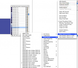
I would suggest you look at a physical color book and pick from that. There are some books that have the CMYK equivalent which will help you get close. Very rarely almost never are PMS colors and CMYK builds exactly alike. Pick from the color book because what you see is what you'll get. It's ink that comes out of a can and not a whole lot of chance for things to go wrong.
I still do a lot of my design in CMYK unless it's for web, then RGB. Early on, it shouldn't really matter you're just trying to rough out the design. If you see that the logo/design is only a few colors, then you can start moving towards spot PMS. If a client is adamant enough, they'll usually just tell you.. "our company colors are this and this..." otherwise, you can usually just pick something close. Unfortunately, you may have gone well down the line with a color that you may not be able to match on the button. I'm sure you can get close though.
Just playing around, I found PMS 2726 for you... it's cmyk breakdown is 79/66/0/0. As you can see, close, but not exact.