I'm not big in reading into things. But today, I came for my regular afternoon work-from-Starbucks ritual in downtown Toronto, along with my iPod Touch.
I have a Bell HotSpot account (which is the Starbucks Wi-Fi partner in Canada).
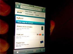
When I connected to the hotspot_Bell SSID as I normally do, and then opened my browser, I was greeted with a login screen that is completely catered to the iPod Touch/iPhone.
I found this particularly interesting considering the previous login screen design worked perfectly fine with the iPod Touch. Why would Bell Canada go out of it's way to design an iPhone-friendly login screen at their Wi-Fi hotspots, considering the company has no chance at striking a deal with Apple as a CDMA carrier, unless...
This is not the same page displayed on my laptop. It is clearly an iPhone-friendly formatted page. Look at the blue border around the options, etc.


