Got a tip for us?
Let us know
Become a MacRumors Supporter for $50/year with no ads, ability to filter front page stories, and private forums.
Phones Post a Screenshot of your Windows Phone start screen
- Thread starter laserfox
- Start date
- Sort by reaction score
You are using an out of date browser. It may not display this or other websites correctly.
You should upgrade or use an alternative browser.
You should upgrade or use an alternative browser.
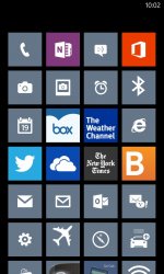
I know there is a very small number of us on mac rumors with windows phones but still why not share yours?Loving my white Nokia Lumia 920!

that's pretty clean looking. nice.
That's beautiful, really. WP8 has the best home screen of any platform, and that Xbox music tile looks so slick.
I absolutely agree. WP8 may have faults but the live tiles are brilliant.
You must hold it first. Good God, that 4 is a sexy thing to hold.Part of me is tempted to cancel my Nexus 4 order and get an HTC 8X.
You must hold it first. Good God, that 4 is a sexy thing to hold.
I'm still waiting on my pre-order from a 3rd party website and I'm getting a bit impatient. I would love to hold it but no stores or carriers are selling it here
I am finding so far that I prefer the smallest tiles. I wish that MS would allow for tiles that are 2x1 or 4x1 instead of current 2x2 and 4x2 choices. The added width without more height would still allow for more information display without taking up so much space.
Attachments
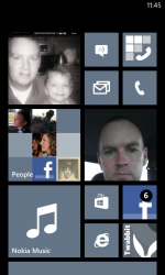
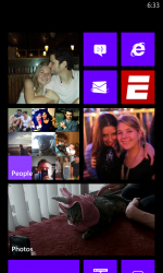
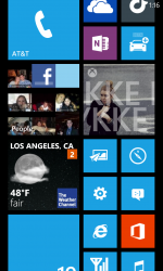
Heres mine
God that took forever haha, also a 920 in white.
God that took forever haha, also a 920 in white.
Attachments
Last edited:
God that took forever haha, also a 920 in white.
Very nice!
We seem to have very similar screens haha. I just like having all my photo ones on top, makes it look that much better.
There is now a website to check out people's start screens!
Love how everyone's start screen is so personalized to their social life!
http://mytil.es/
Love how everyone's start screen is so personalized to their social life!
http://mytil.es/
I honestly hadnt looked at any WP8 stuff yet, but can someone answer something for me. What am I looking at? Can you set those boxes as you like? Do you have to fill them all up? its too confusing for me, but if its possible to only choose a few things to put on and change the size of the boxes, I think it looks pretty good.
You guys are making me like the 920 more and more. I love my iP5 and how it connects with my apps, but that is a very nice phone!!
I'm really liking what Windows is doing with their phones. Could possibly see myself using one in the future.
I honestly hadnt looked at any WP8 stuff yet, but can someone answer something for me. What am I looking at? Can you set those boxes as you like? Do you have to fill them all up? its too confusing for me, but if its possible to only choose a few things to put on and change the size of the boxes, I think it looks pretty good.
This is the Start screen. Basically what your phone opens up to when you unlock it. Can swipe up to scroll in a vertical motion through whatever is pinned on it. Theres a separate list of every app if you swipe to the left in alphabetical order. Basically, you pin the apps you want quick access to on the home screen. Tiles can come in 3 sizes, 1x1, 2x2, and 2x4. So you could have a bunch of little icons taking up the whole screen or a bunch of large ones which display more information on them, like having the email app flip over to show the last email title received. You can put as much or as little live tiles as you want, but since they are important without a unified notification center youll want your main apps on there. Its a very fluid way of getting through a lot of data in very little time.
Its much better to watch in person, with all the live tiles and rotating pictures, etc. It really is a beautiful OS that Android and Apple should take cues from. Think being late to the game helped MS a lot in crafting the UI, its unique and it works extremely well.
Does anyone know how to get the screenshots to sync with SkyDrive?
If not, is there an alternative that automatically syncs all your images with a desktop client?
If not, is there an alternative that automatically syncs all your images with a desktop client?
Does anyone know how to get the screenshots to sync with SkyDrive?
If not, is there an alternative that automatically syncs all your images with a desktop client?
You have to go into the screenshot folder and select all. Then you can save them to skydrive. Unfortunately screenshots don't sync automatically like the camera roll does.
Register on MacRumors! This sidebar will go away, and you'll see fewer ads.


