Become a MacRumors Supporter for $50/year with no ads, ability to filter front page stories, and private forums.

FatDaddy 64.5

macrumors newbie
Original poster
Jul 31, 2006
22
0
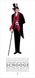
Im trying something different and decided to illustrate a poster for a food drive for my work. This is just the early stage of my design work, I know I need to work on the typography and my illustration. But I want a critique on what you think of how the illustration is coming along? To clip artish? Im not in love with my work yet, any advice would help. Thanks

The text below says, "Did you know that the U.S Census Bureau last year reported that 8.7 % of Utah's residents live below the poverty level? The Utah Food Bank serves over 240 programs. This institution helped the needy last year by distributing 18 million pounds of food statewide. So this holiday season don't be a scrooge. Please bring your canned food items to food drops in the cafeteria at the east employee entrance and font office before December 14th. Thank you very much for your generous support and contributions."
 

Attachments

  • Scrooge Poster Design 15X30.jpg
    Scrooge Poster Design 15X30.jpg
    46 KB · Views: 256
Where to start? I think you have done a nice job, but I'm not sure about the final message. It really depends on your work environment, and only you know what that is. Generally, people do not like to be told to do something ("Don't be a Scrooge; give food"). People are much happier to give thinking they are doing something out of the goodness of their hearts, rather than being guilt-tripped into it. On the other hand, your office might be fun and outgoing and they think this is great, and have no problem with it. You have to be the one to gauge that.
As far as the poster itself, I think the design is very nice; it does not look too clip art-ish in my opinion. The type is designed nicely, although the preview was still a little small so I can't comment on kerning, leading, etc. I do not think you need that leaf or whatever it is at the bottom; it has no relevance to your piece. If anything, perhaps a logo/name & phone number of a food bank? That would also help clarify your position, ie: the viewer would likely first read, "Don't be a Scrooge", then could see the food bank logo and make the connection.
As always, these are just suggestions, but I think you have a great start. Hope it turns out well!
 
The design is great. But If I was standing around the watercooler, I wouldn't know what I was looking at. I would make the Donate and Food Drive Message more prominent. People have short attention spans and you need to catch it within first glance.
 
i think you should take out the word "so" before "don't be a scrooge" because it's unnecessary. as well this would make the main message of the poster read "don't be a scrooge give to the foodbank".
 
A fellow Utahan? I love the design, but it's kinda hard to see the message. I saw SCROOGE first, then kinda bounced around reading other stuff until I got the message.
 
Register on MacRumors! This sidebar will go away, and you'll see fewer ads.