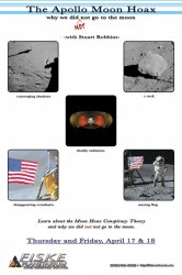
Everything about it is too busy, it puts me off so much.
The typography needs a lot of attention. I would change the header and main text font, and try to work with a grid of some sort to help give an order to things. My eyes have no idea where to look first and in what order. Please get rid of all the '...' - you can get the same effect without their use by thought of layout and composition.
Just a question, and I'm not trying to be rude - but have you ever done any other typography before - or have any background in design?
I have no formal background in design. Just web stuff for ~10 years, but again not formal. However, the person who I worked with last year on the original was an undergrad journalism (or some other unrelated) major, so I would rather work on this myself and be unhappy with the final product than have them do it and be unhappy with the final product. Of course, I'd rather get ideas here for a product I'd be happy with. And I agree, it looks way too busy, which is what I said in my post. It was a quick thing I did while watching an episode or two Star Trek.
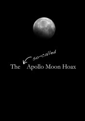
How about something really simple.
Black background with a picture of the moon shot from earth.
Simple text at the bottom saying
"Did we actually get there?" or similar
Then "Find out <insert date, time, place etc>"
EDIT: quick mock up added. Please note the image was found online and as such would need permission etc to be used
I like that one better than the version Topher15 made (and Topher15 used a lunar eclipse shot, not a regular phase). The off-center non-symmetry appeals to me. Also, as I said above, I have plenty of high-resolution lunar photos.
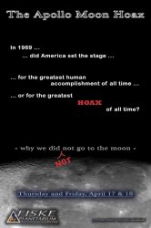
I thought he was saying it was not a hoax
Correct. Part of the whole hoax idea is that people don't actually
think about all the "evidence" that hoax proponents use. That's why I thoroughly enjoy using the double-negative in the sub-title, because people actually have to process it to figure out what's going on. I've gotten some resistance to this idea before, but I've gotten just as many people to say they like it, so I'm sticking with the sub-title.
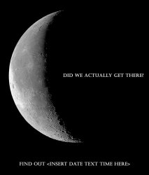
Personally, I think a full-bleed composite of the moon and Earth on a space background would be a compelling image for this subject.

full-bleed composite? What does that mean?
If you found a good moon pic from the Nasa website/other government sites then you don't need permission. Am I correct on this? It's been a while since I had to deal with a copyright issue.
How hard would it be to create your own fake moon landing pictures? Possibly recreate Armstrongs foot print in sand w/black&white photos
Correct, NASA photographs are in the public domain and can be used. Also, the planetarium is an educational non-profit meaning that I can also use some copyrighted material without obtaining permission (so I've been told). As for creating my own fake photos, I lack that skill.