Got a tip for us?
Let us know
Become a MacRumors Supporter for $50/year with no ads, ability to filter front page stories, and private forums.
Poster design. Whataya think?
- Thread starter JGowan
- Start date
- Sort by reaction score
You are using an out of date browser. It may not display this or other websites correctly.
You should upgrade or use an alternative browser.
You should upgrade or use an alternative browser.

I like the ink blots as blood.
I'm not so crazy about the red smoke and faces in the black.
I'd look at typesetting "something wicked this way comes" in a more interesting way in that space instead.
I'd look at the title in black with the red sword standing out of it ... but just a look, to see what that did.
But overall, good job.
What font(s) would you suggest?I find it a little hard to read, but it gets the point across.
Decided to incorporate some of the things said... here is the design at the moment...

Last edited:
Ok, like the improvement, but the white text looks random, just like it has been blotted or smashed on, tie it together more, are you using photoshop?
Good advice... how about this? In the play, Macbeth uses not one, but two daggers to kill King Duncan in order to frame the two men in charge of guarding him.

Last edited:
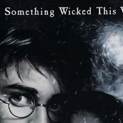
I carefully chose Charlemagne and others. Here's what I know about the play and it's timeframe...The text seems very Harry Potter-esque. Almost cartoonish. It just doesn't flow with the theme.
Just my two cents..
Although written in 1606 Macbeth is about a period of history 600 years earlier (about 1006). The real Macbeth ruled Scotland in the middle of the 11th Century
About this font family (Charlemagne font origin)...
During the reign of the Emperor Charlemagne in the eighth and ninth centuries, the use of classical roman letterforms was revived. These letterforms were the basis of the highly refined versal capitals of late tenth-century England, which were the inspiration for Carol Twombly’s 1989 Adobe Originals typeface. Charlemagne has spiky serifs, but retains clean lines and proportions.
Although the third Harry Potter ("Prisoner of Azkaban") uses the famous line in the advertising and as a theme song, it uses the font CASABLANCA on the movie poster, not CHARLEMAGNE. Two very different letterforms.
So the play takes place around 1006. The font's inspiration was from the highly refined versal capitals of late tenth-century England. I think I'm on the right track.
Attachments
Last edited:
Thank you.Alright then. You're the expert. I was just stating how I felt from a bystanders position. Good luck!
I'm not an expert, but in preparing for the advertising of this play, I have seen it performed a half-dozen times now, took the photos and carefully picked the fonts. I'm glad I posted the poster here because I've gotten good advice that's helped the show. I simply explained in detail how I felt you missed the mark with your Harry Potter remark. Sorry if that got under your skin.
The font's inspiration was from the highly refined versal capitals of late tenth-century England. I think I'm on the right track.
The font Charlemagne is a modern re-draw of Carolingian majuscules, and I am sorry to report that these letterforms are not English.
Carolingian miniscule (which is more rooted in handwriting and informal) was influenced by the English uncial styles (and less formal Roman writing before that) and eventually became the root for the blackletter styles that would come after.
The capital lettering style that the font Charlemagne is based upon would eventually influence the English Versal, which comes later. Not the other way around.
The blackletter font you are using in the poster is a Schwabacher. So, in truth, both of the letter styles you have chosen to use on the poster are germanic, not english.
is this a problem? not really. Most designers can't differentiate a Schwabacher from a Textualis, much less the general public.
But I have to agree with the other poster that the Charlemagne does not work well with your other font. I don't say this for historical reasons, but for visual ones. Charlemagne, as a modern recreation, is a bit too clean for my tastes.
Well -- before I can trust you (sorry), I have to go with the boys and girls over at MYFONTS.COM:The font Charlemagne is a modern re-draw of Carolingian majuscules, and I am sorry to report that these letterforms are not English...
http://www.myfonts.com/fonts/adobe/charlemagne/
About this font family
During the reign of the Emperor Charlemagne in the eighth and ninth centuries, the use of classical roman letterforms was revived. These letterforms were the basis of the highly refined versal capitals of late tenth-century England, which were the inspiration for Carol Twombly’s 1989 Adobe Originals typeface. Charlemagne has spiky serifs, but retains clean lines and proportions.
Its considerable charm makes it ideal for advertising, packaging, and other display uses that require a unique look.
By the way, I'm NOT using Blackletter (good guess) -- I'm using "Ithornët" for "MACBETH" title and for "Shakespeare" -- the reason I went for the clean-looking Charlemagne was because it was the opposite of the grungy and ornamental "Ithornet". Also, I thought it was knife-like... sharp... which in the end (when I added the daggers) worked all the better.
Of course, the play takes place primarily in Scotland but there is one scene in England. Like you, I don't really care actually about the origins so much but rather what the feel to be right.
About it not be pleasing to your own orbs,... I'm cool with that!
Last edited:
Well -- before I can trust you (sorry), I have to go with the boys and girls over at MYFONTS.COM:
During the reign of the Emperor Charlemagne in the eighth and ninth centuries, the use of classical roman letterforms was revived. These letterforms were the basis of the highly refined versal capitals of late tenth-century England, which were the inspiration for Carol Twomblys 1989 Adobe Originals typeface. Charlemagne has spiky serifs, but retains clean lines and proportions.
Its considerable charm makes it ideal for advertising, packaging, and other display uses that require a unique look.
That text and I are not in disagreement.

That text says that the Carolingian majuscules (of which Charlemagne is a modern cut) is the basis of the versal capitals of late tenth-century. Versal capitals came later and were influenced by Carolingian majuscules, but are a vastly different style of letterform. The english anglicized the germanic letterforms and made them their own.
So, if you want authenticity based on your time period and location, Versals would be correct. However, as we have previously defined, no-one will care!
By the way, I'm NOT using Blackletter (good guess)
Used properly, "blackletter" is an classification term, not a specific style of letterform. Blackletter fonts come in a variety of styles (Textualis, Schwabacher, Fraktur, etc.) depending on the size of tool used and their origin. You are using a German Schwabacher.
The colloquial use of blackletter (and other type terms) was a big problem for MyFonts when they were creating their search engine. "How do we let people search for stuff that they don't know the proper name of?". A colleague of mine built the taxonomy at myFonts and we discussed this problem quite a bit at the time. The solution was a proper type classification system combined with a looser user-generated free-tagging system.
Anyways, I apologize for splitting hairs. It is certainly not a criticism of your work. I don't work with type too much anymore (I work in UX), but at the beginning of my career I drew this stuff professionally and I have tried to stay close to the type community here in Boston.
Thanks for the font lesson! Bottomline, I'm glad I posted here... the poster improved (See first draft at top if you're wondering)...
Oh well, the director and actors are happy ... I suppose that's the main thing. This has to go to print! Here's the final proof:

Oh well, the director and actors are happy ... I suppose that's the main thing. This has to go to print! Here's the final proof:
Relax in the knowledge that the Director, the general public et al are not all MacRumors font geeks, historians, wannabe designers or typophiles.
Your design works well (the latest iteration) and as much as I would love to discuss the merits of 10th century fonts Charlemagne looks fine in this layout.
Nice work JGowan.
Your design works well (the latest iteration) and as much as I would love to discuss the merits of 10th century fonts
Charlemagne looks fine in this layout. Nice work JGowan.
Last edited:
Good advice... how about this? In the play, Macbeth uses not one, but two daggers to kill King Duncan in order to frame the two men in charge of guarding him.
Image
I like the creative of designing T letter
Register on MacRumors! This sidebar will go away, and you'll see fewer ads.