Become a MacRumors Supporter for $50/year with no ads, ability to filter front page stories, and private forums.

richard.mac

macrumors 603
Original poster
Feb 2, 2007
6,292
5
51.50024, -0.12662
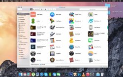
The graphite appearance in Yosemite is boring and too grey scale. Pre Yosemite Graphite had a blue tinge to it and both appearances were attractive and inviting.

Screen-Shot-2014-06-03-at-12.23.40-AM.png
jb1P1sn08Moev0.png


I have sent the following feedback using Feedback Assistant in Yosemite Public Beta. If you feel the same way please submit a feedback ticket!

Screen Shot 2014-08-23 at 10.26.59 pm.png
 

Geebs

macrumors newbie
Aug 23, 2014
2
0
Just a thought: have you tried calibrating your display following the update? Mine was all over the shop. Recalibrating also helps with the field-of-glaring-white problem Yosemite has :cool:
 

richard.mac

macrumors 603
Original poster
Feb 2, 2007
6,292
5
51.50024, -0.12662
I always just use the default colour profile 'Color LCD'.

The Yosemite Graphite appearance is just grey, no bluish tinge to it like since 10.0.0.
 

tkermit

macrumors 68040
Feb 20, 2004
3,586
2,921
As far as I'm concerned, this is very good news as it should make it (even) easier to accurately perceive and judge the color of the content you're looking at or creating on screen and not be influenced by and react to any colors surrounding it. Which, as far as I'm aware, has always been the goal of the graphite theme.
 

richard.mac

macrumors 603
Original poster
Feb 2, 2007
6,292
5
51.50024, -0.12662
Fair point, I see what you mean.

But when I turn on Graphite it feels like all colour is taken away from the window buttons and elements, I'm just looking for a little colour, like in Mavericks.
 

kmj2318

macrumors 68000
Aug 22, 2007
1,669
712
Naples, FL
I'm not too bothered by the change. The application bar in mavericks was completely in grey scale, so the blueish items provided some contrast. In Yosemite, the grey app bar has some warmth, so the solid grey of the buttons has the same contrasting effect. In both Yosemite and Mavericks, the buttons are slightly blue-shifted from the application bar. I feel like one or the other has to have a neutral lighting because if the app bar is a warm grey, and the buttons are a cool grey, the difference would look unnatural.

I prefer the way it's done in Yosemite. The application bar has some real world physicality to it, so it makes sense for that to have natural lighting. The buttons, highlights, and controls are flat and virtual, so the colors can be simplified, they can be treated like text. In Mavericks, the app bar was in grey scale, and the buttons had natural lighting, which is theoretically backwards to me.
 

richard.mac

macrumors 603
Original poster
Feb 2, 2007
6,292
5
51.50024, -0.12662
Looks like no one agrees! Oh well! :p

I'm not too bothered by the change. The application bar in mavericks was completely in grey scale, so the blueish items provided some contrast. In Yosemite, the grey app bar has some warmth, so the solid grey of the buttons has the same contrasting effect. In both Yosemite and Mavericks, the buttons are slightly blue-shifted from the application bar. I feel like one or the other has to have a neutral lighting because if the app bar is a warm grey, and the buttons are a cool grey, the difference would look unnatural.

I prefer the way it's done in Yosemite. The application bar has some real world physicality to it, so it makes sense for that to have natural lighting. The buttons, highlights, and controls are flat and virtual, so the colors can be simplified, they can be treated like text. In Mavericks, the app bar was in grey scale, and the buttons had natural lighting, which is theoretically backwards to me.

I see what you mean, In Yosemite the title bar has some colour and natural lighting and so a bluish graphite UI isn't needed for contrast.

Your words make me feel better about they very grey Graphite appearance, but I would still like just a tiny tiny bit of Mavericks graphite colour in there.
 

Takuro

macrumors 6502a
Jun 15, 2009
584
274
The application bar in mavericks was completely in grey scale, so the blueish items provided some contrast. In Yosemite, the grey app bar has some warmth, so the solid grey of the buttons has the same contrasting effect.

Yeah, exactly. Plus, I think that in Yosemite, graphite is really meant to compliment "dark mode" since it ultimately wound up being a menubar and dock option rather than a full-blown theme. It makes more sense for it to be color-neutral. I personally prefer how it looks.
 

GerritV

macrumors 68020
May 11, 2012
2,258
2,713
I always liked the blue/graphite menu highlights in Tiger. If I remember correctly, the graphite simply had a -80% saturation as compared to the blue. But both were nice colours to work with.
Then, in Leopard I suppose, the blue highlight got an over-saturated blue that I still find hard to look at. Consequently, the graphite became a dirty almost grungy gradient that I didn't like either.
This is why I switch between blue and graphite quite often. The window widgets don't bother me too much, but the menu highlights, checkboxes... do.

I'm not using Yosemite myself, but from what I see the graphite has indeed turned into gray. That may provide the real neutral UI I've been after since Leopard. So Graphite may become my choice in Yosemite.

In other words: please don't let it be "almost gray" (sorry Richard, you don't get my vote here). :confused:
 

tmoerel

Suspended
Jan 24, 2008
1,005
1,570
I always just use the default colour profile 'Color LCD'.

The Yosemite Graphite appearance is just grey, no bluish tinge to it like since 10.0.0.

An uncalibrated screen can NEVER be used to judge colour. I have calibrated many different macs and i can assure you that before calibration they all showed different colour hues and tints. After calibration they all looked the same.

So either calibrate your screen or don't judge what you see!
 

pdaholic

macrumors 68000
Jun 22, 2011
1,947
2,901
I finally installed Yosemite last night. New icons, font, window colors, and stoplights. My 41 year old eyes aren't having problems adjusting to anything. Pretty underwhelming.
 

hamiltonDSi

macrumors 68000
Jul 29, 2012
1,610
284
Romania
Looks like no one agrees! Oh well! :p

I do agree with you, I liked it better in Mavericks...
Now with Yosemite I use Dark Mode (great new feature !) because it really helps me concentrate on my work (I hate full screen) and it's weird because using all this options (or features) has resulted in a black menubar & dock, grey buttons & pop-ups with a vivid wallpaper and translucent UI - It doesn't look quite right.

:)
 

Attachments

  • Captur? de ecran din 2014.08.27 la 09.22.05.jpg
    Captur? de ecran din 2014.08.27 la 09.22.05.jpg
    452.1 KB · Views: 215
Last edited:
Register on MacRumors! This sidebar will go away, and you'll see fewer ads.