Got a tip for us?
Let us know
Become a MacRumors Supporter for $50/year with no ads, ability to filter front page stories, and private forums.
Pretty or ugly
- Thread starter gekko513
- Start date
- Sort by reaction score
You are using an out of date browser. It may not display this or other websites correctly.
You should upgrade or use an alternative browser.
You should upgrade or use an alternative browser.
gekko513 said:Are these images pretty, ugly, interesting or boring?
The one on the left is interesting...is it something enmeshed in ice? I like the texture.
the left one gives you more to think about when you view it. It makes you ask yourself questions and your draw yourself into this one more.
The right one is okay but it looks like something we have seen time and time again on postcards etc. If you were going for which one draws the viewer in more definately the left one does exacty that.
The right one is okay but it looks like something we have seen time and time again on postcards etc. If you were going for which one draws the viewer in more definately the left one does exacty that.
They're kind of hard to see, being so small - especially the one on the left.
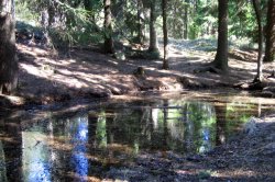
For the right one, it would be better if you took that on an overcast day (no intense light reflecting off the pool showing the blue of the sky) and make it black and white....
D
For the right one, it would be better if you took that on an overcast day (no intense light reflecting off the pool showing the blue of the sky) and make it black and white....
D
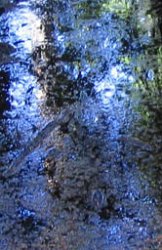
The left image is from another muddy puddle in the forest quite close to the puddle in the right image. The image on the left is a cut-out of just the trees and the sky reflected in the muddy puddle.
I wanted to get some general feedback on the images before I told what they may be used for.
I'm building a collection of 12 Solitaire games each having their own background and card graphics theme. I want to have different kinds of themes. I just want the images to be somewhat interesting or pretty. I have some other themes with postcard clichés, and since I'm no artist I don't mind clichés at all because I won't be able to build 12 themes with unique artistic expression with my lack of talent, anyway.
For this theme I started out with the right image for background and made the left image for card back image in an attempt to match the colors and mood.
The reason why I wanted second opinions on these images is that one part of me thinks they are too dark and not really pretty, while another part thinks that the green, blue patterns in the right image are somehow interesting enough to make up for the too burned out sun beams.
The card image captures the green and blue pattern that I found interesting even better. For the final card it will be bordered in some way, possibly a standard white card border.
So what do you think, is it a keeper or should I just stick to more conventional pretty images?
I think they're a little too busy for the backs of cards - there is no defining space in the images.
There might be some things in the details that would work better than those scenes themselves.
D
There might be some things in the details that would work better than those scenes themselves.
D
Mr. Anderson said:I think they're a little too busy for the backs of cards - there is no defining space in the images.
There might be some things in the details that would work better than those scenes themselves.
D
OK, I think I'll put in on hold for a while and see what other options I have.
Thanks for the feedback, people. Any more quick opinions on this?
Better to use images that don't contain so much detail. Extreme closeups of a specific detail would create a better and bolder visual for card designs. So, instead of photographing the entire tree and pond, do a closeup of one leaf or a ripple of water or the detail of the bark on the tree. All these elements together create a theme that all matche but still creates a distinct visual look for each card.
What would be cooler would be putting images on the FRONT of the cards. One thing I like about Burning Monkey Solitaire is the ability to switch decks; I usually play Eight Off or Canfield so I don't see the backs much.
they are a bit much for the back of cards, something a bit more static and simplier would work better fo that type of use
I didn't express myself clear enough earlier, I think.
The rightmost image was intended as the window background, the playing surface if you like.
Images for the front of the cards is an interesting idea, but for that I would need 144 different images to complete the 12 different themes. Sounds like a little bit too much work.
The rightmost image was intended as the window background, the playing surface if you like.
Images for the front of the cards is an interesting idea, but for that I would need 144 different images to complete the 12 different themes. Sounds like a little bit too much work.
Left looks almost impressionistic at what size I a viewing it at
I like pictures that envoke something in me, and the left pic makes me want to reach in and feel the cold wet mud.
The right one is serine and peaceful, makes me wan to float leaves on the water like boats. Of them both... The left gets my vote of the two
I like the blue mixing with the grey brown mud with a spot of white light in the top left, a touch of greenon the right, a mud island in the middle with a rippled reflection of a tree Compositionally balanced for what I can see of it
?Hope that helps?
Register on MacRumors! This sidebar will go away, and you'll see fewer ads.