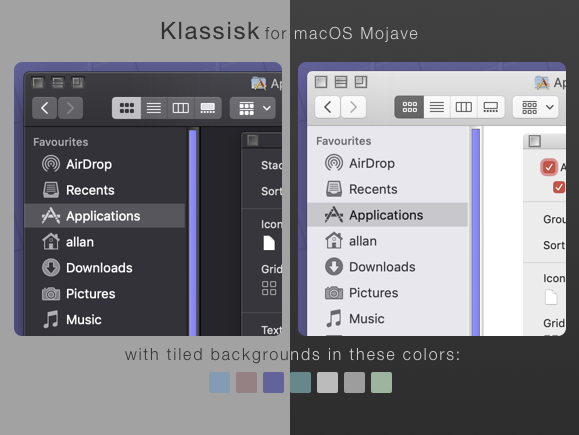
Here's a preview of a Classic theme that I've been working on for the past day or two.
I'll release this theme when I get an OK from MacRumors user redheeler to use his script to install the theme.
If you're adventerous enough I can provide the .car files now.
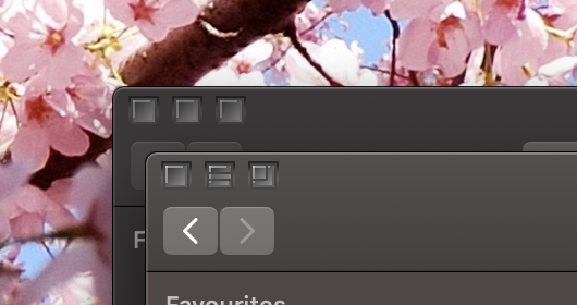
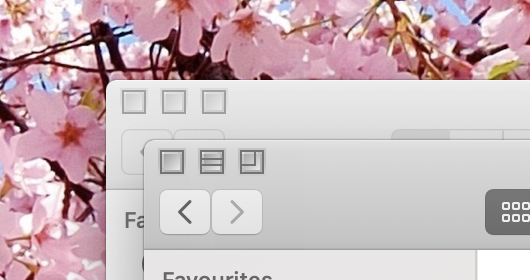
I know that the dark mode window controls are more sunken in than the light version. I hope you don't mind.
Might change opinion on some of the theme elements but this is what I've got for now - also for non-Retina modes.
No, I can't change the buttons on the Finder Toolbar - I mean I want to - it's just hell. So for now because of blend modes in ThemeEngine and macOS Mojave there's a grey'er Finder Toolbar button look throughout all applications that utilize these buttons.
Verdict? Should I make the light version's window controls more sunken in too?
Some screenshots cometh..
Last edited:

