Become a MacRumors Supporter for $50/year with no ads, ability to filter front page stories, and private forums.
L

Lau

Guest
Original poster
I'm due to hand in my graphic design degree portfolio in a couple of weeks, and the way everything has worked out means I've got a lot of books and pamphlets that are A4 sized at the most. I've got an A1 and an A2 poster, but they both fold down into A4 size the way they're packaged too.

Because of this, I'm not going to mount them (what's the point of mounting a book?!) and my briefs are in a A4 pamphlet, so I basically have a stack of books, magazines and papers to present. I currently have a bog-standard A3 black portfolio, but it isn't really the best way to present a stack of books, as the stack is much deeper and smaller, so I'm looking for other options. I was thinking maybe buying a box, or making a box, or maybe buying or making a kind of mini suitcase type thing. I'm thinking well made and still professional but a little bit different.

Have any of you knowledgeable lot seen any nice portfolios or boxes used to present this kind of work? Any good sources for ideas or buying them?

What are your thoughts on these kind of 'alternative' portfolios - pointless, or a nice touch? If someone brought one to interview would you think "pretentious nob" or "makes the extra effort"?!

Thanks for any input, it's much appreciated.


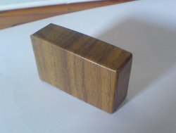
Edit: The best option so far I think is to make something like this, perhaps in a grey or brown rather than black, but I'd appreciate any nifty alternative suggestions. :)

Port-Box-ajar.jpg Port-Box-open.jpg
 
Speaking from the viewpoint of an ex-design lecturer, the way in which my students submitted their work was intrinsically less important than the quality of the work itself. ;)

But... I would also say from the viewpoint of an ex-design lecturer nothing quite made me question peoples creativity more, than those that just submitted everything in a black Daler portfolio. ;)

I ordered a load of books the other week, and they came in a cardboard package called 'Pandaroll-Box' by Pussikeskus (I found that name very amusing by the way) which is similar to what Amazon uses, but is more simple... and doesn't have plastic sleeves either. heh.

I'd try not and get too precious on this Lau... it won't (or at least shouldn't) have any affect on your final grade, though I understand the desire to present and submit your work in the best way possible... I just can't help think that you could make better use of the time that you do have left, by not spending a great deal of it designing and building something that won't really make any beneficial contribution to your grade.
 
Thanks for the suggestions, both of you. I'm not sure a metal case is really my style, tobefirst, but I really like the shape of that smaller one sitting on the top. I'll definitely look for something similar in a different finish.

Funnily enough, iGav, I was thinking along the lines of a brown cardboard box, Amazon style, as for as long as it stayed crisp it would look good. I've got a book of flatplans so I'll maybe look into that.

iGav said:
Speaking from the viewpoint of an ex-design lecturer, the way in which my students submitted their work was intrinsically less important than the quality of the work itself. ;)

But... I would also say from the viewpoint of an ex-design lecturer nothing quite made me question peoples creativity more, than those that just submitted everything in a black Daler portfolio. ;)

That's really useful to know. I defintely don't intend this to be more important than the work, but especially as I don't even like the bloody black portfolios (especially with plastic sleeves!), I really want to do something different at least for interview, if not for the hand in.

iGav said:
I'd try not and get too precious on this Lau... it won't (or at least shouldn't) have any affect on your final grade, though I understand the desire to present and submit your work in the best way possible... I just can't help think that you could make better use of the time that you do have left, by not spending a great deal of it designing and building something that won't really make any beneficial contribution to your grade.

Absolutely, I'm going to see how the time goes - I may end up doing it more for interviews, rather than the hand in date, if time gets short, as they're about 23347237492837 times more important. :D College is getting right on my tits at the moment - I just want to get it done and get out there!
 
Lau said:
I really want to do something different at least for interview

Yeah, stay away from black portfolios that's for sure ;) even now... I/we still get the odd poor unfortunate that lugs along their black A1 portfolio/s (yes plural, I kid you not) brimming with plastic sleeves... so that it barely zips up. :rolleyes: :p

I will say... keep it practical ;) when in an interview you want something that will allow you to present your work effectively, the work is the most important thing, not what it comes in. ;) It serves a different purpose and should be approached differently as to... say a self promotional mailer for example.
 
The metal ones are pretty 'done'. ie, everybody had them like 6 or seven years ago. Also, I have heard horror stories of people actually scratching up big fancy boardroom desks with their super cool metal cases.

I know what you mean about the Pina Zangaros- way too expensive! We just ordered 50 of the Machinas at my office for a leave-behind we're designing. It adds up quick. Not only that, they're so expensive that when you tell them you want to bulk order and would like some samples to play with, they expect you to send the samples back!

I say keep it simple, but don't look cheap.
 
I have my print work displayed in an 11x17 Pina Zangaro Machina portfolio. At least in the advertising industry, they're new enough not to be considered "overdone".

Another thing to keep in mind though is that PZ makes similar screwpost and binder portfolios in a few other materials and finishes. They have one that's simply board wrapped in black book-binder's cloth. I think the version is called Bex and it's considerably cheaper than the machina portfolios.
 
Thanks for the further comments. The idea of scratching up some posh boardroom table brings me out in a cold sweat! :eek:

Munkee - I really like the hardboard ones like this:

34605_34606.jpg


Some sort of deeper hardboard box thing would be good - would be sturdy but not mega heavy. <strokes chin>
 
Lau said:
The idea of scratching up some posh boardroom table brings me out in a cold sweat! :eek:

I've never had that problem personally. I would think, based on the way the PZ portfolios are built, that it would be the hinge area that would scratch. This would be an issue on any of their portfolios because they all use a metal hinge for the spine. Just be careful with it or hand it directly to the person reviewing and let them set it down.

When you buy the portfolios as a set, they come with a black nylon zipper pouch. If you're really worried, you could lay that flat on the table and then set your portfolio on top of it to protect the tabletop.
 
i have a large box rather similar to what you've added in your edit. it seems to do the trick for me. plus, it allows for some really nifty recess mounting of your work.

but like others have said, the most important part is the work itself. the main thing with the portfolio is to prove that you really DO care about craft. no sloppy cuts, off-center mounts, junky clumsy pages, or whatever.
 
JasonElise1983 said:
So expensive though.

:eek: That's obscene!

Take a look at the PZ frost series. They look a lot like the looking glass ones with a slightly lower price tag.
 
usclaneyj said:
no sloppy cuts, off-center mounts, junky clumsy pages, or whatever.

It's a difficult balance, personally I dislike work that is mounted... especially when interviewing people, it's an unnatural environment for most printed design pieces, I like to get my grubby mitts on the work, actually look, touch and feel to gain an idea of how the design works in its natural enviroment. Frequently, work that looks great all mounted up, doesn't stand up when it's trying to serve its purpose.
 
Well...if I have time, I'm going to make a box like the ones in the first post but covered in nice fake wood vinyl and lined with something groovy. :cool: The trick's finding something exciting, but not too distracting from the work. I rather fancy a bright red lining - would look good with the wood. I made a prototype this afternoon and I think it'll work.

Reckon that sounds a bit insane? Or kind of fun?

Oh, and I totally agree about the mounting - good to hear someone in the industry saying it too.

Thanks for all you help so far, everyone. :)
 
That honestly made me laugh out loud.

<Comes into interview and sweeps cape around, scattering footmen with her cane> "Behold! My portfolio!" <creeeeaaaak> :p

I'm thinking slightly kitsch rather than spooky - but I'll see what it looks like. I will keep my eye out for any coffin like traits...

Here's my tiny prototype. That gum tape that you have to lick is incredibly strong, so I think it should hold it neatly under the vinyl.
 

Attachments

  • DSC00106.jpg
    DSC00106.jpg
    18.4 KB · Views: 207
Lau said:
I'm thinking slightly kitsch rather than spooky

Stay away from the velvet though 'eh. ;)

Lau said:
Here's my tiny prototype. That gum tape that you have to lick is incredibly strong, so I think it should hold it neatly under the vinyl.

What kind of thickness vinyl is that?

Wilkinson's used to do wood-veneer-on-a-roll (sticky back plastic to me & you) I'm just wondering... as it'd be dandy if you could get the folds to be really crisp, clean and sharp.
 
iGav said:
What kind of thickness vinyl is that?

Wilkinson's used to do wood-veneer-on-a-roll (sticky back plastic to me & you) I'm just wondering... as it'd be dandy if you could get the folds to be really crisp, clean and sharp.

It's from a little hardware shop, but it just seems to be bog-standard vinyl on a roll stuff. The folds do need to be crisper - I think for this to look good it's going to have to be really crisp and well made, or it's going to look god-awful.
 
Lau said:
It's from a little hardware shop, but it just seems to be bog-standard vinyl on a roll stuff. The folds do need to be crisper - I think for this to look good it's going to have to be really crisp and well made, or it's going to look god-awful.

Have you tried scoring the underside of the vinyl? I can't remember what the technique is called, but you make 2 cuts into the material, both at about 45 degrees essentially making a V shape, that'll crisp the edges up nicely on thicker material.

Also if you have access to a B&D heat gun, that would make the vinyl more pliable, though be careful not to melt it. ;)
 
Hmm, cheers iGav. I just had another go, and really pulled it tight and it looks much better. It is sticky back plastic, sorry if I didn't make that clear.

I found a good link on how to make a box, although it's using the canvas stuff you glue with PVA.

I think it'll be ok, as it'll be on such a bigger box. I like your idea of loosening it up with heat. I'll test it out on the prototypes first, in case it bursts into flames. :p
 
I like your work, Lau.

You should be fine no matter what you present the material in.

Gav - that's an interesting point about not mounting print work for presentation, I've never thought about it like that. Which is ridiculous, because the first thing I do when I see a nicely designed anything is touch it.

I like print as opposed to web because it's tangible, so I guess it only makes sense that people be able to feel it and hold it.

I'm up for senior review in a few weeks - unfortunately all my profs are mount nazis.
 
Thanks, Mike. :)

It's a tough one about the mounting. Some of my tutors do recommend mounting our work, but enough of the others don't to make it a personal choice. Also, not only is it the tutors I have more respect for that say no to mounting, but it seems to be the ones that are more in touch with the industry. You could always mount it for the review, but not for the portfolio you'll take out. There's no point in losing marks over something like that, but at least you can take an unmounted one out into the real world.
 
Lau said:
I think it'll be ok, as it'll be on such a bigger box. I like your idea of loosening it up with heat. I'll test it out on the prototypes first, in case it bursts into flames. :p

A good hair dryer would probably do the trick as well. ;) probably safer too. heh.

Crisp lines is what's going to make it though girl. ;)

Have you considered something more intricate? maybe like the current iPod packaging?

Mike Teezie said:
Which is ridiculous, because the first thing I do when I see a nicely designed anything is touch it.

Exactly... ;) It's human nature to want to touch and feel things. ;)

Mike Teezie said:
I like print as opposed to web because it's tangible, so I guess it only makes sense that people be able to feel it and hold it.

I love the tactility that comes with printed work... which is something that I miss deeply working mainly on interaction design. Though... that's not to say that you cannot add physical qualities to digital work. ;)

Mike Teezie said:
I'm up for senior review in a few weeks - unfortunately all my profs are mount nazis.

and

Lau said:
Some of my tutors do recommend mounting our work, but enough of the others don't to make it a personal choice. Also, not only is it the tutors I have more respect for that say no to mounting, but it seems to be the ones that are more in touch with the industry.

You shouldn't be downgraded if you decide not to mount your work, and it's not something that you should accept if that occurs. Present the work in a way that is most sympathetic to the format, and if needs be, justify your reasons for doing so. I know of no lecturer that would downgrade you if you opted not to mount your work, but presented it in a way that you felt best suited it's qualities, regardless of whether mounting is their preferred way for presenting work.
 
iGav said:
Have you considered something more intricate? maybe like the current iPod packaging?

Well, that was my first thought, 'cause I loves the paper craft, man. :D But then I kept thinking that the best and quickest way to get to the work is a normal box, and I wondered if it a fancy one would just over-complicate the whole thing, and make the whole thing a bit pretentious.

I do like the idea of a square though. Squares are highly pleasing. :)
 
Register on MacRumors! This sidebar will go away, and you'll see fewer ads.