What can I do to make sure I stay within the print safe boundaries, and do you guys think that those 2 have color problems.
thanks guys
I am not sure your level of color knowledge so, if what I am saying sounds really basic to you, oh well.
A. First, history on me, I worked for a major catalog company retouching, I also went to school for Graphics/Pre-Press. This is what I got my start in, now I am doing web stuff, it is all pretty much the same. Anyway,
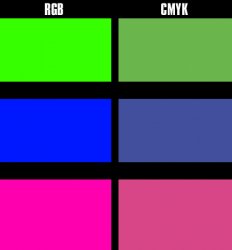
1. There are two major color models, there is RGB and there is CMYK. For your purposes, before something can be printed it must be converted from RGB to CMYK.
Why does it need to be converted?
Glad you asked, because RGB is for viewing purposes. It is for the monitor. RGB has what is call a color space.(large one)
What is a color space?
These are the amount shades in each color.
In order to print things on a normal printing press it must be convert to CMYK. These are four printing inks. I am not going to break them down because you can google that and it will tell you what each inks name.
The CMYK color space is much smaller than the RGB color space so when the printer converts your file for printing, it finds the closes shade of that color in the new CMYK color space. Example, if a color is really bright in RGB, the closets CMYK color might be much duller if that shade is outside it's color space.
The other problem you have is what is called DOT Gain. In short terms, you want to compensate for DOT Gain so your images are not darker when they get printed. Ink spreads.
The best advice is to color correct in the CMYK space if, you are going to have them printed by a printer. Ask the printer about the DOT Gain and compensate for that in Photoshop. Also have the printer pull you a proof of what the final image will look like on there presses so, you can adjust your images before printing.
As far as your images, they just look a little on the dark side, again you can compensate for that by doing the stuff above before having them printed.
")