Got a tip for us?
Let us know
Become a MacRumors Supporter for $50/year with no ads, ability to filter front page stories, and private forums.
Public beta 3 control center
- Thread starter bootzilla
- Start date
- Sort by reaction score
You are using an out of date browser. It may not display this or other websites correctly.
You should upgrade or use an alternative browser.
You should upgrade or use an alternative browser.
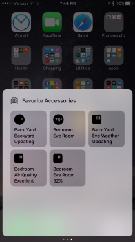
Edit : find myself. Need to change my eyes...What is this new third control center panel ?

AgreedEdit : find myself. Need to change my eyes...
What is this new third control center panel ?
A randomly bilingual control panel?
I think Apple is going the wrong way here. Control Center is to Access Settings or Quick Actions.. well.. quick.
Why would I swipe up, swipe 2 times left to toggle my light. My suggestion here for Apple: Let people customize the Control Center.
Some sections with space for modules like "Toggles, HomeAppSwitches, MusicControl", and so on.
Why would I swipe up, swipe 2 times left to toggle my light. My suggestion here for Apple: Let people customize the Control Center.
Some sections with space for modules like "Toggles, HomeAppSwitches, MusicControl", and so on.
I think and have requested that when you slide up you get the main toggles then left to home or right to music. Nice and simpleI think Apple is going the wrong way here. Control Center is to Access Settings or Quick Actions.. well.. quick.
Why would I swipe up, swipe 2 times left to toggle my light. My suggestion here for Apple: Let people customize the Control Center.
Some sections with space for modules like "Toggles, HomeAppSwitches, MusicControl", and so on.
Yep, as it stands now, I'm ALWAYS on the wrong pane and am confused for a little bit. That's not good UI.
It should basically be the last pane that you used.Yep, as it stands now, I'm ALWAYS on the wrong pane and am confused for a little bit. That's not good UI.
It is. It's just whenever I need audio controls, I'm on switches pane and vice versa. Really, almost every time 
It wasn't a thing before as everything was on a single pane. Now, it's a new unnecessary complexity.
It wasn't a thing before as everything was on a single pane. Now, it's a new unnecessary complexity.
Probably because it would be harder to reach some of the controls and it would still be somewhat cluttered in the sense of having too many of different kinds of things all together.Why do they not make a taller control center with all controls ?
Exactly.Why do they not make a taller control center with all controls ?
So if you have nothing with the Home app then that panel won't even show up, correct?
Correct
I really hope that they put the music controls back on the main Control Center screen in the final version...maybe swap screens of the Airplay and Night Shift button with the Music controls. Seems like that would be more useful for most people IMHO.
Register on MacRumors! This sidebar will go away, and you'll see fewer ads.


