Become a MacRumors Supporter for $50/year with no ads, ability to filter front page stories, and private forums.

Kingsly

macrumors 68040
Original poster
So I'm redesigning my site, now that I have the full version (no demo) of Adobe CS.

Last revision I was using the demo, so there wasn't too much thought put into it or anything.
I really like the clean lines and look of iWeb's 'modern' template, but am declining to use it, for what I imagine are obvious reasons.
So... Ideas? I have lots of groovy pictures and graphics (i LOVE Illustrator) to integrate, and the black on white theme is getting soo old.
 
the user will have to load the entire background image regardless of how big the window is. make the bloody thing smaller, or compress it harder, or use a smaller palate. Or lose the clouds and make the sky colour the background and use a transparent gif for the trees.

Looks nice tho, once it finally comes in. God help anyone on dialup...
 
I think you are working on the site atm, cause it doesn't seem to load anything except for the menu/top picture.

Edit: now I see why it took so long, you have this 1mb picture set up as a background
http://www.mariposaprod.com/IMG_0259.jpg
Use save for web in photoshop and play around with it, till you got a fast loading but still a good quality background. Iwouldn't use a background like this one though since it will make everything else hard to read.

A good thing would be to design the whole site in photoshop slice it up and put it all back together in dreamweaver. I still make a lot of sites like that.
 
kaboutertje said:
I think you are working on the site atm, cause it doesn't seem to load anything except for the menu/top picture.

Edit: now I see why it took so long, you have this 1mb picture set up as a background
http://www.mariposaprod.com/IMG_0259.jpg
Use save for web in photoshop and play around with it, till you got a fast loading but still a good quality background. Iwouldn't use a background like this one though since it will make everything else hard to read.

A good thing would be to design the whole site in photoshop slice it up and put it all back together in dreamweaver. I still make a lot of sites like that.
Thats the one image I'm not happy with... so its probably getting replaced. Anyway, I used 'save for web' in illustrator, but I guess its not compressed enough.
I've seen sites that have cool b/g pix that never take so long to load!

frankblundt, what I meant was limit the size of a window and then crop the image to fit.
 
stuartluff said:
I think from what I have read you kind of like my style of work. Take a look at http://www.stuartluff.co.uk its done in iWeb too :D
Your site looks a lot better in comparison to the paintball site. The background images used on that site are far too big btw (not 1mb big but 200kb is too big if you ask me).
I don't think the TS is a fan of your site though, since he is talking about a background image which your site seems to be missing, not that I mind though.
Your site is clean, simple, but still looks good.
 
If you use Image Ready (not sure about Illustrator, but it opens automatically when you "Save for Web" in Photoshop) it shows you the original and the compressed versions and their sizes (in the "2-up" tab) and lets you tweak the compression settings to your heart's content before saving.

For that image i'd imagine a Gif with an adaptive palette of 8 or so colours would be a lot smaller than what you've got, but you can try Jpg too - it re-renders it after every change you make to the settings and displays the new estimated file size at the bottom of the window.

And please don't try and limit/control the browser's experience with window sizing, positioning, pop-ups etc. Unless you're promoting pr0n sites, where these kinds of techniques are very popular. Just make your page size smaller and design it in a way that it still looks acceptable in a larger window with a background colour or (small, repeating) texture.

Although broadband penetration is increasing, there are still large numbers of browsers out there on dialup, for whom you should be trying to keep the total page size (images etc included) under 50KB (and even that will still take 10 seconds or more to load - imagine counting to ten every time you go to turn the page of a magazine..).
 
stuartluff said:
I think from what I have read you kind of like my style of work. Take a look at http://www.stuartluff.co.uk its done in iWeb too :D
I really like that site. You did it in iWeb?

frankblundt, I am really at a loss. the site has gone through more generations than I can count, and so far this one is the only one I really like...
... guess Im just not creative enough. :D
 
Here's a re-compressed version of the image - yours is a jpg at about 275KB, this is a gif done with a 16 colour palate (in ImageReady), which comes out at 60KB

lunch.gif

I like your style - your images are cool, but actually i preferred the old page.. the grey is a little, well, grey :p The nav links are a little lost now, and where's your logo gone (i like your logo too).

Actually the grey is growing on me..
 
frankblundt said:
Here's a re-compressed version of the image - yours is a jpg at about 275KB, this is a gif done with a 16 colour palate (in ImageReady), which comes out at 60KB

View attachment 53415

I like your style - your images are cool, but actually i preferred the old page.. the grey is a little, well, grey :p The nav links are a little lost now, and where's your logo gone (i like your logo too).

Actually the grey is growing on me..
Thanks for the feedback...I need it. I could lighten up the grey a bit... perhaps it wouldn't be so bold. I realized I made a mistake on the contact page and the links turn green when I mouseover... I cant figure out how I did it or how to make it in the other pages. Help?
Also, I want the logo in there, but I really like how clean it is now. Where should I put it?
 
White's the way to go

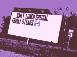
I think you should reconsider the grey background and replace it with white. The gray just doesnt seem to compliment anything. The white would give good constrast to the purple and really help bring out to the middle white of the sign. Maybe stick a thin 1px black border around your image. Think it over....:cool:
 
pavetheforest said:
I think you should reconsider the grey background and replace it with white. The gray just doesnt seem to compliment anything. The white would give good constrast to the purple and really help bring out to the middle white of the sign. Maybe stick a thin 1px black border around your image. Think it over....:cool:
Well, there are the other images to think about... what about a very light grey?
 
for the navigation menu you put up there:

Try to put them all in either small letters or caps and preferrably in a sans-seriff font. It will make them look much nicer. try to separate the words out and may be put in a dot between them.

I really like the way you have posterised the background images,
 
Register on MacRumors! This sidebar will go away, and you'll see fewer ads.