Become a MacRumors Supporter for $50/year with no ads, ability to filter front page stories, and private forums.

Strider64

macrumors 68000
Original poster
Dec 1, 2015
1,511
13,531
Suburb of Detroit
I have been slowly been slowly redesigning/redeveloping my website and the reason for the slow development is due to personal matters that I'm not going to go into. I though hopefully will be speeding up my progress over the next couple weeks/months though I have learn to take one day at a time.

Here's my current website : https://www.pepster.com/index.php

Here's what I'm working on: http://rocketryoftech.com/index.php

Even my main website has been taking a hit for that isn't even the way I want it, but it is what it is. I am trying to go for the simplest look by that I mean I want it to look unclutter and professional. Any helpful suggestions or critiques would be useful, right now I'm still working on my Logo. I will be installing a login system and might try once again to implement a Facebook login system.

If anyone is interested the calendar was developed by me using PHP OOP and I'm willing to give the source code away for FREE. It even has an individual daily booking system (that isn't yet implemented yet on the development site) and would be pretty easy for a person with average to advance PHP coding skills to install.
 

olup

Cancelled
Oct 11, 2011
383
40
I have been slowly been slowly redesigning/redeveloping my website and the reason for the slow development is due to personal matters that I'm not going to go into. I though hopefully will be speeding up my progress over the next couple weeks/months though I have learn to take one day at a time.

Here's my current website : https://www.pepster.com/index.php

Here's what I'm working on: http://rocketryoftech.com/index.php

Even my main website has been taking a hit for that isn't even the way I want it, but it is what it is. I am trying to go for the simplest look by that I mean I want it to look unclutter and professional. Any helpful suggestions or critiques would be useful, right now I'm still working on my Logo. I will be installing a login system and might try once again to implement a Facebook login system.

If anyone is interested the calendar was developed by me using PHP OOP and I'm willing to give the source code away for FREE. It even has an individual daily booking system (that isn't yet implemented yet on the development site) and would be pretty easy for a person with average to advance PHP coding skills to install.

Who's your target audience for this site?
If it's meant, just for you and you don't particularly care about what it looks like, then it's fine the way it is. But if you're trying to get an audience for it, you need to find a designer and work on typography,layout and the logo.
 
  • Like
Reactions: besler3035

tobefirst ⚽️

macrumors 601
Jan 24, 2005
4,612
2,335
St. Louis, MO
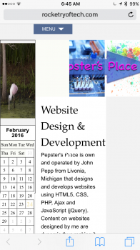
Here is what it looks like on my phone, in case you haven't considered mobile devices.
 

Attachments

  • image.png
    image.png
    568.5 KB · Views: 231

Strider64

macrumors 68000
Original poster
Dec 1, 2015
1,511
13,531
Suburb of Detroit
Thanks! Yeah I haven't gotten to the mobile portion of the design yet. They say it's easier to design first for mobile, tablets and then PC. However, I don't mind doing it the other way around. There's so much to consider in designing and developing a website, I wish there were more hours in a day. :D
 

besler3035

macrumors 6502a
Oct 29, 2004
561
110
Grand Rapids, MI
Stay away from Comic Sans in that logo. Just...stay away.
Who's your target audience for this site?
If it's meant, just for you and you don't particularly care about what it looks like, then it's fine the way it is. But if you're trying to get an audience for it, you need to find a designer and work on typography,layout and the logo.
Agreed here. As a web designer until this past December (now full-time photographer), I can tell you that this design would've been great 10 years ago. Get started by looking at places like siteinspire.com, smashingmagazine.com, etc. to give you some ideas of what's expected in terms of usability and design.
 

Strider64

macrumors 68000
Original poster
Dec 1, 2015
1,511
13,531
Suburb of Detroit
Stay away from Comic Sans in that logo. Just...stay away.

Agreed here. As a web designer until this past December (now full-time photographer), I can tell you that this design would've been great 10 years ago. Get started by looking at places like siteinspire.com, smashingmagazine.com, etc. to give you some ideas of what's expected in terms of usability and design.
This website still is in it's very early stages, the problem I having is I'm developing and designing at the same time, but more developing lately than designing. I have typography knowledge (college course) of what should go where and know that serif font is generally used for titles and headings, while sans-serif is general used for paragraphs and text that people read thoroughly and should read easily. The logo is something I threw together to get an idea and last night I came up with a more refined logo (I hope). I agree I need to start visiting smashingmagazine.com again and look other websites for ensiparation and ideas. I need to put down my development hat and solely concentrate on the design portion. The problem I have (I been this way my whole life) is that I jump around from one project to another and never finish what I start. Though I have a lot of development work done, but unfortunately that portion is rarely ever seen or noticed by the average website visitor. :( One of my New Year's resolution is to complete tasks and that would be design work. I'll post back when I further along with the website, for like I said it's in it very early stages. Thanks for the input.
[doublepost=1456334548][/doublepost]Wow, that is weird I didn't notice, but my Photoshop has a little quirk in it, I select a font that says Calibri font ( a sans-serif ) font but it gives it says Chalkboard font (or something) to that effect. Anyways I just change it good old Arial, but like I said I still in the process of redesigning the logo.
 

960design

macrumors 68040
Apr 17, 2012
3,795
1,674
Destin, FL
Any helpful suggestions or critiques would be useful, right now I'm still working on my Logo.
1) What does your website solve for me? 2) Can I figure that out in five seconds or less? 3) If it can solve my 'problem' how do I get you to start working on it?

I'm not trying to be mean, but here is my thought process in building sites for customers:
Websites are not for you(website owner), they are not to market your abilities or products, no one cares about your website.

Get rid of the calendar. Does not help with #1.
Do not do the slow navigation button transitions. Make the transition obvious and less than .3 of a second.
Think about what your logo would look like in only black and white. Build off of that.
 
Last edited:

D.T.

macrumors G4
Sep 15, 2011
11,050
12,467
Vilano Beach, FL
I'd grab a nice static template, probably something Bootstrap based, then you can easily incorporate the design into what it _sounds_ like you want to focus on, and that's the backend.

Like others have pointed out, if it's just for knocking around, coding around, then go have fun :) If it's to create any sort of online business presence, you'll definitely want something a little more polished. Your old site seems to suggest that you want to market your services as a web developer/dev/designer[?]

Side note: I wouldn't get too far into the weeds about the tech, you spend quite a few cycles talking about PHP, the tech is largely irrelevant, it's the solution that counts.
 
Register on MacRumors! This sidebar will go away, and you'll see fewer ads.