Relatively long post this one but I feel it's warranted to get my thoughts across accurately.
UPDATE: I've added some thoughts on post #32 after spending two weeks with the machine working in Lightroom, on a photographic safari.
The backstory:
My equipment is used to earn my sole income as a wildlife photographer and I understand there is almost always a compromise somewhere in a purchasing decision. I buy whatever fits my workflow needs the most efficiently based on how I prioritise those compromises. Admittedly though, I was partially dreading my TB13 arriving (3.3/16/512) because there has been so much negativity surrounding these new machines.
This is not my main machine. I use a fully loaded 2012 iMac for my heavy lifting because I feel any laptop is a compromise on ultimate power so I used a 2012 11" Air for light editing on the move, writing articles and running Keynote presentations when I host talks. Despite not being a 'pro' labelled machine, I needed portability over power, so it was every bit as 'pro' as my needs for a laptop required.
Now those needs have changed a little and I require more power on the move so, despite being barely two days old, here are my thoughts so far...
Build:
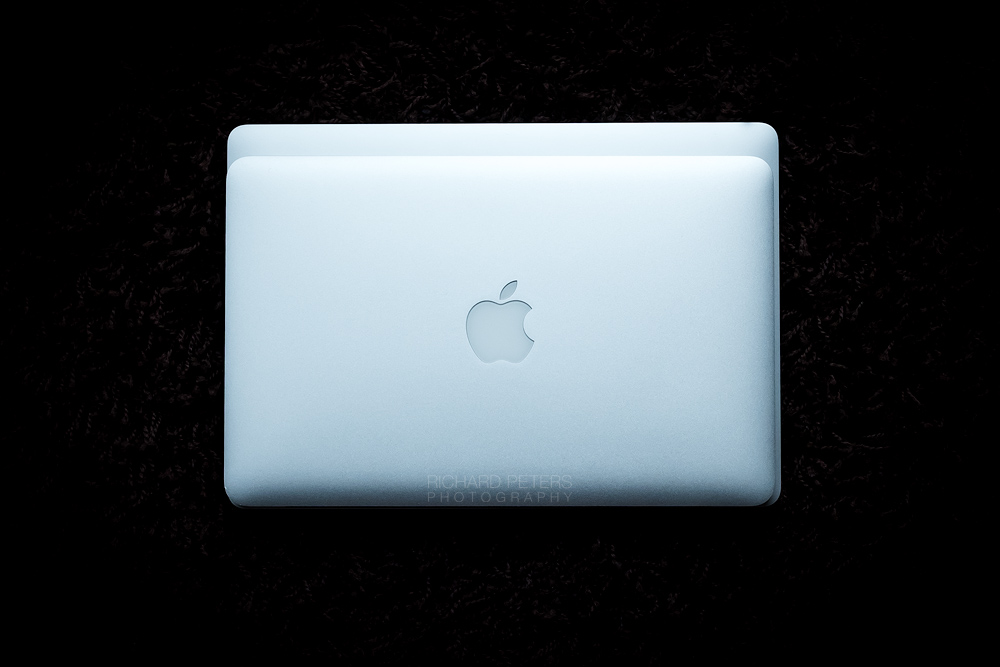
I hadn't seen one of these in the flesh until mine arrived so I was amazed at just how thin it is even after seeing photos of it online. The build is typically first class. For me, the priority in a portable computer is the portability. Personally, I think it's phenomenal just how small and light this thing is considering the specs and as I travel with a lot of heavy camera gear I greatly appreciate the advancements in reducing the weight and footprint, which now isn't much larger than my old 11" Air, as the image below demonstrates.

I do miss MagSafe. I never had an issue with the old charger and my original one from the MBA is still going strong despite dragging it all over the world. If nothing else, a charging LED would be nice on the new cable.
I thought I'd miss the lit Apple logo on the lid but the white plastic suddenly looks very dated compared to the sleek mirror finish of the logo on the MBP.
Battery Life:
I have Dropbox and Adobe CC running in the toolbar and use Ghostery for Safari. Bluetooth and Siri are both off. My first 24 hours with it went as follows:
I turned off wifi the second night and noted there was zero battery drain from midnight to 930am. So it seems having wifi on allows the machine to perform tasks when asleep, despite all Energy Saving settings and Do Not Disturb being on. No major deal but it would be nice to have zero drain when sleeping without having to turn off wifi manually.
I did notice when using Pages the laptop heats up quite a bit. The fans don't come on but it is noticeably hotter so I presume that'll mean Pages uses more CPU power than I would have expected.
Keyboard:
I've never tried the 12" MB so was concerned how I'd find these shallow keys but so far I like it a lot more than I expected. I would prefer it to be a little quieter but I quite like the clickiness of it. I've spent a good few hours writing on it so far and the more I write, the more I enjoy. That being said I think there is definitely an adjustment period which I haven't quite broken through the threshold of just yet. That said, going back to the 11" Air keyboard after two days the keys seem tiny and the entire thing feels very old and cumbersome.
I have had the letter 't' double type three or four times, so I'll keep an eye on that. At first I thought it was just me but it's the only letter to have done it, so it might be a sticky key although I can't replicate it when I try.
Keyboard backlight seems much dimmer on low setting compared to my old Air, which was very bright even at 1 or 2.
TouchBar:
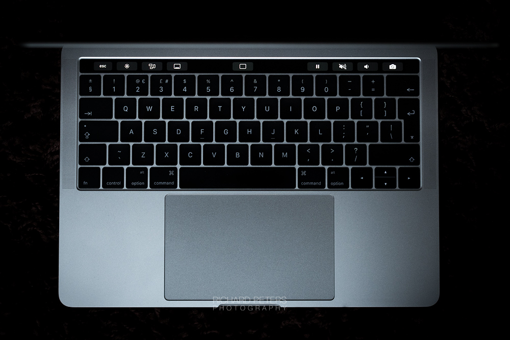
I didn't purchase this machine based on the TB but more based on how much power I could get for the smallest footprint. I have the TB set to display the expanded control strip and I've removed the buttons I don't need, and grouped the ones I do left and right with a space in the middle. Having the customisation is really nice and I'm not fussed about the contextual stuff within apps (unless Adobe do something cool with Lightroom) so all the most used things are always where I want them, laid out how I want them. Whilst not currently a game changing workflow tool, I expect it to mature in time and become more useful.

I was surprised to see how low resolution it looks compared to the Retina screen. That's not to say it's bad but it certainly looks a little fuzzy with all that beautiful crisp text directly above it!
I get why Apple didn't expand the TB to the far left of the strip area, so it balanced with the Touch ID, but I'm torn between appreciating the symmetrical look and feeling like it's wasted space.
It bugs me the escape button is shorter than the rest, so even with an equal amount of buttons either side of the TB, it's not quite symmetrical.
The shortcut to the screensaver is very useful for me as it means now have an impromptu slideshow of my work always ready to go.
Screen:
I'm coming from a 2012 11" MBA. What else is there to say? Actually, what I will say is I'm surprised at just how crisp everything looks to my eyes at all resolutions. Even 1680 x 1050 looks impressive and easily usable should I ever need the extra space. I have it set on default for display (scaled to 1440 x 900) and find the difference in text sharpness between that and 1280 x 800 to be negligible when looking close, and identical at a normal working distance.
My iMac screen now looks a little naff, so I am more eager than ever to see the 2017 iMac refresh happen!
Trackpad:
Love the size. No accidental clicks or issues with Tap to Click enabled. It's my first haptic trackpad and I like it a lot.
Thunderbolt/USB-C only:
I replaced several cables so I can still connect exactly the same things as before with the same amount of cables as before. Job done. Having a bank of ports that can perform the tasks of any other port is far more in keeping with a high end machine in my view. For those using it primarily on a desk, you can now use a hub to connect everything, via one cable, and hide it away. Far more elegant than multiple cables coming out of all sides, IMO.
I buy a laptop with the intention of it lasting 3 or 4 years so I don't want something that will be compromised in flexibility or port speed a few years from now, which is what a USB-A port would have been. To be at the cutting edge of technology I can live with having to compromise in the short term with new cables, which are not a burden.
I think the ports would possibly benefit from being a little further apart.
No SD reader:
For me it's of no concern as out of the 10 DSLR's I've owned over the years, 7 never supported SD and the newer ones that do, offer it as a secondary, slower, slot against the faster CF and XQD (and soon, I expect CFast). I value the ability to clear the buffer and send files to the computer as fast as possible, so having a high-end laptop that only supports the slowest card format never made sense to me anyway, even if it is the most popular amongst vloggers and enthusiasts.
Performance:
I've not really thrown anything big at it yet. However it'll be coming out to Africa with me for two weeks at the start of February for a couple of workshops I'm running, so it'll get more of a workout then.
Price:
Like others, my biggest issue with this machine is the price. It's a lot of money. A lot. Especially here in the UK. But this isn't exclusive to Apple. Camera companies are putting prices up too. As an example, the latest 70-200 f2.8 lens I picked up retails at £2599 versus the previous version which is still available now at £1999 (and when it first came out, was about £1599). The version before that retailed at about £1299 on release. Things are getting expensive and it's becoming ever more painful to buy high-end goods! But with that lens, and just like with computers, cars or any goods really, there are cheaper alternatives. Nobody is forced to buy anything so it feels stupid to complain, as I could buy something cheaper if I really wanted.
Final thoughts:
I am thrilled with the 2016 MBP. No two ways about it. Blatant hardware failures aside, I feel like a lot of the bashing this machine has been given possibly stems either from resentment in justifying the price or it not being the right tool for the job but people want it to be because it's new and shiny, when actually something smaller, cheaper, lighter, faster, a desktop machine or more legacy connected, is. It's great to have the latest stuff but if it's not the right fit for your needs buy what is and be happy. Mine is now happily living inside it's new Joli sleeve and I'm delighted with it. Perfect tool for the job, both the sleeve and the MBP!

Ultimately, to each their own. All I can say is the TB13" MBP is, for me, simply the best laptop on the market with a perfect balance between portability, power and build. The 11" MacBook Air was my favourite computing experience of all time and I was dreading the day it would need to be replaced. That is no longer the case.
UPDATE: I've added some thoughts on post #32 after spending two weeks with the machine working in Lightroom, on a photographic safari.
The backstory:
My equipment is used to earn my sole income as a wildlife photographer and I understand there is almost always a compromise somewhere in a purchasing decision. I buy whatever fits my workflow needs the most efficiently based on how I prioritise those compromises. Admittedly though, I was partially dreading my TB13 arriving (3.3/16/512) because there has been so much negativity surrounding these new machines.
This is not my main machine. I use a fully loaded 2012 iMac for my heavy lifting because I feel any laptop is a compromise on ultimate power so I used a 2012 11" Air for light editing on the move, writing articles and running Keynote presentations when I host talks. Despite not being a 'pro' labelled machine, I needed portability over power, so it was every bit as 'pro' as my needs for a laptop required.
Now those needs have changed a little and I require more power on the move so, despite being barely two days old, here are my thoughts so far...
Build:
I hadn't seen one of these in the flesh until mine arrived so I was amazed at just how thin it is even after seeing photos of it online. The build is typically first class. For me, the priority in a portable computer is the portability. Personally, I think it's phenomenal just how small and light this thing is considering the specs and as I travel with a lot of heavy camera gear I greatly appreciate the advancements in reducing the weight and footprint, which now isn't much larger than my old 11" Air, as the image below demonstrates.

I do miss MagSafe. I never had an issue with the old charger and my original one from the MBA is still going strong despite dragging it all over the world. If nothing else, a charging LED would be nice on the new cable.
I thought I'd miss the lit Apple logo on the lid but the white plastic suddenly looks very dated compared to the sleek mirror finish of the logo on the MBP.
Battery Life:
I have Dropbox and Adobe CC running in the toolbar and use Ghostery for Safari. Bluetooth and Siri are both off. My first 24 hours with it went as follows:
- I charged it to 100% then took it off battery power at 230pm.
- I played around with screen brightness during the first hour or two but eventually settled at 50% and used it on and off most of the afternoon and evening to write a magazine article in Pages, surf the web and play around with setting it all up. I also didn't notice the keyboard backlight wasn't turning off until about 8pm but I then read the fix for the bug on here and got it behaving properly.
- It slept all night from 11pm to 10am and used 5% power during that time period.
- I used it on and off all morning to write some emails, visit several websites and update to macOS 10.12.3.
- It slept from 130pm to 8pm at which point it had 20% left (drained about 3% in that sleep)
- I used it until the 5% remaining warning came on at 9:43pm. At this point it had been off of mains power for just over 31 hours although Activity Monitor was telling me the usage time on battery was 11 hours 22 minutes, so I'm not sure what that's actually referring too?
I turned off wifi the second night and noted there was zero battery drain from midnight to 930am. So it seems having wifi on allows the machine to perform tasks when asleep, despite all Energy Saving settings and Do Not Disturb being on. No major deal but it would be nice to have zero drain when sleeping without having to turn off wifi manually.
I did notice when using Pages the laptop heats up quite a bit. The fans don't come on but it is noticeably hotter so I presume that'll mean Pages uses more CPU power than I would have expected.
Keyboard:
I've never tried the 12" MB so was concerned how I'd find these shallow keys but so far I like it a lot more than I expected. I would prefer it to be a little quieter but I quite like the clickiness of it. I've spent a good few hours writing on it so far and the more I write, the more I enjoy. That being said I think there is definitely an adjustment period which I haven't quite broken through the threshold of just yet. That said, going back to the 11" Air keyboard after two days the keys seem tiny and the entire thing feels very old and cumbersome.
I have had the letter 't' double type three or four times, so I'll keep an eye on that. At first I thought it was just me but it's the only letter to have done it, so it might be a sticky key although I can't replicate it when I try.
Keyboard backlight seems much dimmer on low setting compared to my old Air, which was very bright even at 1 or 2.
TouchBar:
I didn't purchase this machine based on the TB but more based on how much power I could get for the smallest footprint. I have the TB set to display the expanded control strip and I've removed the buttons I don't need, and grouped the ones I do left and right with a space in the middle. Having the customisation is really nice and I'm not fussed about the contextual stuff within apps (unless Adobe do something cool with Lightroom) so all the most used things are always where I want them, laid out how I want them. Whilst not currently a game changing workflow tool, I expect it to mature in time and become more useful.

I was surprised to see how low resolution it looks compared to the Retina screen. That's not to say it's bad but it certainly looks a little fuzzy with all that beautiful crisp text directly above it!
I get why Apple didn't expand the TB to the far left of the strip area, so it balanced with the Touch ID, but I'm torn between appreciating the symmetrical look and feeling like it's wasted space.
It bugs me the escape button is shorter than the rest, so even with an equal amount of buttons either side of the TB, it's not quite symmetrical.
The shortcut to the screensaver is very useful for me as it means now have an impromptu slideshow of my work always ready to go.
Screen:
I'm coming from a 2012 11" MBA. What else is there to say? Actually, what I will say is I'm surprised at just how crisp everything looks to my eyes at all resolutions. Even 1680 x 1050 looks impressive and easily usable should I ever need the extra space. I have it set on default for display (scaled to 1440 x 900) and find the difference in text sharpness between that and 1280 x 800 to be negligible when looking close, and identical at a normal working distance.
My iMac screen now looks a little naff, so I am more eager than ever to see the 2017 iMac refresh happen!
Trackpad:
Love the size. No accidental clicks or issues with Tap to Click enabled. It's my first haptic trackpad and I like it a lot.
Thunderbolt/USB-C only:
I replaced several cables so I can still connect exactly the same things as before with the same amount of cables as before. Job done. Having a bank of ports that can perform the tasks of any other port is far more in keeping with a high end machine in my view. For those using it primarily on a desk, you can now use a hub to connect everything, via one cable, and hide it away. Far more elegant than multiple cables coming out of all sides, IMO.
I buy a laptop with the intention of it lasting 3 or 4 years so I don't want something that will be compromised in flexibility or port speed a few years from now, which is what a USB-A port would have been. To be at the cutting edge of technology I can live with having to compromise in the short term with new cables, which are not a burden.
I think the ports would possibly benefit from being a little further apart.
No SD reader:
For me it's of no concern as out of the 10 DSLR's I've owned over the years, 7 never supported SD and the newer ones that do, offer it as a secondary, slower, slot against the faster CF and XQD (and soon, I expect CFast). I value the ability to clear the buffer and send files to the computer as fast as possible, so having a high-end laptop that only supports the slowest card format never made sense to me anyway, even if it is the most popular amongst vloggers and enthusiasts.
Performance:
I've not really thrown anything big at it yet. However it'll be coming out to Africa with me for two weeks at the start of February for a couple of workshops I'm running, so it'll get more of a workout then.
Price:
Like others, my biggest issue with this machine is the price. It's a lot of money. A lot. Especially here in the UK. But this isn't exclusive to Apple. Camera companies are putting prices up too. As an example, the latest 70-200 f2.8 lens I picked up retails at £2599 versus the previous version which is still available now at £1999 (and when it first came out, was about £1599). The version before that retailed at about £1299 on release. Things are getting expensive and it's becoming ever more painful to buy high-end goods! But with that lens, and just like with computers, cars or any goods really, there are cheaper alternatives. Nobody is forced to buy anything so it feels stupid to complain, as I could buy something cheaper if I really wanted.
Final thoughts:
I am thrilled with the 2016 MBP. No two ways about it. Blatant hardware failures aside, I feel like a lot of the bashing this machine has been given possibly stems either from resentment in justifying the price or it not being the right tool for the job but people want it to be because it's new and shiny, when actually something smaller, cheaper, lighter, faster, a desktop machine or more legacy connected, is. It's great to have the latest stuff but if it's not the right fit for your needs buy what is and be happy. Mine is now happily living inside it's new Joli sleeve and I'm delighted with it. Perfect tool for the job, both the sleeve and the MBP!

Ultimately, to each their own. All I can say is the TB13" MBP is, for me, simply the best laptop on the market with a perfect balance between portability, power and build. The 11" MacBook Air was my favourite computing experience of all time and I was dreading the day it would need to be replaced. That is no longer the case.
Last edited:

