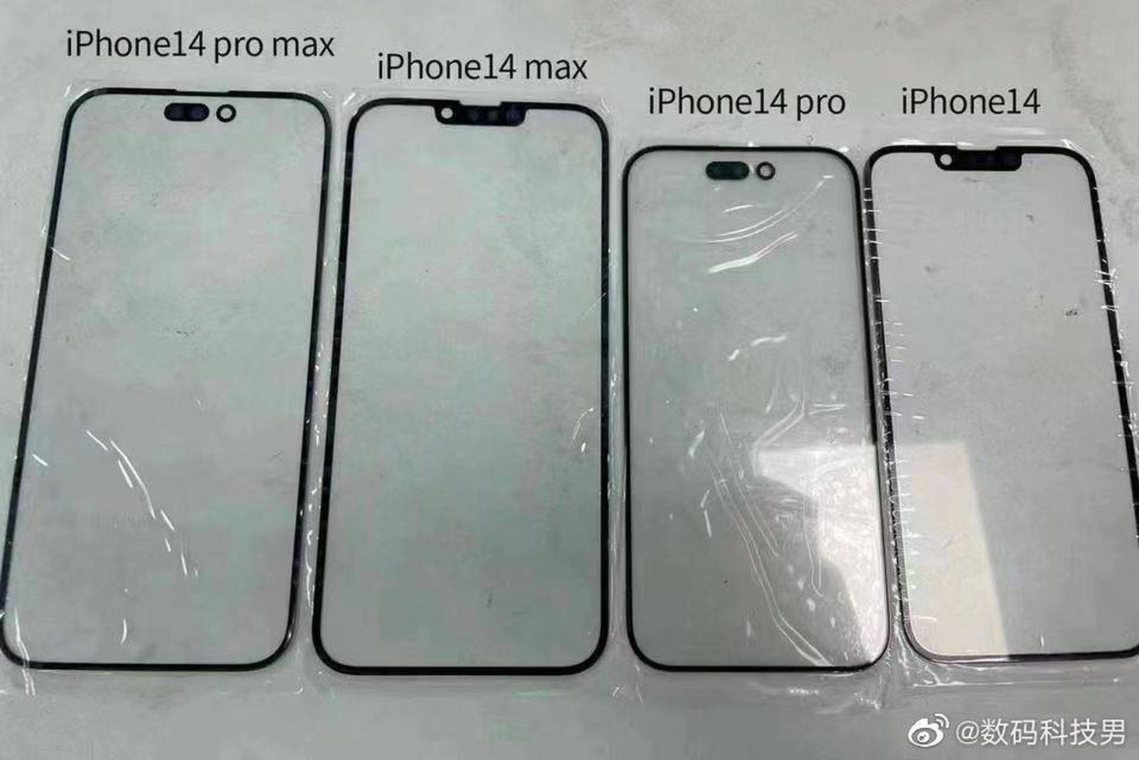
If the final product looks anything like the rumored renders, this will be a classy looking device. I totally get why they separate the two module spaces. And even though the space above will not matter from a UI perspective, the UX will improve by the area becoming less noticeable — even though I don’t even notice the module space on my 13PM.
Not sure why there is any negativity on what we’re seeing (which won’t look as a good as the final product). Most likely the negative comments are from trolls, shills, or people who generally don’t like change. In any case, based on what they suggest, I’m glad these people are not making design decisions at Apple.
It’s going to look great! The only question now is which Android handset maker will copy their design first?