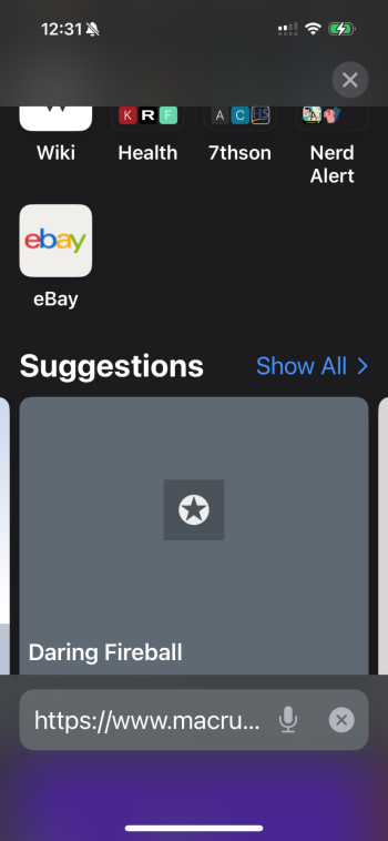
Just updated my iphone 15pro to iOS 18.1. Can anyone explain the rationale of making the Safari website suggestions so large they take up most of the screen? In prior versions, when I would tap the address bar, website suggestions would display as rows of icons matching the size of my book marks, making it simple to tap one without much effort. Now I have to scroll through these comically large tiles that serve no purpose other than making it take longer to find the website I’m looking for. It seems like an accessibility feature for people with poor vision. I just don’t understand the reason behind it, unless it’s just implementing change for change sake.
Got a tip for us?
Let us know
Become a MacRumors Supporter for $50/year with no ads, ability to filter front page stories, and private forums.
Safari iOS 18.1 website suggestions
- Thread starter 7thson
- Start date
- Sort by reaction score


