Become a MacRumors Supporter for $50/year with no ads, ability to filter front page stories, and private forums.

johndoe123abc

macrumors member
Original poster
Jul 10, 2012
64
0
Is it just me, or are the traffic lights not vertically centred in Safari? They appear to look okay on Maps.

Actually I've noticed this quite a bit with rendered text inside controls as well e.g. text in the Safari address bar.
 
Is it just me, or are the traffic lights not vertically centred in Safari? They appear to look okay on Maps.

Actually I've noticed this quite a bit with rendered text inside controls as well e.g. text in the Safari address bar.

I haven't really noticed, but i don't look that close at them (who does?). I would say they are bugs. These will no doubt be fixed before the GM release.
 
Just took a screenshot and measured in Photoshop. They are indeed centered.
 
I just checked and they are not centered vertically, but slightly higher up. I also found this image from an article. The other toolbar buttons are centered. I don't find that it matters though, there might be a good reason for it. Having things perfectly centered sometimes looks incorrect. This could have been done to maintain the top horizontal line of the buttons, for example. Gradients also visually obscure spacing. Better yet, how were they in Mavericks?

k50fuw5wlrnwhk2g4afh.png
 
I just checked and they are not centered vertically, but slightly higher up. I also found this image from an article. The other toolbar buttons are centered. I don't find that it matters though, there might be a good reason for it. Having things perfectly centered sometimes looks incorrect. This could have been done to maintain the top horizontal line of the buttons, for example. Gradients also visually obscure spacing. Better yet, how were they in Mavericks?

Image

In Mavericks, they sit above the toolbar.
 
I just checked and they are not centered vertically, but slightly higher up. I also found this image from an article. The other toolbar buttons are centered. I don't find that it matters though, there might be a good reason for it. Having things perfectly centered sometimes looks incorrect. This could have been done to maintain the top horizontal line of the buttons, for example. Gradients also visually obscure spacing. Better yet, how were they in Mavericks?

Image

I knew I wasn't imagining it! I also dislike the text position in the address bar, seems stuck to the bottom with a lot of whitespace at the top :(
 
What I don't like is having the traffic lights directly next to the back/forward button. Just stupid.
 
What I don't like is having the traffic lights directly next to the back/forward button. Just stupid.

Customise your toolbar. I swapped the "navigation" buttons with the "Show Sidebar" button. That said, I rarely use them since I have a magic trackpad.
 
Don't get your hopes up for a fix.
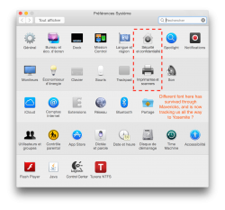
Even obvious design problems never get fixed. This one has annoyed me for over a year now :
 

Attachments

  • Capture d’écran 2014-06-23 à 13.28.16.png
    Capture d’écran 2014-06-23 à 13.28.16.png
    411.6 KB · Views: 338
That’s the same font, long words just get kerned to fit. Blame your verbose language.

There's still something that doesn't work : they are even vertically misaligned.

About the printers and scanners... the "and" could have been on the second line to avoid all that.
And the Security and confidentiality, the "and" could have been on the first line. It's really as if they hadn't tested it.

It seems to me that internalization of OS X is always rushed; since I've got my first mac, I got into the habit of swapping the system language to English (US) as soon as possible.
 
French isn't particularly more verbose than american English, IMHO.

In this case it definitely is. Wasn’t talking generally.

The vertical alignment is definitely off by 2px on the printer text though. That’s pretty odd.

----------

About the printers and scanners... the "and" could have been on the second line to avoid all that.
And the Security and confidentiality, the "and" could have been on the first line. It's really as if they hadn't tested it.
Good point.
 
Register on MacRumors! This sidebar will go away, and you'll see fewer ads.