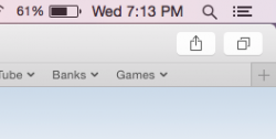
Hey guys I don't know about you, but when there are no tabs open the button to add another tab is just floating, and doesn't have a real cohesive look as compared to the rest of the app. What do you guys think. Looks nice otherwise, didn't realize the windows would have the curve they do.
Become a MacRumors Supporter for $50/year with no ads, ability to filter front page stories, and private forums.
Safari Ugliness (Trivial)
- Thread starter C.clavin
- Start date
- Sort by reaction score
You are using an out of date browser. It may not display this or other websites correctly.
You should upgrade or use an alternative browser.
You should upgrade or use an alternative browser.
Mine is different. It's located in the lower-right corner here. Perhaps it got something to do with which toolbars you got active? (if any) I got both the tabs and the bookmarks toolbars active and even if I hide both, the plus-button still lines up perfectly in the lower-right corner.
Hey guys I don't know about you, but when there are no tabs open the button to add another tab is just floating, and doesn't have a real cohesive look as compared to the rest of the app. What do you guys think. Looks nice otherwise, didn't realize the windows would have the curve they do.
It's a bug, after closing View Tabs or the View Favorites bar the top doesn't always resize properly.
Strange, should I report it? Seems to be an important area in the operating system.
Can't hurt to get it logged.
I reported something similar were you can't show both Favorites and Tabs, at least consistently.
Use the Feedback Assistant, I assume they have some degree of automation to filter though all the reports. I'd like to think we'll make this a better release for our efforts.
Strange, should I report it? Seems to be an important area in the operating system.
When you have the Favorites Bar on it looks really good.
Attachments
Hey guys I don't know about you, but when there are no tabs open the button to add another tab is just floating, and doesn't have a real cohesive look as compared to the rest of the app. What do you guys think. Looks nice otherwise, didn't realize the windows would have the curve they do.
I've never experienced this on Yosemite.
Register on MacRumors! This sidebar will go away, and you'll see fewer ads.


