Become a MacRumors Supporter for $50/year with no ads, ability to filter front page stories, and private forums.

cynik

macrumors newbie
Original poster
Apr 13, 2013
7
0
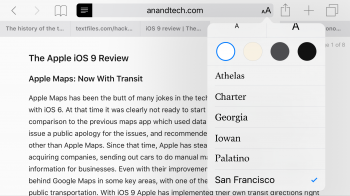
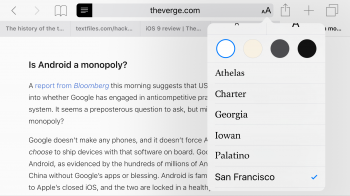
Has anyone noticed, for those of you who frequent theverge.com, that when using the Reader mode to read their articles, San Francisco font text is thin, but using the Reader mode elsewhere with San Francisco font presents a normal/heavier font? Does anyone know why it's not consistent?
 

Attachments

  • image.png
    image.png
    733.7 KB · Views: 148
  • image.png
    image.png
    715.8 KB · Views: 98

KALLT

macrumors 603
Sep 23, 2008
5,380
3,415
I have the same on El Capitan. Reader mode seems to save your preferences per website. It could be that iOS 9 has not overridden all of the style settings or that the markup of the website somehow interferes with the reader mode (it’s also just HTML, Javascript and CSS). Or it’s simply another unrelated bug.

Edit: When I inspect the source code, I see that reader mode has added a font-weight property to the body text <p> elements. Odd. Maybe it uses that style for a particular part (like a headline, or quote or like) and misinterprets the structure of the article on The Verge.
 
Last edited:

cynik

macrumors newbie
Original poster
Apr 13, 2013
7
0
If that's the case, then I wouldn't mind because I quite like the thin font displayed on The Verge over the other sites.
 
Register on MacRumors! This sidebar will go away, and you'll see fewer ads.