Become a MacRumors Supporter for $50/year with no ads, ability to filter front page stories, and private forums.

JohnMC

macrumors 6502
Original poster
May 5, 2006
386
1
Duluth, MN
Hi All,

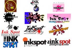
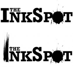
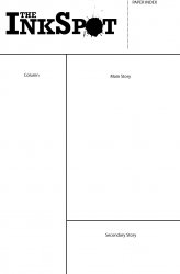
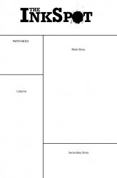
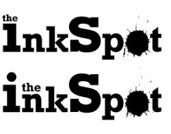
I am currently working on a redesign of my school newspaper and I thought I would tackle the logo first. I am not a graphic design student so I'm looking for some opinions regarding what the professionals on MacRumors would do. I have not decided on color(s) yet but the paper is printed by a CYMK press. What do you think and what do you like/not like.

Thanks,
John
 

Attachments

  • New Logo.jpg
    New Logo.jpg
    95 KB · Views: 570
Is the newspaper in black and white or color ?

If black and white the top one looks pretty good but it should be much wider if it's to be at the top of the paper.
 
We have a twelve page newspaper with the cover, back and pages 6 & 7 in color. Next to the logo on the masthead is were we put the index.
 
Currently yes. We run a single wide strip down the left and have a wide strip on the right with our cover story.
 
Here is a very boring view of what the design layout of the paper currently looks like.

John
 

Attachments

  • Front Page.jpg
    Front Page.jpg
    118 KB · Views: 121
Here's a revision.

I like the placement of this one. I'm not sure about all lowercase as suggested by SwiftLives, but it would be easy to try. I like initial caps in web addresses on business cards and such, but that's not important in a masthead because the font is large.

Dale

I did not steal your avatar. Honest.
 
Peace -- I like the placement of the index on your revision. I might steal your idea.

Swiftlives -- Here is the logo set with lowercase type.

Does anyone have suggestions for color use (possibly one or two colors)?

John
 

Attachments

  • New Logo_lowercase.jpg
    New Logo_lowercase.jpg
    65.2 KB · Views: 306
even though as a designer, i'm usually favouring minimalist works, i have to admit that you pulled off something uniquely different in the second original logo (the one with the ink stroke), and that's what I'd use. Otherwise, I think the type is generally good and set properly.
:)
 
Fonts may differ but the concept is not new

:eek:
First rule of design: Research.
Second rule of design: Originality.

Nevertheless, since this name and concept have apparently entered public domain, your first arrangement is most appealing (with improved kerning). I don't particularly care for the exaggerated character weights. I am a sucker for creative use of positive and negative spaces. Hence I wonder how a white spot would look in the negative space of the "p" or the "o." As I ponder, it may not work well on small versions - appearing as though the character plugged up a bit perhaps.

Dotting the "i" with the word "the" gives me the initial mistaken read of "link" instead of "ink."
 

Attachments

  • inkspots.jpg
    inkspots.jpg
    24.5 KB · Views: 283
Okay. Figured out what's bothering me.

On the letters you've made larger - as the size has increased, so has the relative weight. So the "I" and the "S" appear to be bolder and thicker than the rest. And it doesn't have a sense of deliberation to it. But that's not going to be a simple fix. Perhaps try it at all the same height? No small/drop caps.

It's unfortunately even more prevalent in the lowercase version. Of all that you've posted, the very first one is my fave. I'd just tinker with the kerning a little bit as a previous poster mentioned.
 
Register on MacRumors! This sidebar will go away, and you'll see fewer ads.