Become a MacRumors Supporter for $50/year with no ads, ability to filter front page stories, and private forums.

Silly John Fatty

macrumors 68000
Original poster
Nov 6, 2012
1,802
512
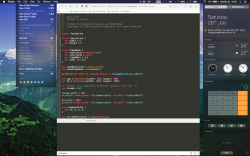
Does anyone have screenshots of Yosemite with a different desktop background?

I'm wondering what it would look like and perhaps I would have a different picture of it.

Thanks :)
 

=E=

macrumors regular
Nov 8, 2013
132
8
.se
Does anyone have screenshots of Yosemite with a different desktop background?

I'm wondering what it would look like and perhaps I would have a different picture of it.

Thanks :)

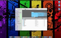
A while ago I tried it out on my MBP but before going back to Mavericks I posted this http://fav.me/d7pthpb on DeviantArt. Hope it helps. Everything is default, but not the wallpaper.
 

ebanoac

macrumors newbie
Jun 17, 2014
4
0
Salvador, Brazil
I Hope it helps ;)
 

Attachments

  • Captura de Tela 2014-07-17 às 22.11.00.jpg
    Captura de Tela 2014-07-17 às 22.11.00.jpg
    425.6 KB · Views: 611

Small White Car

macrumors G4
Aug 29, 2006
10,972
1,468
Washington DC
Hi,

How did you get your HD icon on the desktop to display your free space?

Can this be done in Mavericks ?

Many Thanks
Rob


When using the Finder, go to the 'View' menu and select 'Show View Options.'

Then check on 'Show Item Info.'

Note that this setting is per folder. So you need to do it on the desktop AND in any folders you want it to appear in. If you want it everywhere do it in a folder and then click "Use as Default" at the bottom of the View Options window.
 

djtech42

macrumors 65816
Jun 23, 2012
1,451
64
Mason, OH
It's a shame about the folder icon. It's the only thing that looks really ugly to me in Yosemite. I know it can be easily modified, but I can't believe Apple decided on that design.
 

hammie14

macrumors regular
Mar 18, 2010
247
145
UK
When using the Finder, go to the 'View' menu and select 'Show View Options.'

Then check on 'Show Item Info.'

Note that this setting is per folder. So you need to do it on the desktop AND in any folders you want it to appear in. If you want it everywhere do it in a folder and then click "Use as Default" at the bottom of the View Options window.

Many Thanks :D
 

kolax

macrumors G3
Mar 20, 2007
9,181
115
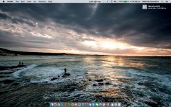
Looks nice with different backgrounds. The translucency effects are growing on me.

I do wish they'd tone the vibrance down though, I don't think I can be arsed manually toning down the folder icons, Finder etc.
 

3282868

macrumors 603
Jan 8, 2009
5,281
0
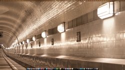
Dual display 27" LED LCD's in "Dark" theme
 

Attachments

  • Left.jpg
    Left.jpg
    786 KB · Views: 245
  • Right.jpg
    Right.jpg
    808.7 KB · Views: 248

Silly John Fatty

macrumors 68000
Original poster
Nov 6, 2012
1,802
512
Thanks guys! Like all of you, I'm disappointed about the icons etc. in the iOS 7/8-style, but it does look better with different backgrounds.
What I dislike the most is actually the font. Many will say it's not much of a deal, but personally, it irritates me somehow…
 

tomtendo

Suspended
Aug 29, 2009
813
933
Florida
Thanks guys! Like all of you, I'm disappointed about the icons etc. in the iOS 7/8-style, but it does look better with different backgrounds.
What I dislike the most is actually the font. Many will say it's not much of a deal, but personally, it irritates me somehow…

The new font - Helvetica Nueue - is beautiful! IMO
 

Silly John Fatty

macrumors 68000
Original poster
Nov 6, 2012
1,802
512
The new font - Helvetica Nueue - is beautiful! IMO

Yeah I like the font as well, but it's not the font that's the problem for me, but more that OSX uses this font. I also love Times New Roman for example, but simply couldn't imagine having the menus in Mac OS in that font haha.

So, it's just this habit of always seeing the same font that got "ruptured" for me, but I'll probably get used to it anyway… I mean just remember the Chicago font :D
 

iVikD

macrumors regular
Sep 11, 2011
227
11
Spain
Dark mode screencap, switched to light mode because the statusbar icons look retarded in dark
Screen%20Shot%202014-07-25%20at%2010.58.28%20PM%20(2).png
 
Last edited:

costica1234

macrumors regular
May 21, 2013
203
150
Dark mode, with iStat menus font changed to white and white f.lux icon as well (couldn't figure out how to make the rest of iStat with white ...). Looks pretty sleek on 1680 x 1050 display :D
 

Attachments

  • Screen Shot 2014-07-26 at 10.54.08.png
    Screen Shot 2014-07-26 at 10.54.08.png
    1.1 MB · Views: 282
  • Screen Shot 2014-07-26 at 19.17.44.png
    Screen Shot 2014-07-26 at 19.17.44.png
    2.8 MB · Views: 236
Last edited:

iVikD

macrumors regular
Sep 11, 2011
227
11
Spain
Dark mode, with iStat menus font changed to white and white f.lux icon as well (couldn't figure out how to make the rest of iStat with white ...). Looks pretty sleek on 1680 x 1050 display :D

How did you change f.lux to white?
I've been thinking of going into each app's resource files and editing their respective statusbar icons to make them white, shouldn't be too hard using photoshop, but what a pain in the ass...
For example, here's a screenshot of the 1password mini icon painted white (I just went into the resources and edited menubar.tiff)
Screen%20Shot%202014-07-26%20at%202.10.34%20PM.png


Also, would you mind sharing your wallpaper? It looks pretty great
 
Last edited:

costica1234

macrumors regular
May 21, 2013
203
150
How did you change f.lux to white?
I've been thinking of going into each app's resource files and editing their respective statusbar icons to make them white, shouldn't be too hard using photoshop, but what a pain in the ass...

That's how I changed f.lux as well, and I actually used Preview.app to make the icon white. Worked like a charm. You just have to edit the flux-icon-mono4.tiff pic inside /Contents/Resources.

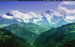
Also, would you mind sharing your wallpaper? It looks pretty great

See the attached file for it :). I actually took it from here: https://www.dropbox.com/sh/iotqud3fce1w1ar/AAA8eXnUmU8yyxf432L5vkWCa#/, a great link with stunning wallpapers posted by someone here on MacRumors. Definitely bookmark it!
 

Attachments

  • 03400_themightyjungfrau_2880x1800.jpg
    03400_themightyjungfrau_2880x1800.jpg
    591.3 KB · Views: 229

myevilclone

macrumors newbie
Aug 17, 2013
14
34
Black and White Versions! Love the black but I like sticking with the white because it makes the whole OS seem more unified.

c5fdd4.png

13caff.png

5c2df5.png


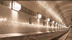
And just in case someone wants the wallpaper here you go:

03c4e3.jpg
 
Register on MacRumors! This sidebar will go away, and you'll see fewer ads.