Become a MacRumors Supporter for $50/year with no ads, ability to filter front page stories, and private forums.

bobby68

macrumors member
Original poster
Dec 28, 2009
53
8
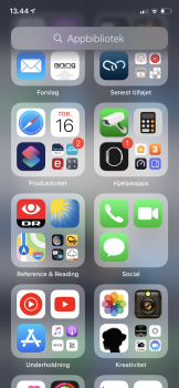
I can’t help feeling that the search bar on the widget and app-library page seems redundant showing all the time.

We can pull down and get to the search bar, just like on the homescreen where it doesn’t show all the time.

As it is now I think that it messes with the space for widgets and also in the app library.

What do you think?

I have suggested it in the feedback app.
 

Attachments

  • 2572C358-3787-4D87-B5C4-B5B1344844F9.png
    2572C358-3787-4D87-B5C4-B5B1344844F9.png
    1.4 MB · Views: 162
I would agree except for one point, the search on app drawer page serves a slightly different function than the other two, being purely reserved for apps and the alphabetised list. Aside from access to this list, I suppose it is slightly redundant. Certainly there is no need for the ‘Search’ graphic on the widgets screen.
 
I would agree except for one point, the search on app drawer page serves a slightly different function than the other two, being purely reserved for apps and the alphabetised list. Aside from access to this list, I suppose it is slightly redundant. Certainly there is no need for the ‘Search’ graphic on the widgets screen.

I get your point about the app library screen. But still it does the same as the search bar when we pull down on the screen - gives all the apps in an alphabetic list and let you search for an app.
 
I get your point about the app library screen. But still it does the same as the search bar when we pull down on the screen - gives all the apps in an alphabetic list and let you search for an app.

Yeah sure, I agree with getting rid of the graphic in this case, I thought initially you meant that all had the same functionality.
 
Register on MacRumors! This sidebar will go away, and you'll see fewer ads.