Become a MacRumors Supporter for $50/year with no ads, ability to filter front page stories, and private forums.

Woodrow72

macrumors member
Original poster
Nov 16, 2008
41
0
Utah
I have posted a few times in the past as well as a post earlier today seeking some advice. I appreciate the different points of view these forums have so I come to you, again, seeking comments and criticism on my photo's.

As I stated in an earlier post I have the desire to become a great photographer, the advice I have received thus far has been great and I look forward to hearing more.

I would like some comments and criticisms on some of the following photo's. Any advice or recommendations are appreciated. Thanks in advance!


Texture2.jpg


Bridge2.jpg


Bridge.jpg


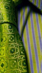
I have an obsession with neck ties. I have started wearing them to work and school and take the chance anytime I get to photograph ties. Here are two of my favorite. Side note: It is interesting the looks and comments you get when you walk up to a random person and ask them if you can take a picture of their tie, some are receptive others are taken aback.


Tie.jpg


Green&Blue.jpg
 

Phrasikleia

macrumors 601
Feb 24, 2008
4,082
403
Over there------->
The first three seem a bit empty to me; they're lacking a strong subject or focal point.

I suppose you could say that in the first one the tree is your subject, but it reads as a landscape here because of the tight crop. I love the leading lines and texture, but I feel as though something is missing--a point of resolution or visual pay-off.

Same with the bridge. It's not working as a subject in its own right because it leads us to something else. I think the B&W conversion works well, and the blur you applied is interesting, but doesn't do enough to keep my focus on one particular aspect of the bridge. I feel as though a person or some other subject ought to be in that bright spot on it.

The ties are nice, but not compelling. You should try to push it a bit with these shots. See what different angles or lighting might produce.
 

davegregory

macrumors regular
Jul 7, 2009
195
2
Burlington, Ontario
I like the tree photo the best of all, but I have to agree that it just lacks resolution. You're seeing the leading lines which is good, but the lines don't take me anywhere. In the B&W photo of the bridge, if you had a subject 1/4 into or 3/4 into the bridge I think it would be a much better photo. But I think you went a little overboard on the blur in PP in that picture. It's too obvious when viewed at full size. The tie doesn't work in B&W for me personally. Ties are usually colourful for a reason and I think the photo should reflect that. But that's just my opinion. The coloured photo you have of the tie is over saturated. The stripes in the shirt give it away, just something to look for when you're PPing your images. Your adjustments should be scaled across different shades on the same object. Also, compositionally, I would've pulled back more on this shot. I want to see more of the tie. Or maybe have the tie draped across a chair or hanging from a mirror and get the tie from different angles, get reflections. Everyone knows what a tie looks like on a person, change it up a bit maybe.

I too aspire to be a great photographer, it's an ongoing process. I look back at photos I took 2 years ago and think "What was I thinking with that?" "I should have done this". It's good to look back at your earlier work and criticize it as well.
 

Woodrow72

macrumors member
Original poster
Nov 16, 2008
41
0
Utah
Thank you both for you comments and suggestions! This is exactly what I am looking for!

On the first shot of the tree that you have both mention I was trying to capture the texture of the tree more so than anything else, but I do see what you are talking about that it should lead somewhere. I always have a hard time seeing this while I am shooting, but thats what practice is for right?

On the B/W version of the bridge I actually did not add any blur during PP I think that is because of the focus point when I shot it.

davegregory: I agree with you on the green tie is it very saturated and you're right it was done in PP. Thanks for the advice on the placing of ties for the future I have been trying to find another view or shot to take.

Phrasikleia: Can you explain what you mean by "push it a bit" I am always looking for a challenge and would love some suggestions on what you think should be done, I have seen a lot of your work on this site and respect your opinion and view as a photographer.

Thank you both for the recommendations and suggestions, I will take them into account as I continue shooting.
 

Designer Dale

macrumors 68040
Mar 25, 2009
3,950
101
Folding space
Your tie has a nice sense of color and line, but needs a deeper depth of field to keep everything sharp. These will all look the same and just become documentations of ties unless you use your imagination and make it into something else. I think that is what Madam P means by "pushing it".

I played with the green one.

Dale
 

Attachments

  • Green&Blue_1.jpg
    Green&Blue_1.jpg
    785.6 KB · Views: 73

jdl8422

macrumors 6502
Jul 5, 2006
491
0
Louisiana
I like the concept behind the ties. I like the colors and textures, I wouldnt use the ties for B/W, the color is what makes it, IMO. The pictures you showed on here are missing some "creativity". Not to knock you down at all. They just seem pretty boring. Maybe try different angles and focal points. I like the cropping on the above posting. All in all, keep snapping away and just have some fun with it. Thats the beauty of a digital camera, if it sucks, erase it lol
 

Phrasikleia

macrumors 601
Feb 24, 2008
4,082
403
Over there------->
Phrasikleia: Can you explain what you mean by "push it a bit" I am always looking for a challenge and would love some suggestions on what you think should be done, I have seen a lot of your work on this site and respect your opinion and view as a photographer.

Aw shucks, thanks. :)

Your tie has a nice sense of color and line, but needs a deeper depth of field to keep everything sharp. These will all look the same and just become documentations of ties unless you use your imagination and make it into something else. I think that is what Madam P means by "pushing it".

I played with the green one.

Dale

"Madam P"...I rather like it. :D Yes, that's basically what I meant. In other words, push it beyond the limits of expectation. I think one way to make a photo interesting is to capture something in a way that one wouldn't normally expect: from an unusual angle, from a view through a "frame" or "window" of some sort, in an unusual juxtaposition, at an unnatural scale, in a conceptually charged environment...basically anything that adds a layer that isn't a "given" and removes the photo from what is wholly ordinary. Another way is to capture something that is simply drop-dead gorgeous or extraordinary in its own right (in which case, the real challenge is to do it justice). Hope that helps. :)
 

Woodrow72

macrumors member
Original poster
Nov 16, 2008
41
0
Utah
Designer Dale: I love that crop! I am now on a mission to look for new ways to photograph these ties, thanks for the advice!

Phrasikleia: I understand now what you are talking about thanks for the advice and I look forward to pushing the envelope.

Thanks everyone else for the advice, it is very much appreciated, keep it coming!
 

micol124

macrumors member
May 29, 2008
36
0
Milan, Italy
Ok, so I love the two pictures with the bridge, the color picture more because of the colors and the B/W one for the lines... but I don't like the composition... I wish you could either crouch down lower or stand up higher and try the shot again.. those lines are really nice but I feel they are not at their best yet. I would also consider turning this into an HDR, or at least I'd play with it adding a little saturation and contrast... :)
I like the cropped version of the green tie that was suggested. You might also want to try a mask on the B/W tie picture so that only the tie looks colored.. or even a slight sepia color... :D Good job :D
 
Register on MacRumors! This sidebar will go away, and you'll see fewer ads.