Become a MacRumors Supporter for $50/year with no ads, ability to filter front page stories, and private forums.

Makosuke

macrumors 604
Original poster
Aug 15, 2001
6,801
1,522
The Cool Part of CA, USA
I'm trying to get a title style working, and am wondering if there's a clever way to do it that I'm missing. I've attached an image to demonstrate, but what I basically want to do is take some heading text and drop one or more words to just below the baseline, while actually displaying a bottom border that "splits" the two.

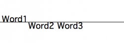
Visually, the result is one word above a line and the next below.

Now, I could get this working easily enough with a two-line heading and a bunch of custom positioning, but I'm trying to figure out some clever way of doing it with nothing but a single h1 tag and one or more spans to move the text up/down, something like this:

Code:
<h1>Word1 <span>Word2 Word3</span></h1>
This is so the page degrades well and makes sense semantically, and also because if it's all on one line I don't need to worry about getting the lower words spaced horizontally past the upper ones, just the vertical position.

I was thinking that, similar to some ways of getting linespacing consistent with superscripts, the vertical-align property combined with line-height: 0; would do this. But, while I can move text down with a vertical-align: -100% or somesuch, if I set a line height it refuses to move down past that setpoint, and if I don't it just pushes the bottom border of the containing h1 element, so the horizontal line is in the wrong place.

vertical-align: sub; does what I want (drops text through the bottom border), but of course it's only about 1/4 of a word drop, not a full character height.

Am I overlooking something, or is this just not going to work?
 

Attachments

  • droptext.png
    droptext.png
    5.2 KB · Views: 104
This'll get you there for the most part. Getting to closer to that line can be hard.

Code:
h1 {
 position: relative;
 border-bottom: 3px solid #000;
}
h1 span {
 position: relative; top: 1.2em;
}

Kudos on wanting to do it semantically :)
 
Thanks much for the tip. I had a feeling there was going to be a solution in that direction, but it probably would have taken me a ridiculous amount of time to get to that point.

Obviously the particular font and rendering engine will throw this off, but if you set values carefully and use px sizes, it's possible to get the text aligned pretty well, and when it does break it won't break horribly, it'll just be a slightly different look (more space or bumped through the line).

Now if everybody would just upgrade to a browser that supports downloadable fonts, the world would be a perfect place...
 
You could also use the HTML <sub> tag rather than a <span> so that semantically you've got a decent fallback and apply the styles mentioned above to that.
 
You could also use the HTML <sub> tag rather than a <span> so that semantically you've got a decent fallback and apply the styles mentioned above to that.

Actually the sub tag wouldn't be semantically correct. It's only for subscripts. The OP is simply styling the presentation of the words in the heading, which semantically can best be done with the span tag since it's ambiguous. Using the sub tag gives the text different meaning, especially in accessible technologies that read the page based on the tagging.

Here's a decent read on what semantics is and how to think about it.
 
Actually the sub tag wouldn't be semantically correct. It's only for subscripts.
I was about to post the same thing, with the exact same explanation of why, and you beat me to it.

But indeed, it's not actually subscript text--just a visual design element--so I don't want to mark it as such if I don't have to. Same reason I don't want to use two lines of text, since from a semantic standpoint it's not.

Also, after spending two weeks fighting with problems caused by Symantec's products, I've begun to hate the sound of the word, even if it's spelled differently.
 
No need for the lecture on semantics, guys, I'm well-read on the topic (everything from Zeldman to Shea to Cederholm etc.) and practice it in my designs to as great an extent as possible. :)

I've seen the <sub> tag used like this in the past and given the terse description of usage in the W3C spec an argument can be made for using it this way. Granted, this isn't strictly a math or science equation, but if the meaning you're trying to impart to the words in the heading by dropping them visually lower suggests a type of hierarchical relationship, then IMO it's OK. The added benefit is, of course, users with styles turned off would still see the effect to a certain degree based on the browser's rendering of subscripts.

I haven't seen how alternative devices, such as screen readers, handle the tag, but I would guess from situations like H2O they would be read straight across as normal.

No biggie, just tossing it out there as a possible alternative here. I just get sick sometimes of people <div>ing and <span>ing their code to death instead of taking advantage of inheritance rules and real HTML tags that can get the job done and still hold up under validation and real-world use.
 
No offense intended, and apologies if what I said came across as preachy.

What you're saying makes perfect sense, I just didn't give enough context in my description as to why I don't think <sub> is appropriate in this case. Specifically, if anything it's the first word that's superscript to the rest of the heading; the "dropped" part is the main portion of the title.

Which of course leads me to where I probably should have started from, which is raising the other half of the text rather than lowering the latter.

I still don't think I want a <sup> tag in this context though, because the baseline shenanigans really is decorative--if it doesn't look right I think I'd prefer the degradation was to nothing at all, rather than less offset.

I'd link my roughs of the page, but I'm not sure the client is ok with that before the thing goes live.
 
Granted, this isn't strictly a math or science equation, but if the meaning you're trying to impart to the words in the heading by dropping them visually lower suggests a type of hierarchical relationship, then IMO it's OK.

Yes, in that case, I would also agree it would be semantically OK. I did think about that too, but it hadn't been stated by the OP that is was anything more than just a styling so I just let it alone. The link I provided wasn't merely for your sake, but also for anyone who came across the thread who wanted to learn more. Sorry though if any offense was taken, just spreading the word.
 
No offense taken, just explaining where I was coming from. :)

The great thing about web design is that there are lots of ways of approaching a given problem, especially when dealing with hypotheticals and edge cases.
 
I just finished IE debugging this, and figured it was worth posting the exact way I ended up getting it to work, in the event somebody Googles into this thread looking to do something similar.

Specifically, I figured out that you need to set the line-height of the pre-dropped text as a fraction, NOT pixel or em based. Reason being that IE (new versions included) and all Gecko/Webkit-based browsers calculate line-height differently, so it's impossible to get it to line up properly on both unless you use a fraction. That said, I'm frankly a little surprised by how well it worked when I tested it on Windows and in different browsers.

Relevant code below.

Code:
h1 {
	margin: 0;
	margin-bottom: 36px;
	padding: 10px;
	padding-bottom: 0;
	border-bottom: 1px solid #cccccc;
	[b]line-height: 0.7;[/b]
	font-size: 24px;
	position: relative;
}
h1 span.drop {
	position: relative;
	top: 26px;
	font-size: 36px;
}

Code:
<h1>Word1 <span class="drop">Word2 Word3</span></h1>
 
Register on MacRumors! This sidebar will go away, and you'll see fewer ads.