Got a tip for us?
Let us know
Become a MacRumors Supporter for $50/year with no ads, ability to filter front page stories, and private forums.
Show your Infograph AW Face
- Thread starter eqquito
- Start date
- Sort by reaction score
You are using an out of date browser. It may not display this or other websites correctly.
You should upgrade or use an alternative browser.
You should upgrade or use an alternative browser.
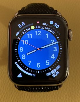
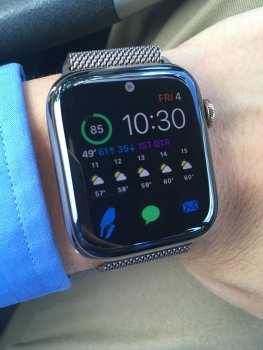
I’ve never tried that one in blue, quite nice.Another one for your collection...
I really like this one, so much so that I copied it.Another one for your collection...
It goes perfectly with the Blue Horizon sport band. Enjoy. 😎I really like this one, so much so that I copied it.
Oh, and that’s something else.. I never thought of changing the color of the watch face to match the color of the band. Genius!It goes perfectly with the Blue Horizon sport band. Enjoy. 😎
Every day, is a school day... 😎Oh, and that’s something else.. I never thought of changing the color of the watch face to match the color of the band. Genius!
Another one for your collection...
What watch face is that please. I can't change any of them to blue, California is close but now deep blue like that
Thanks
What watch face is that please. I can't change any of them to blue, California is close but now deep blue like that
Thanks
its infograph with all of the subdials set to "off"
oh wait, maybe not, didn't, just realized there are numbers on the watch face...now i am curious
its infograph with all of the subdials set to "off"
oh wait, maybe not, didn't, just realized there are numbers on the watch face...now i am curious
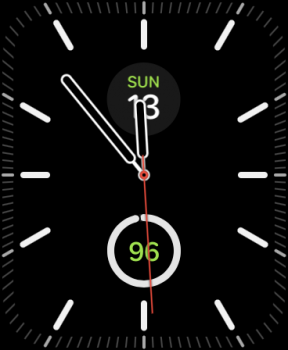
It's the California face set to circular instead of full screen.
It's the California face set to circular instead of full screen.
But there is no option for A solid dark blue
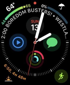
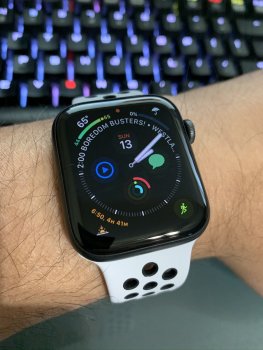
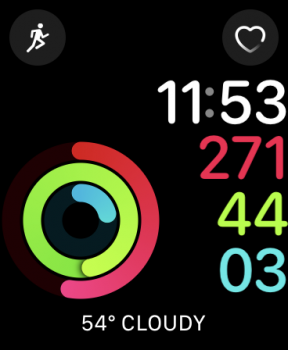
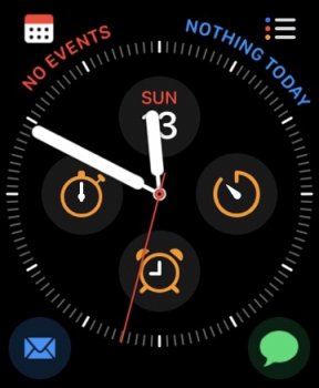
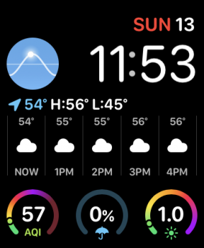
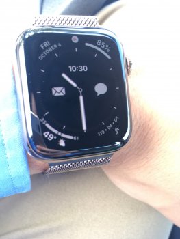
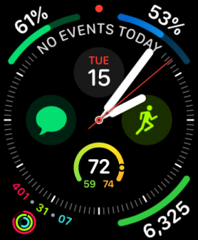
I'm constantly trying to optimize for the best Infograph Analog set up. Never liked the digital version myself. My guiding philosophy on complications is that they should display useful, timely, dynamic data. I'm not so big on using the face as an app launcher for apps that don't reflect change. A bonus if I can include some trad watch complications too like a timer or day/date stuff.I find myself changing my complications every day looking for "the best" setup. Lets all share our current setup for ideas.
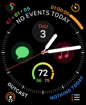

When 6.1 is released, I'll probably find something to replace the battery percentage complication I'm using.
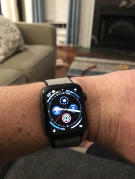
I’ve just set mine up, mostly for information I kind of find interesting at a glance. Then I have my Dock set with the apps I access most. I suppose I could do without the compass in there, but it’s still a novelty just now, so it’s staying. My activity has gone to pot this week because the wife has diseased me with a bloody cold, which just messes me up with my immune system 

Register on MacRumors! This sidebar will go away, and you'll see fewer ads.


