Become a MacRumors Supporter for $50/year with no ads, ability to filter front page stories, and private forums.

MacBoobsPro

macrumors 603
Original poster
Jan 10, 2006
5,114
6
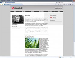
I've redone my online portfolio and would like a few people to give it a test run to check for any text reflows and other possible anomalies.

If you have the time and don't mind just having a quick nosey on each page and listing anything you spot that seems out of the ordinary I would be very appreciative.

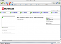
The actual portfolio section isnt finished yet but the rest of the site is.

Its done in iWeb too. :D


Cheers, Boobs.
 
The RSS logo looks misplaced (moslty because of it's colors), and the Lime fruit draws to much attention, it tottaly unbalances the site. You should consider using a colorscheme and not just shades of gray, it looks really unengaging, and not like a "fresh approach". Though good job doing it all in iWeb, that must have taken some time, i would prefer a different approach.

the read more and comments text is to big too, again looks unbalanced! And the subheading on the News and Welcome items is, to small, boxed (looks bad), and irrelevant (I cant really se its pupose when the itmes are just underneath)
 
The RSS logo looks misplaced (moslty because of it's colors), and the Lime fruit draws to much attention, it tottaly unbalances the site. You should consider using a colorscheme and not just shades of gray, it looks really unengaging, and not like a "fresh approach". Though good job doing it all in iWeb, that must have taken some time, i would prefer a different approach.

It is a work in progress and I agree with what you say about the image and the RSS button. Once I find or create a better image I will put it in there. I also dont like the pic of myself but I'm not sure what else to put there. It definitely needs an image in that spot though to balance the page.

the read more and comments text is to big too, again looks unbalanced! And the subheading on the News and Welcome items is, to small, boxed (looks bad), and irrelevant (I cant really se its pupose when the itmes are just underneath)

Thats a limitation in iWeb. Theres only so much you can edit. :(
 
To be honest I really didn't like the Google ads. Especially considering it dumps quick links right down the bottom.

I got to the form page (http://web.mac.com/stuartluff2/stuartluff/get_a_quote.html) but I found no way back (I had closed the background page in the mean time) and because the URL is of a different format I couldn't directly edit it either.

"View Stuart Luff’s Portfolio" under your picture goes to coming_soon.html rather than portfolio.html like the other link does.

It is a nice site but the one thing sticking out like a sore thumb is the google ads, just the way I feel about them I suppose but it seems to cheapen the site.
 
You should look at an app called context free, it is a really cool geometric generator, it can do allot of cool stuff, just to spice your site up! I made this site recently its pure handwritten css/js/HTML though it looks good i am not quite satisfied yet http://ungefair.dk/ it is to dark.
EDIT: And for some reason the js isn't loading on one of the pages in ff, probably a encoding issue :)
 
To be honest I really didn't like the Google ads. Especially considering it dumps quick links right down the bottom.

I got to the form page (http://web.mac.com/stuartluff2/stuartluff/get_a_quote.html) but I found no way back (I had closed the background page in the mean time) and because the URL is of a different format I couldn't directly edit it either.

"View Stuart Luff’s Portfolio" under your picture goes to coming_soon.html rather than portfolio.html like the other link does.

It is a nice site but the one thing sticking out like a sore thumb is the google ads, just the way I feel about them I suppose but it seems to cheapen the site.

I made the form open in a new page because once you submit the form it takes you to a page outside of my site giving you no way back. Opening in a new window at least allows you to close it once submitted and go straight back to the page you were on.

I must of missed a link for the portfolio if one of them does indeed go to the portfolio page. Does it have some football manager stuff on it?

Regarding google ads I am just testing something out and will most likely get rid. I do agree they cheapen the site, and will also take some possible work away from me once they are optimised for graphic design ads etc.
 
I made the form open in a new page because once you submit the form it takes you to a page outside of my site giving you no way back. Opening in a new window at least allows you to close it once submitted and go straight back to the page you were on.

You could ad a link back to the main page though. For example your logo at the top left.

I must of missed a link for the portfolio if one of them does indeed go to the portfolio page. Does it have some football manager stuff on it?

coming_soon.html doesn't but the portfolio.html does
 
You could ad a link back to the main page though. For example your logo at the top left.


coming_soon.html doesn't but the portfolio.html does

I have just re uploaded now the main button links were a bit iffy. The text went to the right place but if you clicked on the grey background of the button some took you to the wrong place. So thanks for spotting that.

When you spend ages doing something you tend to start overlooking things, hence this site check request. :)

If iWeb allowed users to edit the style of every item it would be a fantastic app but it doesnt allow editing of some of the crappiest designed stuff, like comment links and Blog headings etc. I've done my best to try and tie it all together without it being too obvious.
 
Ok. Thanks for your input guys. I have figured out how to adjust the type on pretty much everything in iWeb now so the comments and headings etc should fit better with my style. No more giant 'comment' buttons etc apart from one which I can't do diddly about (Apples fault) :mad:

I have added a red RSS button to better fit with the colour scheme, I have changed the Lime picture to a more subtle fresh(ish) grass image (lame I know but it needs a pic I think). I have also dropped the ads and quick links for a cleaner look.

Now I just need a relevant image so I can take my mug off the page. Ideas anyone?
 
You get an odd grey box in IE7 here at work. Yeah, yeah I know but the world uses IE so you need to check it in there. If you don't have access to all the browsers you need to test it in you can try browsershots.org
 

Attachments

  • StuartLuff.jpg
    StuartLuff.jpg
    171.2 KB · Views: 80
You get an odd grey box in IE7 here at work. Yeah, yeah I know but the world uses IE so you need to check it in there. If you don't have access to all the browsers you need to test it in you can try browsershots.org

thanks I'll take a look.
 
I like the overall design; very simple, clean, and balanced.
The site structure is easy to understand and quick to navigate.
It's obvious to me that you are an experienced graphic designer.

Some observations:​
  1. The grey background ends abruptly below the footer.
    Looks distinctly "wrong" with short pages in a large browser window.
  2. Page-loads redraw the entire site from a blank white background.
    This is vaguely disconcerting and unexpected, akin to a strobe effect.
    Personally, I think I'd place the content pages in an iFrame to mitigate this effect.
  3. The top horizontal nav is very nicely designed, but the dark rectangles surrounding each link look like buttons, but are not.
    I think I would invert the rectangle and text colors on rollover, similar to the OSX application menu behavior. Target the rectangle, not the text.
  4. The text formatting, colors and fonts are very appropriate and beautifully executed.
    The headlines maybe could come down a point.
  5. The Quote form is nicely designed, and looks very complete and professional.
    I think I would add "Company Name" to the contact info.
  6. The comment system on the articles pages is a nice touch.
    I like the use of color in the article header.

Nice website.

Excellent feedback. I'll revisit some of the points you have made.

How do I implement iFrames? Remember this is done in iWeb and I am not really a web designer and have no HTML experience.
 
One thing I would say is something I've noticed in other iWeb sites is that it takes ages to load. Because of this you get an effect like this:

Picture 1.png

as it's loading, which doesn't look very slick. Obviously with headings as images there will always be a certain amount of that (and you have to balance it out with the aesthetic benefit of not using default fonts), but I think the reason iWeb makes that especially bad is that it uses images where a HTML/CSS site would have used code. For example, in the navigation links there are a few layered images to load, when in fact, you could make a (small, fast-loading) image for the text button and the rest (background, etc.) would just be code and it would basically load instantly.

Just thought I'd mention it, because it looks a slick site (once it's loaded!) and that does spoil the effect somewhat.
 
One thing I would say is something I've noticed in other iWeb sites is that it takes ages to load. Because of this you get an effect like this:

View attachment 118659

as it's loading, which doesn't look very slick. Obviously with headings as images there will always be a certain amount of that (and you have to balance it out with the aesthetic benefit of not using default fonts), but I think the reason iWeb makes that especially bad is that it uses images where a HTML/CSS site would have used code. For example, in the navigation links there are a few layered images to load, when in fact, you could make a (small, fast-loading) image for the text button and the rest (background, etc.) would just be code and it would basically load instantly.

Just thought I'd mention it, because it looks a slick site (once it's loaded!) and that does spoil the effect somewhat.


It is one of the major drawbacks of using iWeb. :( But I'm not a web designer and have no real HTML, CSS etc experience. I use iWeb as it is so simple to use. For me the simplicity of it out weighs the poor results on some browsers and load times etc. However I am aware of both and (with the help of this thread) I am trying to limit the impact of long load times and non standard browsers, like Explorer. :D


EDIT: Re uploaded and I have used default fonts (Helvetica) a little bit more to allow for quicker loading while also keeping the style somewhat. I prefer 'Helvetica Bold Condensed' but if i make it an image it takes longer to load and if i leave it as text it invariably displays as a different font on various browsers.

Any more observations/tips anyone has I'd love to hear them. Thanks to everyone so far.
 
Register on MacRumors! This sidebar will go away, and you'll see fewer ads.