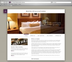
I'm helping out a friend rebrand their company (well so far I've done everything...) as a part of the entire branding overhaul I've created a very quick web layout of how the new web site might look.
Some honest (not soul destroying) feedback or idea would be appreciated.
Thanks
Some honest (not soul destroying) feedback or idea would be appreciated.
Thanks
")