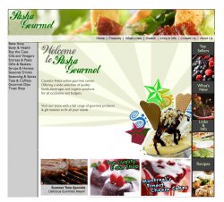
OK - if "Shop" is the header for those it should be closer / better associated with them - right now it looks like it's all there alone.
For the left menu - don't change font size - just add some spacing. If you are using table cells for each you can add some padding ... if you are using CSS - again some padding.
BUT most importantly - please please please
")
- don't try and make this site in Flash. Don't get me wrong - nothing wrong with Flash - but it has it's purposes. A site like this, where you want to be able to change the items for sale regularly, have it search engine friendly, fast to go through should remain in HTML. Also if you ever add a shopping cart, content management system, etc --- a Flash site would not work for any of those.
Actually, I think technically it is possible to build a shopping cart in Flash sites (at least with the help of additional server-side tools) but it is quite complicated.
I disagree about the font size in the left menu - I'd say decrease it slightly, make it stand out more, and definitely add padding.
However, also add some space between the separate items, or some other way of differentiating one item from another. Different computers will size that same text differently, and the links will sometimes go to new lines. So make sure that even if a link takes up more than one line on some computer, it will be easy to tell apart.
In addition, I'd check out the alignment of objects. The "Shop" button/header? appears wider than the box below it, etc. A lot of this may result from using tables as a layout tool, but by eliminating border widths you might be able to make it look a bit spiffier.
In the menu bar, that gray link doesn't look quite right. I'd try white, perhaps... and, though it is probably my personal preference, I'd try to eliminate the underline, perhaps changing it to a bold, but the text may not stand out enough then.
Finally, the boxes at the bottom. I agree with the other posters - the cartoonish text doesn't look great. It's okay, but it would look a lot better if you simply had a white or gray semitransparent overlay, containing the text in a dark gray or black simple font, above a portion of the picture.
In fact, you may want to try for a white background instead of a gray one, and you might even consider changing the green up on top to a white as well.
Now,
keep in mind that my suggestions may look horrible. They are meant to be ideas. I usually go through hundreds of different subtle and not-so-subtle changes when making a web site.
The most important thing to remember is:
tinkering is your friend!
However, make sure to save often, and save new copies often. (For instance, if you are making HTML files, save them as design_1.html, design_2.html, design_3.html as you keep making new candidate designs). Also, although this may sound like common sense, don't try to change the whole site at once (assuming you are working with HTML), just change one page continuously until you reach a final design, and then change the other pages to match it - and make sure you have consistency.
Finally, congratulations. The site looks pretty good. Though not perfect or wonderful, it is great for a fifteen year old. It looks better than the site I made for my father's company a three or four years ago by far (THAT SITE IS UGLY!). I didn't have great design sense back then. I was a better programmer than a designer. (The site did have a fairly advanced core - at least, for me being a fifteen year old or so - involving XML-to-HTML conversions through XSLT, all of which happened on the server, but that doesn't excuse its looks).
A final tip: keep in mind what kind of atmosphere you want. If you want a calm atmosphere, you may want to incorporate very little color EXCEPT for pictures of food, which should all look as vibrant as possible - boost the contrast in Photoshop (not too far, though), keep tons of white space. If you want a very active atmosphere. This may draw the visitor in.
And I've made a very very quick and dirty (read, not very good) mock up of a few of the possible things you might consider. I changed one of the images at the bottom, and the menu at the top.