Got a tip for us?
Let us know
Become a MacRumors Supporter for $50/year with no ads, ability to filter front page stories, and private forums.
Site Design Mockup Critique (and how-to) please!
- Thread starter yoyo5280
- Start date
- Sort by reaction score
You are using an out of date browser. It may not display this or other websites correctly.
You should upgrade or use an alternative browser.
You should upgrade or use an alternative browser.
It can be done. It looks good, but its use is very limited with its current design (unless you wanted to add a content region other than the twitter message). Note that I'm going to explain this as if you know, at least basic, css and html code.
Omisan can be accomplished with css and the right font. The arrow would have to be an image, though I would recommend making it a background-image. The happy holidays would be able to be accomplished via css, html, and an image or, if you're feeling like scripting, some javascript.
The twitter message can be inserted using their API's. It can be formated like that via css.
The rest is standard text. The majority of the site, if built right, can be text, making it very search engine friendly.
Hope that helps.
MegaMan1311
I only know basic HTML 
and by basic, I mean very very very basic.
CSS,Javascript, and APIs are waay beyond me.
and by basic, I mean very very very basic.
CSS,Javascript, and APIs are waay beyond me.
I only know basic HTML
and by basic, I mean very very very basic.
CSS,Javascript, and APIs are waay beyond me.
Then I suggest you start reading through the stickies in this forum and reading tutorials online. We aren't going to make your site for you, but as you have specific questions we'd be more than happy to help out. There's plenty of free text editors you can download if you want to take this on from the coding angle. There's also some WYSIWYG editors (where you don't have to mess with code so much), and some are listed in the stickies though not many to choose from and even fewer free ones.
I really like both,
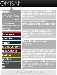
I think on the PDF (first version?) if you put your site name bigger and above the TWITTER MESSAGE aligned to the right then I would prefer that one. Depends on how you would show the content of the sections, both are pretty good options.
If you need help I can try to help, my website is www.mfjram.com I've been lagging on it though so only the blog is up and it's not really customized -_- hahaha.
Keep me updated !
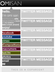
Instead of just writing "Twitter Message" and "This is a copyright", use examples of text that may actually appear. You're unlikely to have twitters that are only two words long, and it's much easier to understand the purpose of the design if the text in it is relevant.
Looks fine, just create it!
He doesn't know how to code it!
So that will be sort of hard.
I can help!
Maybe...
Register on MacRumors! This sidebar will go away, and you'll see fewer ads.