desenso said:
1) Why the frame? Go and look at you favorite 5 sites in terms of design and count how many of them use frames / iframes. My guess would be 0.
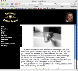
2) The color choice is perplexing. When was the last time you bought an all-black tube of toothpaste, or a tube of black toothpaste? When I think of dentistry (and all its grinding and painful tools), I don't really want the color black to be assosiacted with it. When combined with dentistry, it makes me thing of pain, death, and rotting teeth. It's also rare to find corporate websites in black, and there's a good reason why.
3) Remove the floating head. As others have pointed out, it's totally inappropriate. I'm sure she has another picture of herself, in her work environment, that looks much more friendly. It just doesn't work, and should be removed asap.
4) Make the forms PDF. You're on the mac forums, so I assume you have a mac, which means this should be quite easy. The way they are at the moment is terrible.. plus as a PDF you could combine both pages.
5) I'm not a fan of hover menus on websites because 99.9% of them don't work well. Sadly, yours fall into that group... dont' be disheartened though, I've only ever seeon one that works properly. If you insist on keeping them because you feel they're impressive, then at least be consistent - why can I click on the Services "hover" link and get a page, but not the 'Care of Your Teeth' links? It's inconsistent and confusing. Navigating the site is a challenge.
6) Did you design the logo? It's a bit strange - not necessarily bad, just strange. I can't tell if those are cannons, snails, or or what. Will they use that logo at their offices? I see on the staff page that they have a sign on their office building - it's kind of quaint and old-school. Perhaps you should consider working that into your webpage. I'm not saying the logo is bad, but I wonder if it's appropriate to redesign a logo for the webpage only?
I hope I don't sound overly critical. There are many things about the site that are good - text-size, consistent use of colors, etc. My biggest concern is not that you've designed a bad site, but that it might be more appropriate for a rock band, not a dentist's office. A website needs to be consistent with the company's profile, and from what I can gather from the pictures, their first choice when it comes to a color scheme probably wouldn't have been black and gold. I could be wrong.
1. I'm not sure exactly why we agreed on the iframe. I think it was just the only way that we knew how to make the site appear in the right side
2. Yes, I agree, black is bad. We had many fights over the color of the site. In the end, the Graphic Artists got their way because they are soo smart

3. I will look into a more "friendly" head picture.
4. We originally had the forms in PDF, but they weighed in at an insane 11mb
is there anyway to compress them to a more reasonable size?
5. Good points on the menu. I do not remember why we used the hover menu to be honest. Yes, it does not work properly, but at least we didn't render the site useless and did include an alternate navigation system. I absolutely understand what you are saying though
6. No, the logo on the website is their logo 100%. It is on all of their paperwork, business cards, etc.
No, you do not sound overly critical. I asked for opinions and opinions I received, thanks a lot. I am only a freshman in college, so I obviously am not that great at websites yet.
I am working on a new website for our college hockey team as the guy in charge now is graduating. It needs to be done by July, so I will be taking all of these recommendations to make a hopefully better website.
Thanks again, I am loving these opinions.
EDIT:
Of course I am using a Mac
We are using Dreamweaver for the site. We are not using it as "Drag and Drop" though, but all coding. Another note on the menu, it originally worked with EVERY browser, then when we arranged everything into a table, the menu mysteriously stopped working with Safari and IE for Mac, strange! Unfortunately, we did not have time to step through the Safari build of the .js file.