Hi everyone,
I've just installed the Yosemite beta on my Retina MBP (15"), and the first thing I've noticed is that the text seems to have become much smaller in lots of places.
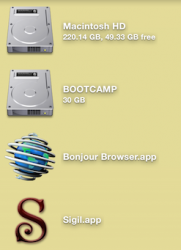
For example, the text in the Finder's status and path bars is so small it's barely readable from a normal distance. You need to really stick your face up to the screen to see it. Same goes with the file info (the blue subtitle text) in Finder items, including on the desktop.
I've attached a picture. It's been shrunk by 50% to simulate a non-retina screen (since I assume most people don't have retina screens, so to them it would look massive and they wouldn't understand why I'm moaning).
Has anybody else experienced this? I'd love to get some affirmation that it's not just my eyes.
I remember hearing during the Platforms State of the Union that Apple has adjusted Helvetica Neue so that the spacing more closely resembles Lucida Grande. Maybe something didn't quite work with that, because I swear that lots of text has become absolutely tiny.


