The left side below the logo on the main page is blank. If this is a portfolio site, or a site to showcase your work, then you should make better use of it. For example, you could move the main nav over to t he left and make the entire solid blue area and current portfolio area where you view the images instead of having pop ups. Pop ups don't always go through, and can be a bit clunky. I don't think the buttons need to be quite so large for the navigation either and the logo is getting a lot of real estate as well. It is in the right location but I think it could stand for someo scaling down.
While the site looks like it is moving in a good direction, right now it feels clunky and a bit toyish. And, while there is nothing wrong with that, I don't think it is the look that you are going for. The person who said the type is a bit small is right. It could stand to be bumped up a point size.
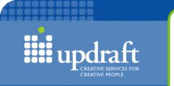
As far as your logo goes, there are some spacing issues between the u/p, p/d, d/r(the serifs are kinda butting up, but don't marry nicely) and r/a. The only pair that are sort of working are the f and t, but they don't know if they want to be touching or not. The tagline doesn't fit nicely below the logotype. I'm not sure that it is the typeface you want to do, and I would give it a go without all caps.
I'm not sure if you copied each square in your logo, but the two on the bottom left don't appear to be the same as the others, at least in the intro. Also, I think you are using the metaphor o a green box breaking out of boxes to say, thinking out side the box, breaking outside of the box, that kind of thing. To be honest, and a bit blunt and I will probably get called out for being too harsh - Don't use that idea, it's cheap, cliche and it has been done a million times, and it will be done a million times again. You have a name in updraft. So why don't you incorporate the conceptual thinking behind the name into the look of the logo. If I think of updraft, I think of wind, breathing, air, movement, elevation, progression, etc. I think that from that idea you can get a much more successful logo, and if this is what you want to do when you are out of school, it will benefit you in the long run to go back to the drawing board. Good ideas, keep going.
")