Got a tip for us?
Let us know
Become a MacRumors Supporter for $50/year with no ads, ability to filter front page stories, and private forums.
Social media infographic
- Thread starter dla2444
- Start date
- Sort by reaction score
You are using an out of date browser. It may not display this or other websites correctly.
You should upgrade or use an alternative browser.
You should upgrade or use an alternative browser.

Check out the inforgraphic!
[url=http://farm8.staticflickr.com/7047/6896379238_234468d322.jpg]Image[/url]
Think Before You Post
http://visual.ly/think-you-post
Very interesting. Thanks for sharing!
Did you create the graphic?
Very interesting. Thanks for sharing!
Did you create the graphic?
Thanks! Yeah, along with my group. We are trying to get as many views as possible for it. If anyone has any ideas of how to market (views) this, let me know? Thanks.
Good job!
A couple of quibbles ...
But those are just quibbles.
Well done!
A couple of quibbles ...
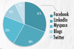
- Using a gradient to convey a percentage is confusing. Where exactly is 45% in that first graphic? I kinda know ... but why make it unclear?
- All that work and you couldn't line up the colored squares in the attached graphic below? Also, the numbers inside the pie chart could be typeset better.
- The bottom list of referenced sites is too big. It should have been underplayed to not compete visually with the rest of the infographic. And I wouldn't include anything in the url that isn't absolutely necessary: no http://, no www.
But those are just quibbles.
Well done!
Attachments
Thanks! Yeah, along with my group. We are trying to get as many views as possible for it. If anyone has any ideas of how to market (views) this, let me know? Thanks.
Very cool. Well done!
I like the textured background and the muted blue colors.
I've never worked on an infographic before, but it definitely looks like fun!
Good job!
A couple of quibbles ...
- Using a gradient to convey a percentage is confusing. Where exactly is 45% in that first graphic? I kinda know ... but why make it unclear?
- All that work and you couldn't line up the colored squares in the attached graphic below? Also, the numbers inside the pie chart could be typeset better.
- The bottom list of referenced sites is too big. It should have been underplayed to not compete visually with the rest of the infographic. And I wouldn't include anything in the url that isn't absolutely necessary: no http://, no www.
But those are just quibbles.
Well done!
My professor also made a comment on the pie chart. He isn't a fan of pie charts because they don't accurate represent the portions. I agree with you about the reference part, but I already handed in the project. Now I have to get as many views as possible.
----------
Thanks for the comments!
Check out the inforgraphic!
[url=http://farm8.staticflickr.com/7047/6896379238_234468d322.jpg]Image[/url]
Think Before You Post
http://visual.ly/think-you-post
My source of infographic ideas.
100 Websites To Submit & Market Your Infographic For Free
Check out the inforgraphic!
[url=http://farm8.staticflickr.com/7047/6896379238_234468d322.jpg]Image[/url]
Think Before You Post
http://visual.ly/think-you-post
Well, you can make your infographic viral by submit to over 50 infographics galleries at this site: infographicssubmit.com. I think your graphic is quite good, and visual.ly is just one among hundreds of galleries that can make people hear about you.
Good luck.
Last edited:
Hey guys, i'd like to share some infographics with you!
Hello everyone,
I'd like to share some interesting infographics with you, related to digital and mobile world! Thanks so much, cheers!
http://www.neomobile-blog.com/are-you-the-real-mobile-expert/
Hello everyone,
I'd like to share some interesting infographics with you, related to digital and mobile world! Thanks so much, cheers!
http://www.neomobile-blog.com/are-you-the-real-mobile-expert/
Please check out this infographic about twitter fake accounts and tell me what you think! http://ernestoolivares.com/infographics/twitter-official-accounts-vs-fake-acoounts/
Well.. Its an informational Post. I liked the way you represented it.
Please try to get a animated video too that represent your graphic in a better way.
Please try to get a animated video too that represent your graphic in a better way.
Register on MacRumors! This sidebar will go away, and you'll see fewer ads.